
TripTo
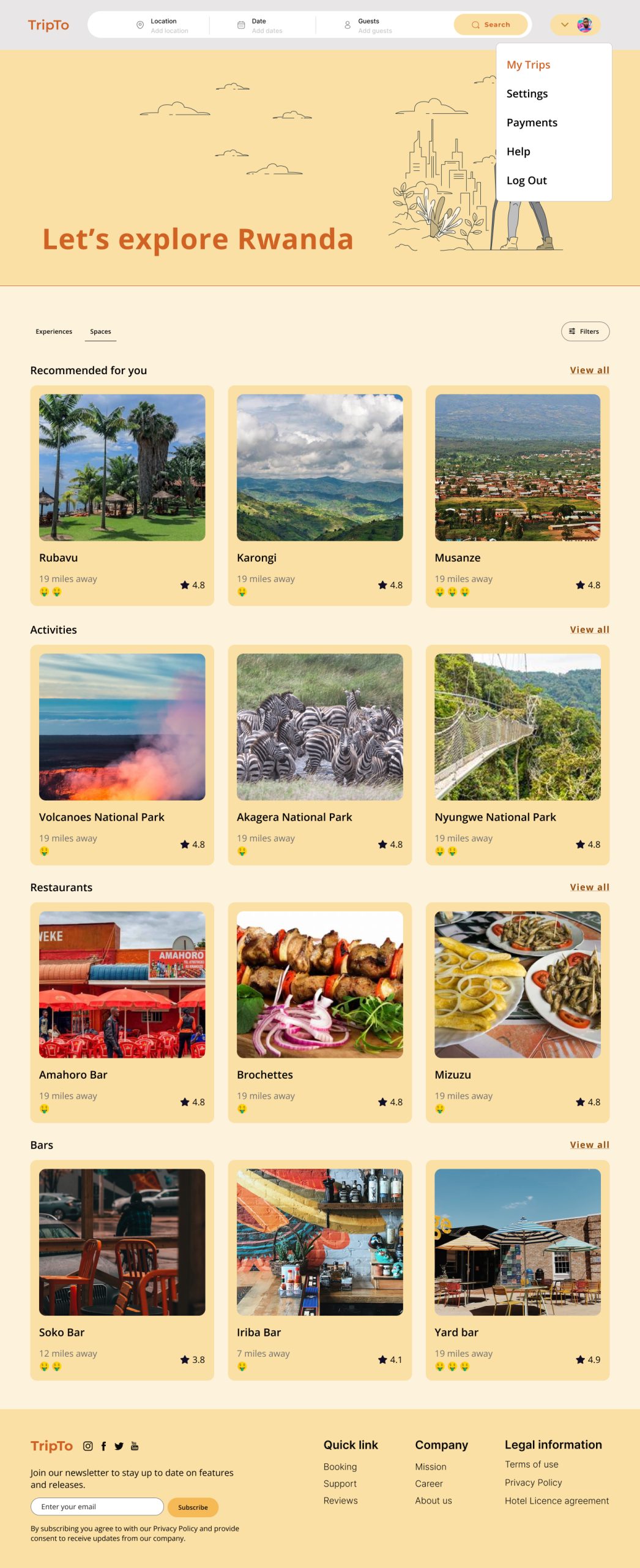
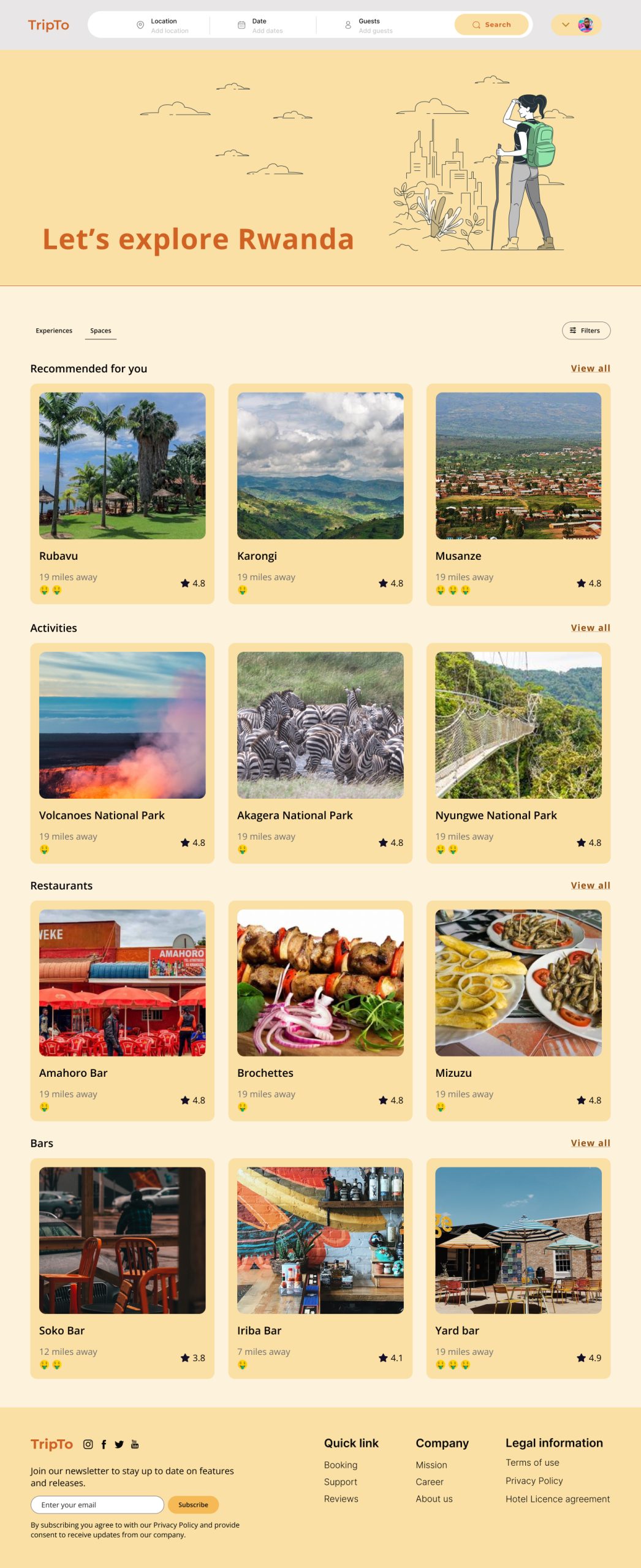
Let’s explore Rwanda
Providing Rwanda travelers with a seamless booking experience.
Travel and tourism startup committed to connecting African domestic/international tourists to leisure spaces and experiences.
Overview
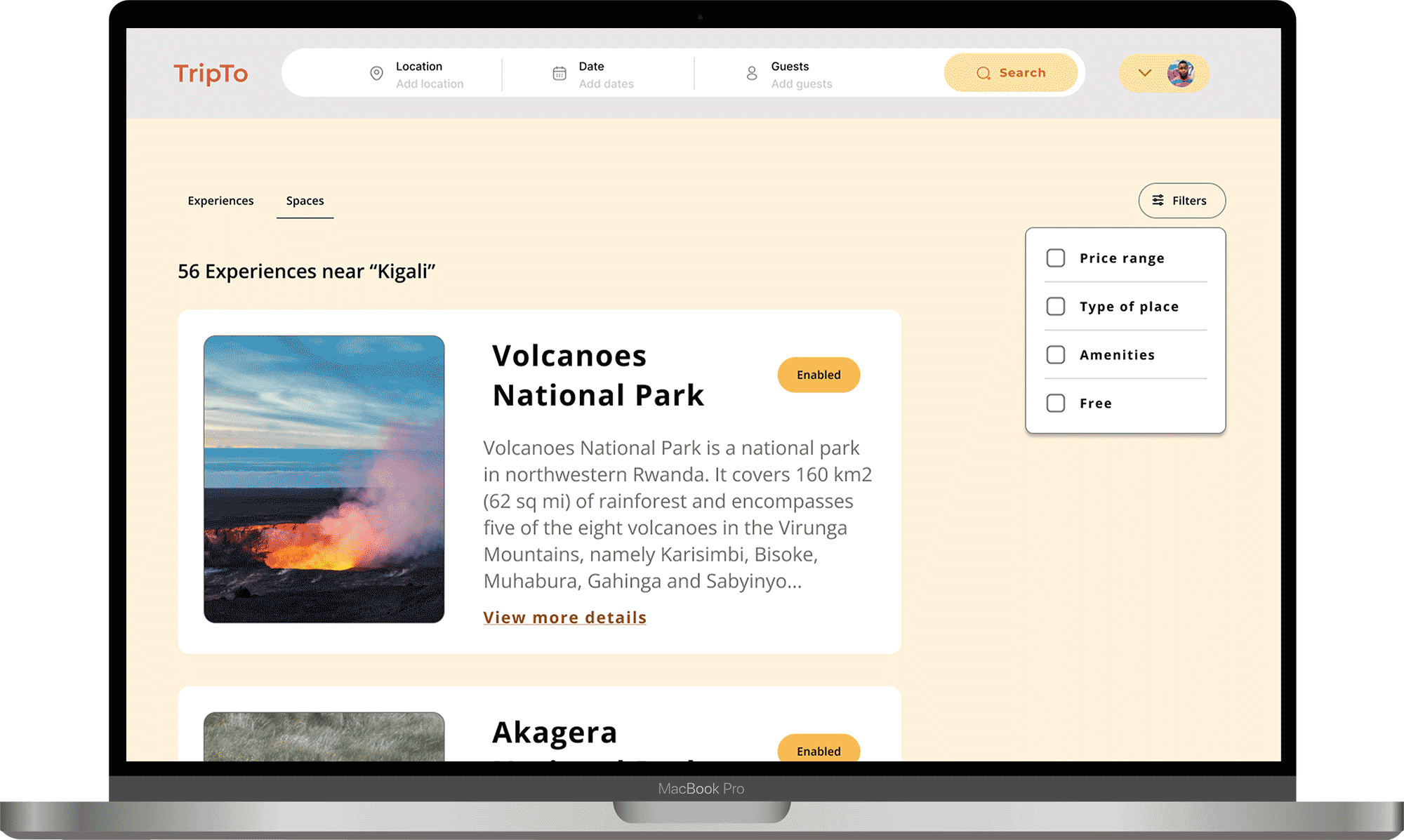
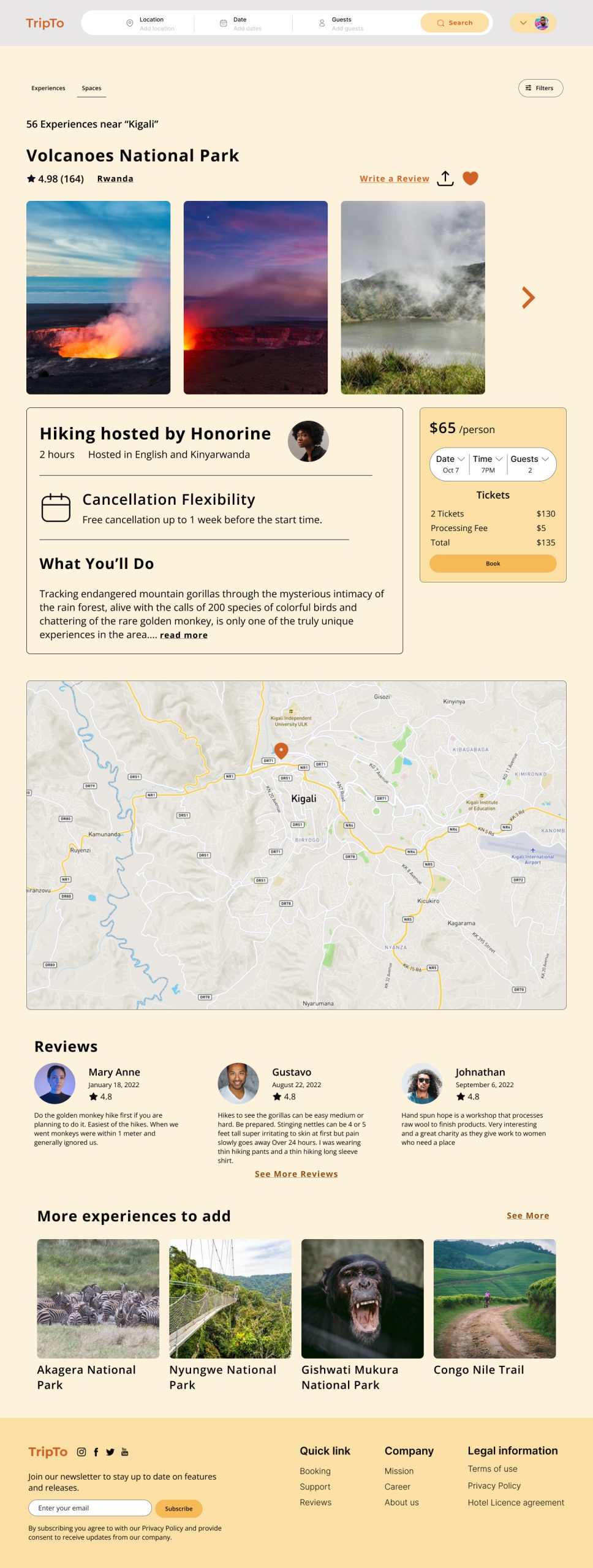
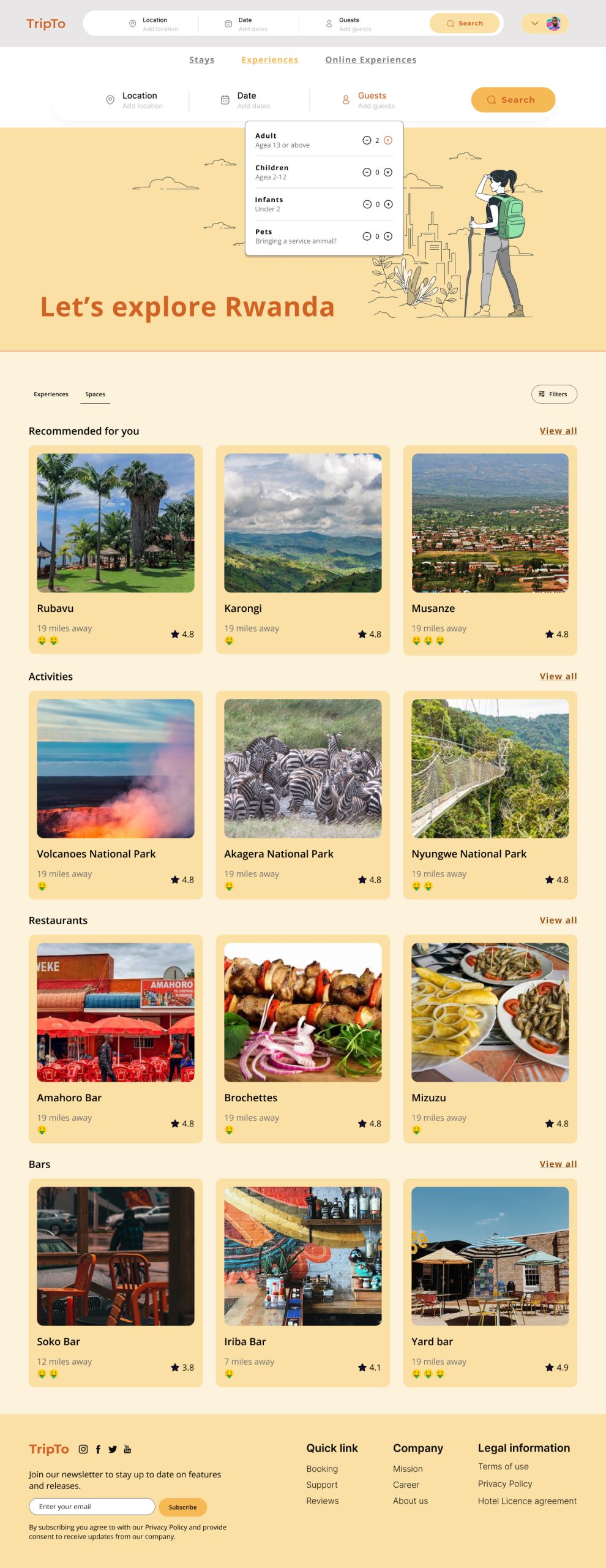
Imagine you are in a new city or you already live in a city and you want a space( for the purpose of the MVP; any restaurant or bar), or an experience to visit. TripTo is a web application that makes it easier by categorizing a catalog of spaces, and experiences to explore and helps you make bookings for them, and makes it easier to make payments.
Deliverables
- User Flow
- Wireframes (MidFis)
- UI (HiFis)
- Style Guide
- Dev Handoff
Role
UX/UI Designer (Team of 6)
Tools
Figma, FigJam, Slack, Zoom, G Workspace
Duration
8 weeks
Challenge
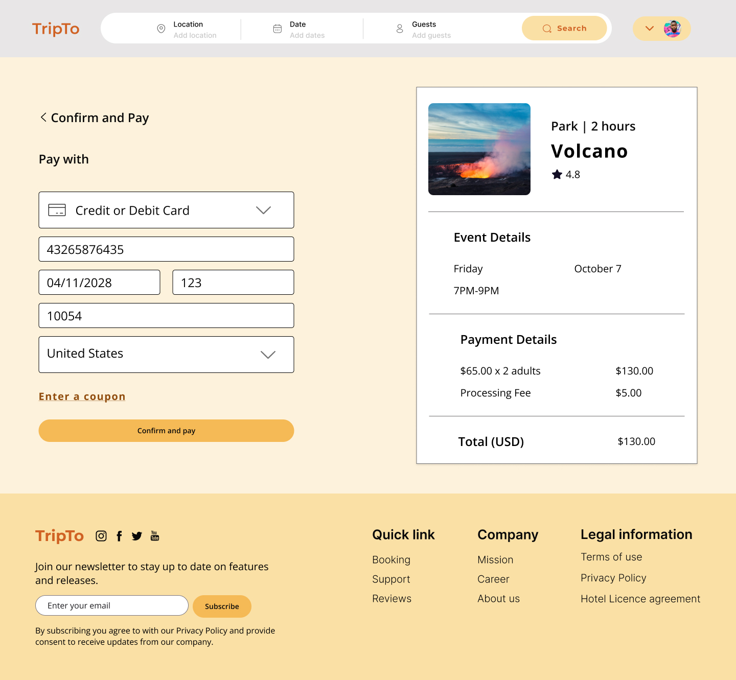
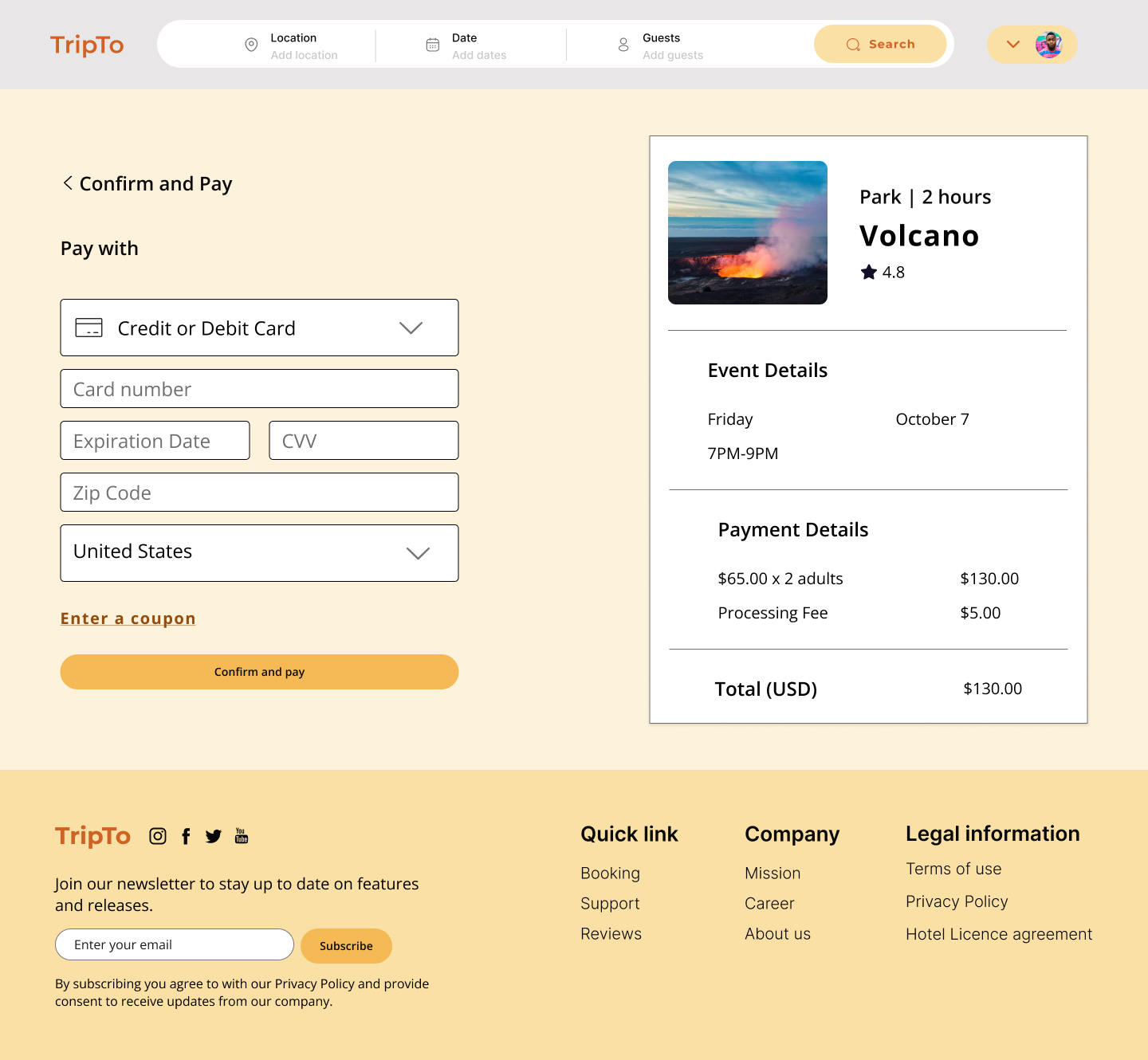
- Since the company is new, the client wanted the design team to help create a website that will be able to provide travelers with a seamless booking space/experience to explore Rwanda in a simple way.
- The easy payment options as well as booking and rebooking with Itineraries are the main challenges that the team works to resolve.
Solution
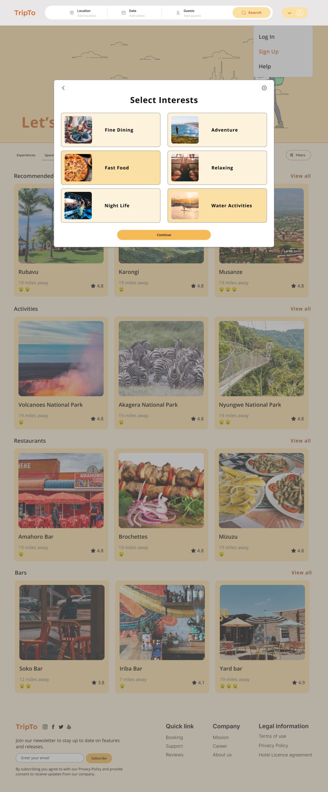
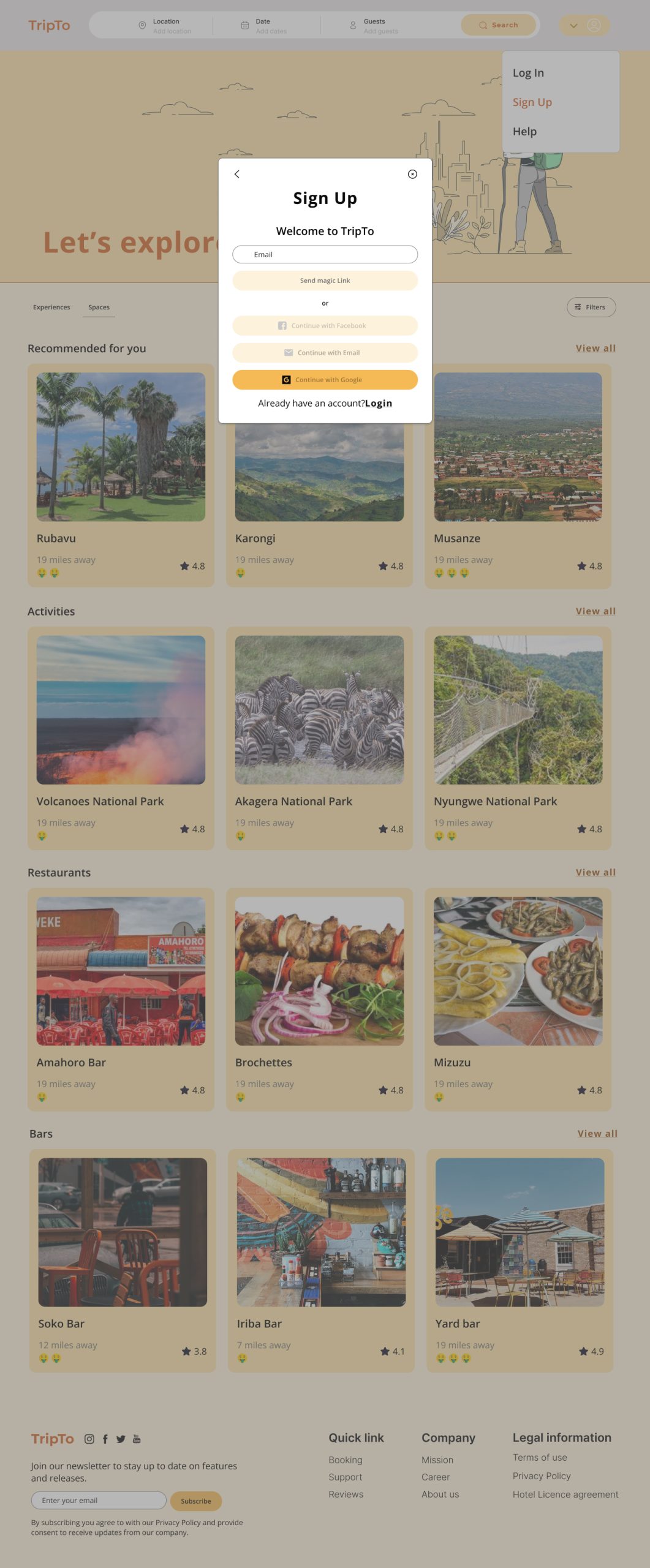
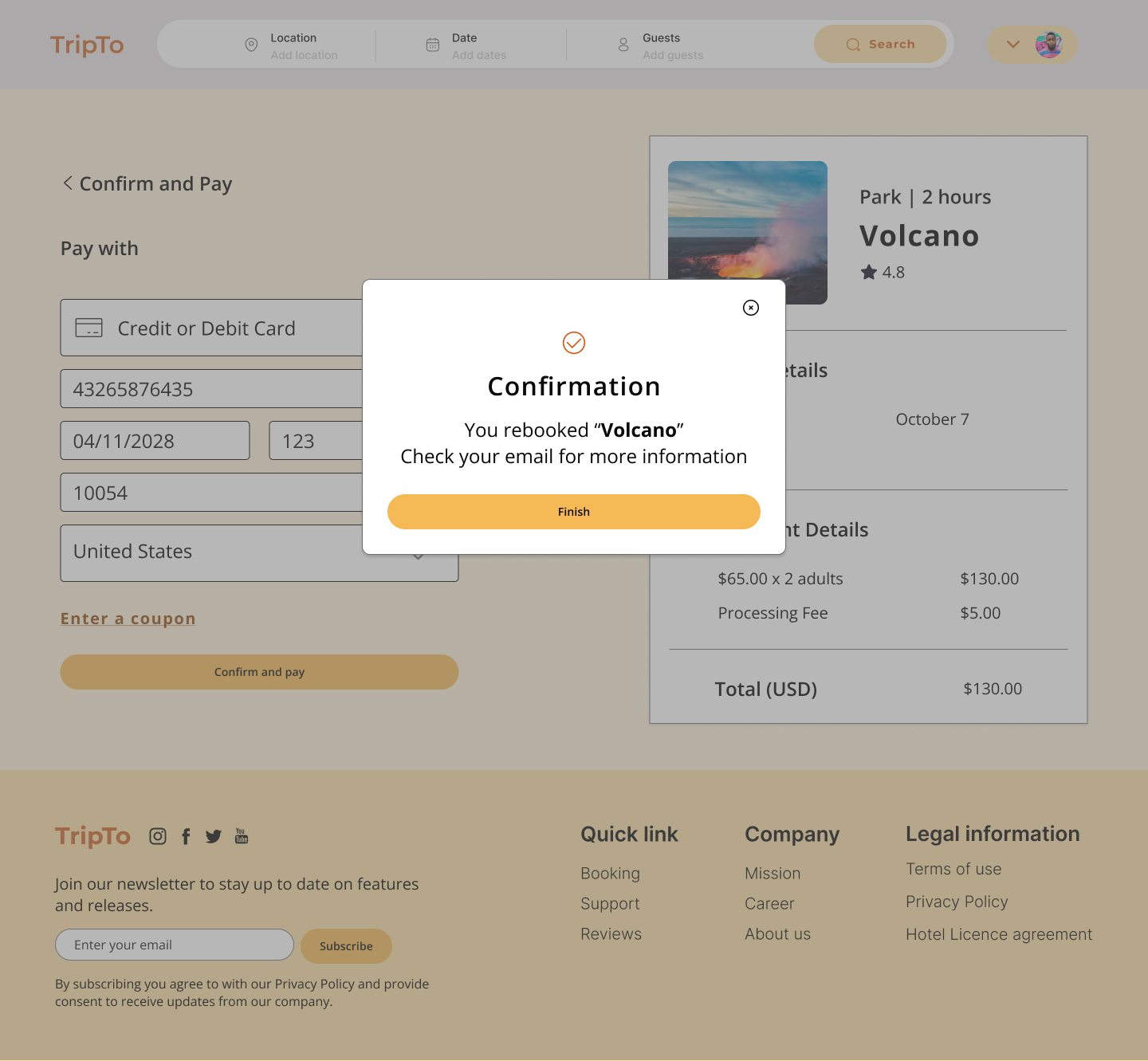
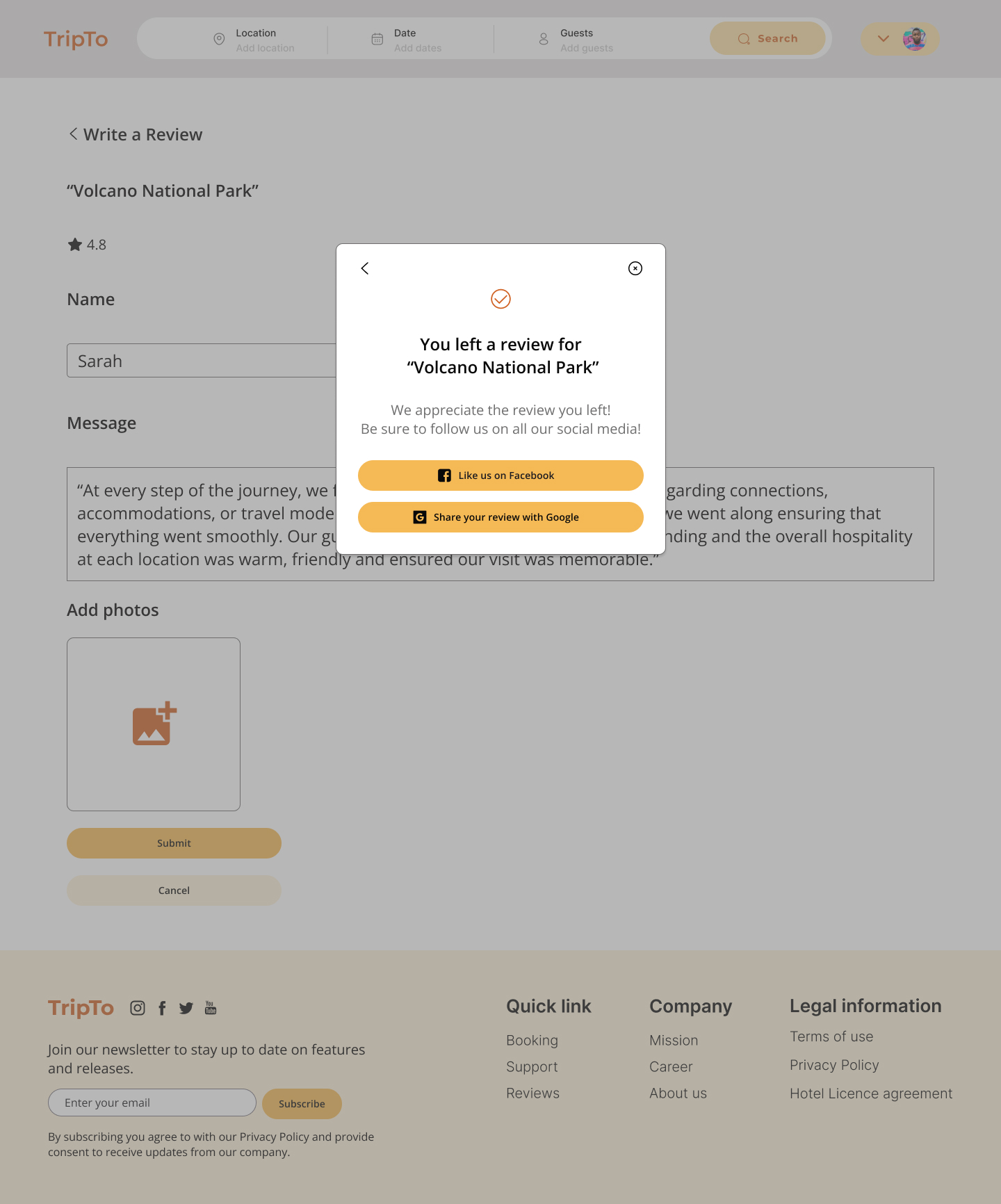
As a team, we were instructed to focus on creating simple user flows in these areas for the first phase:
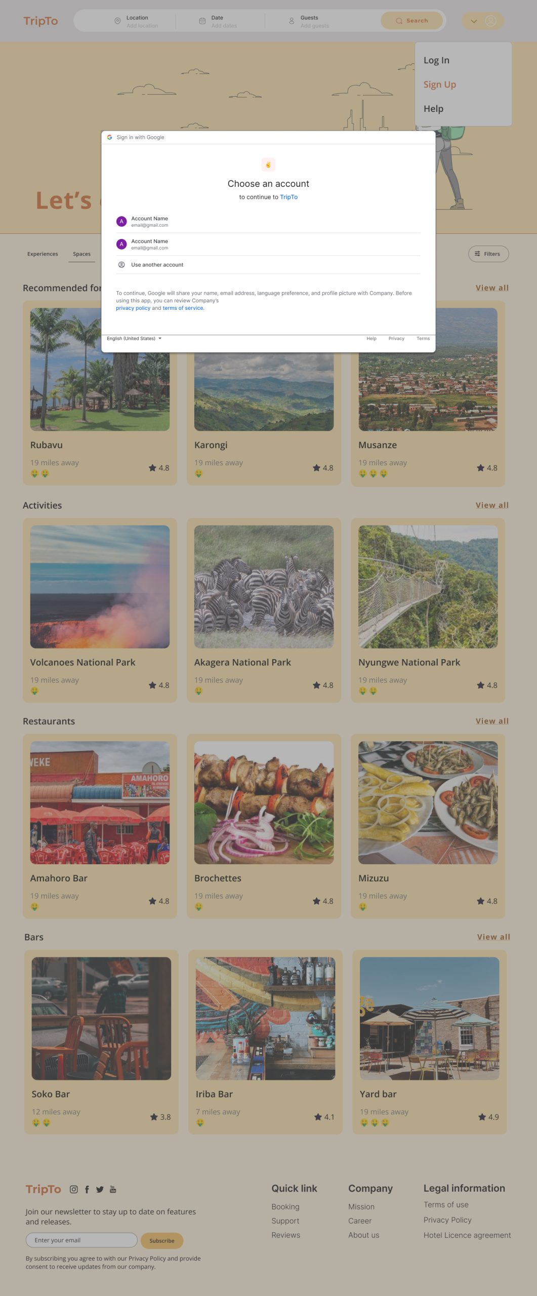
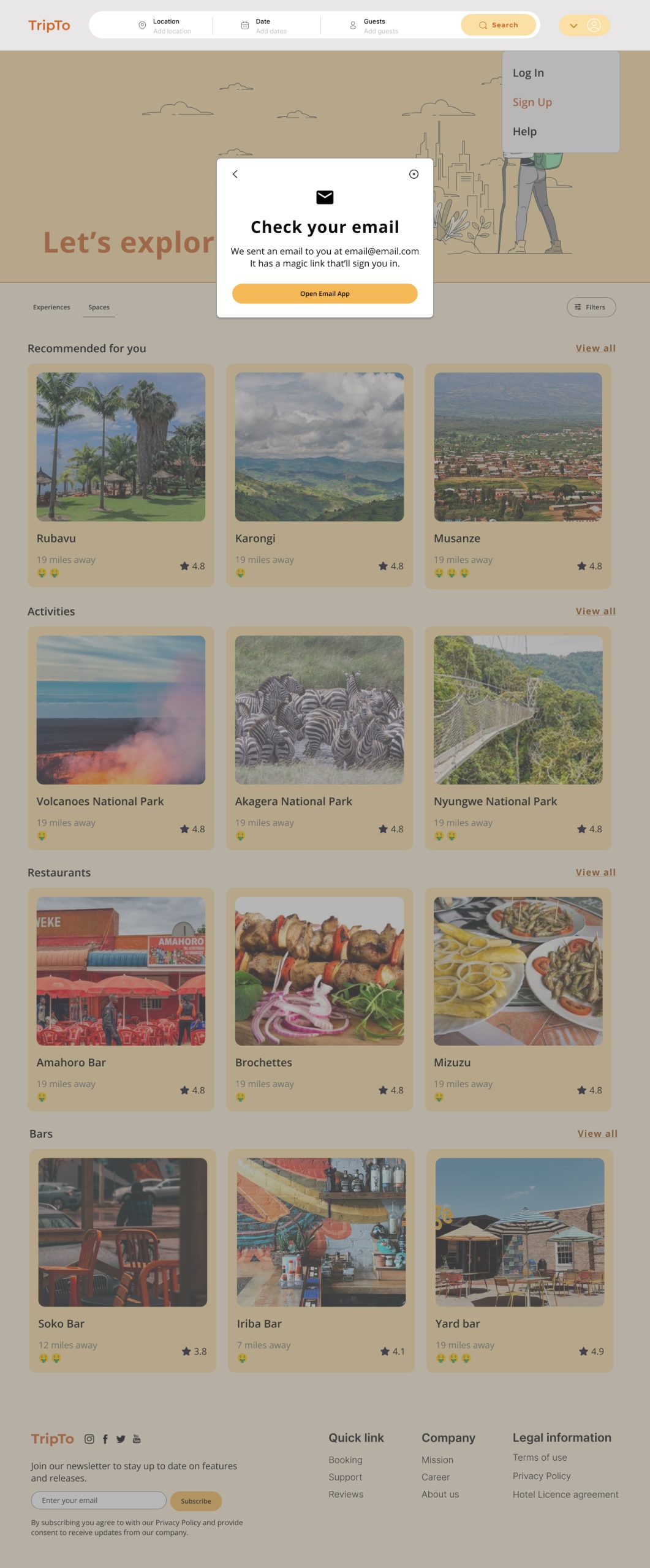
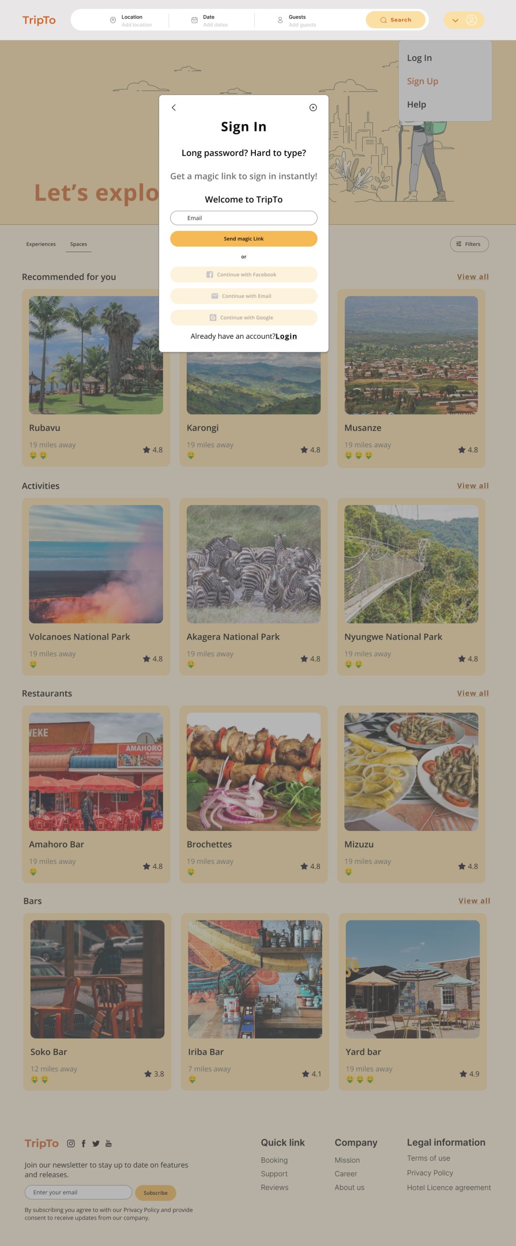
- Sign Up/ Login
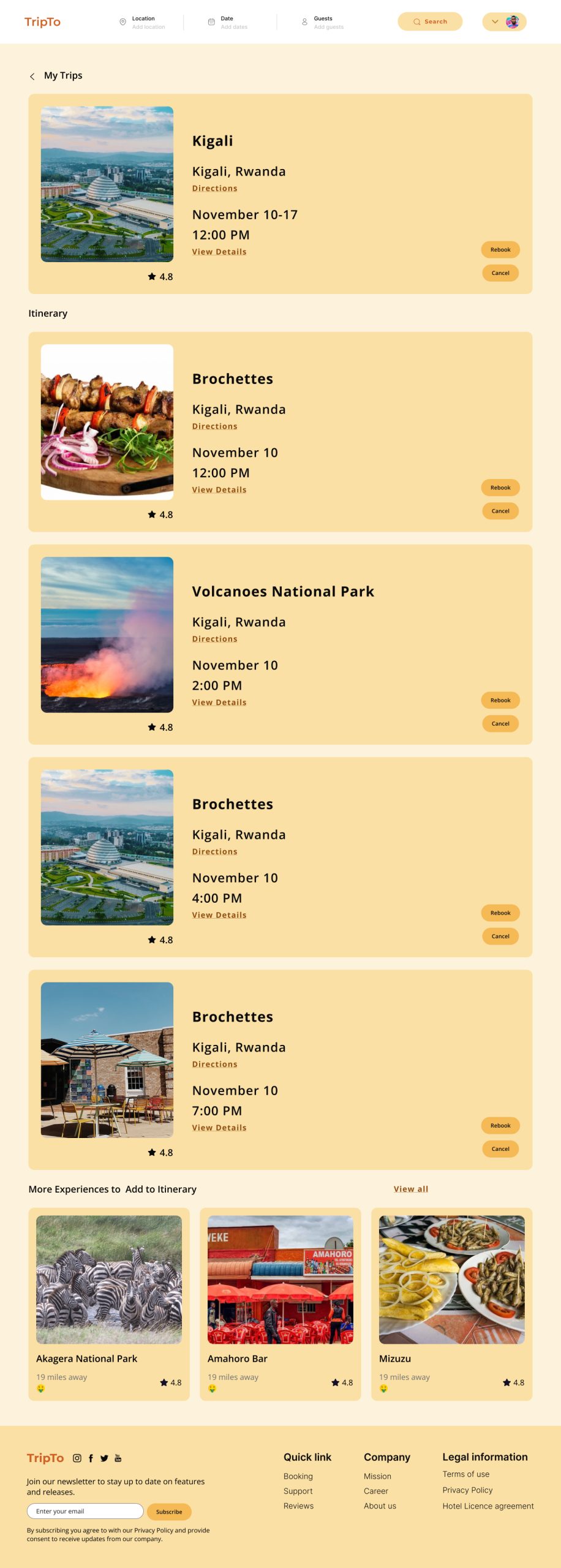
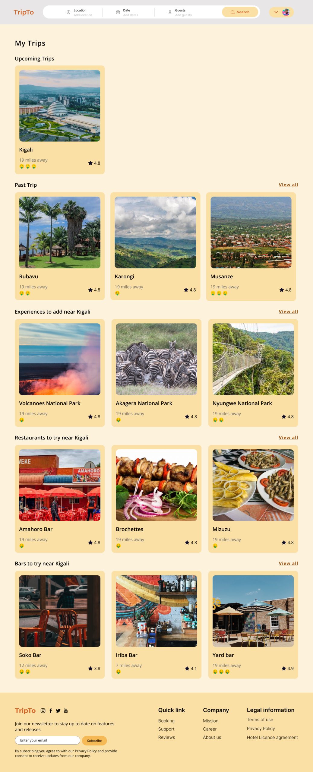
- Booking and Itineraries
- Review/Rebooking
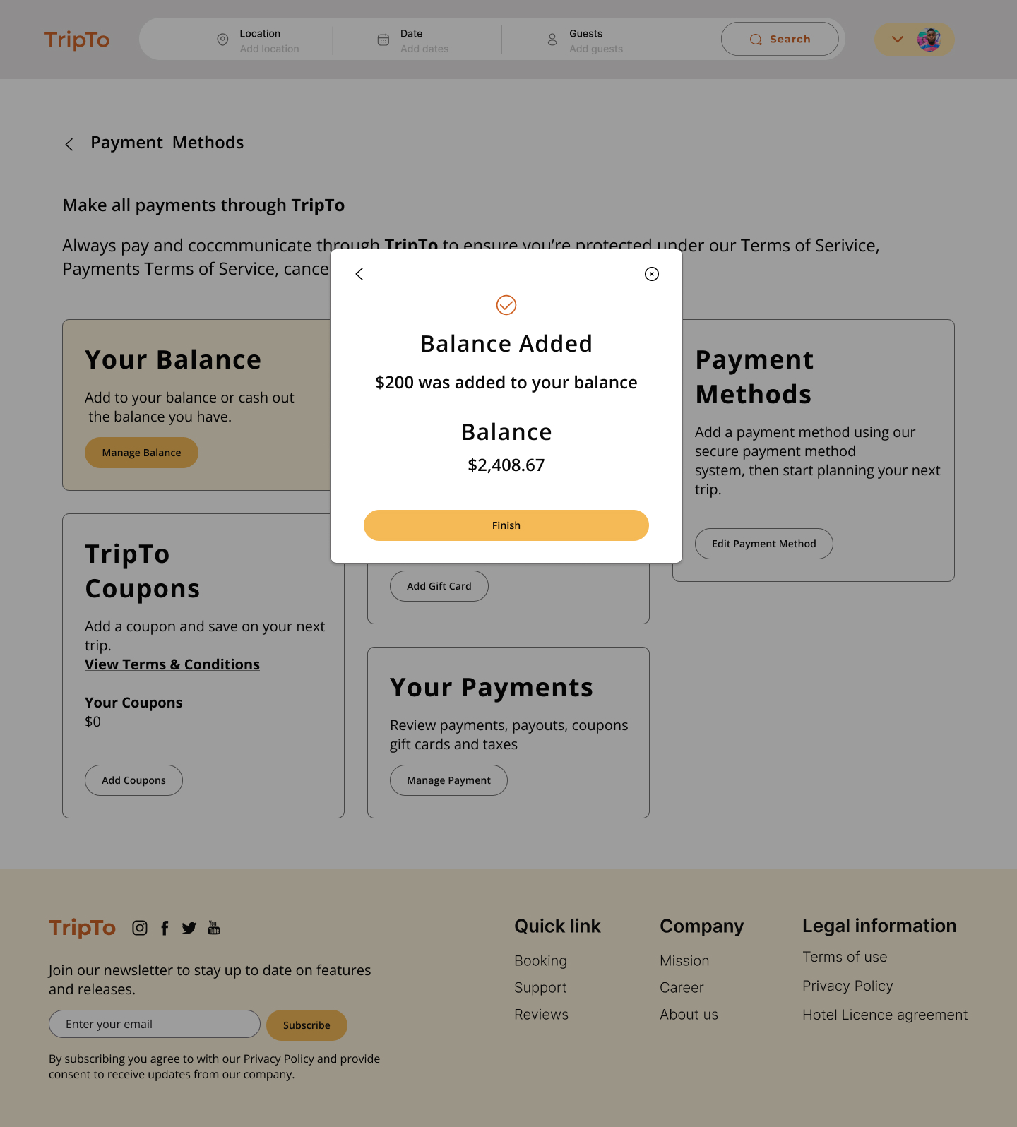
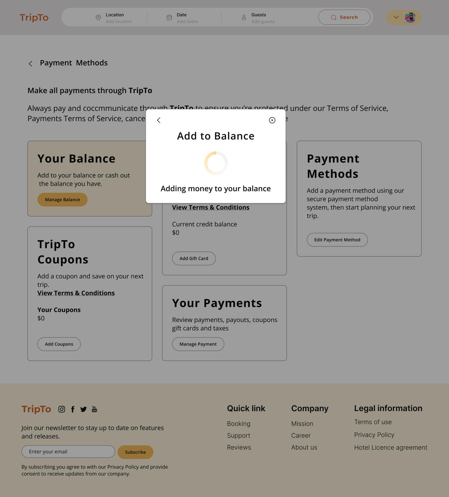
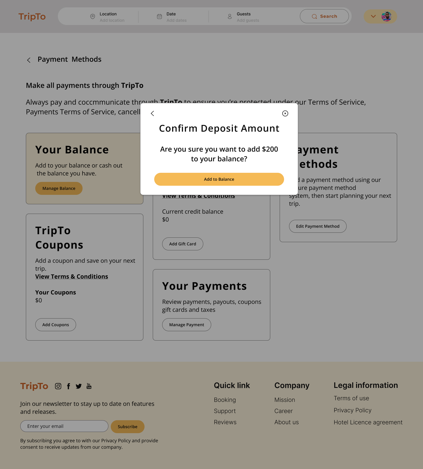
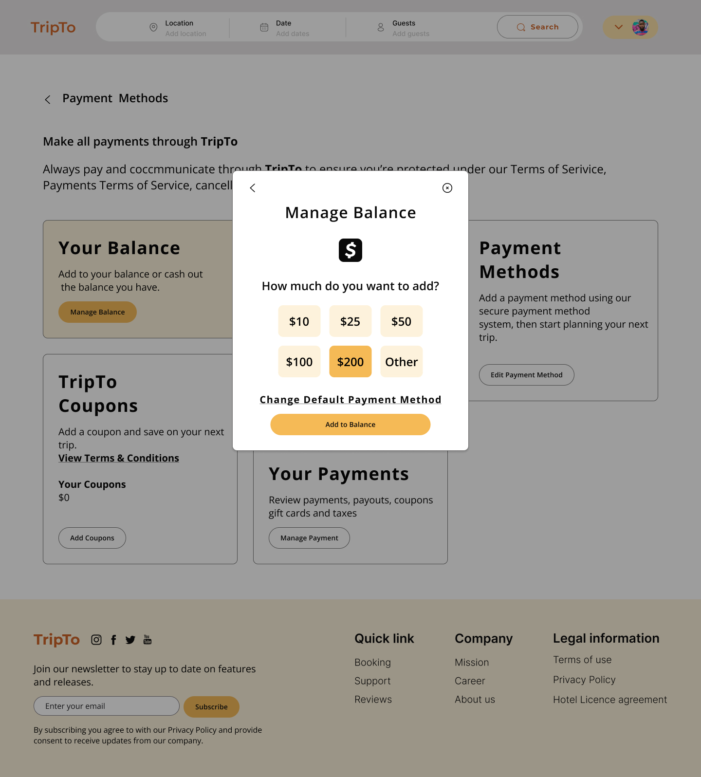
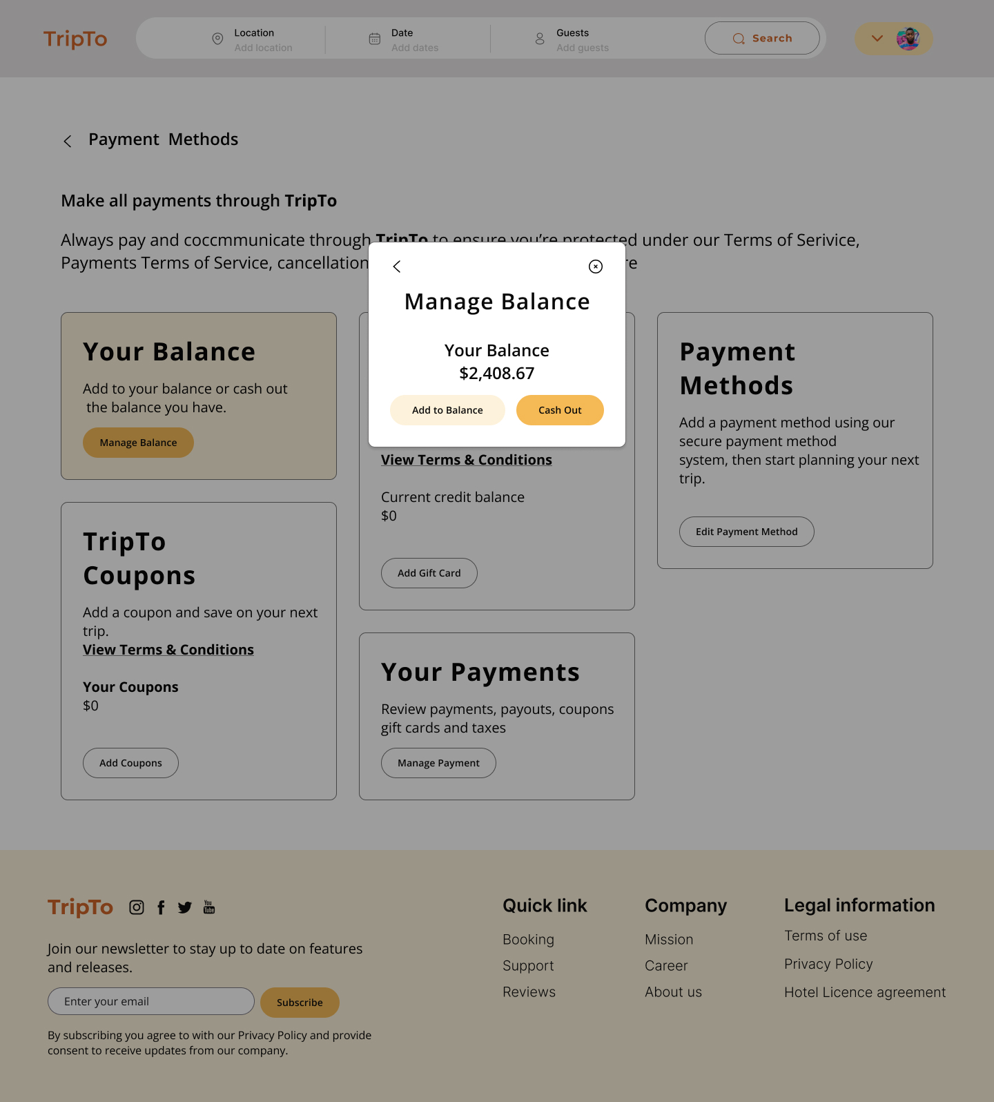
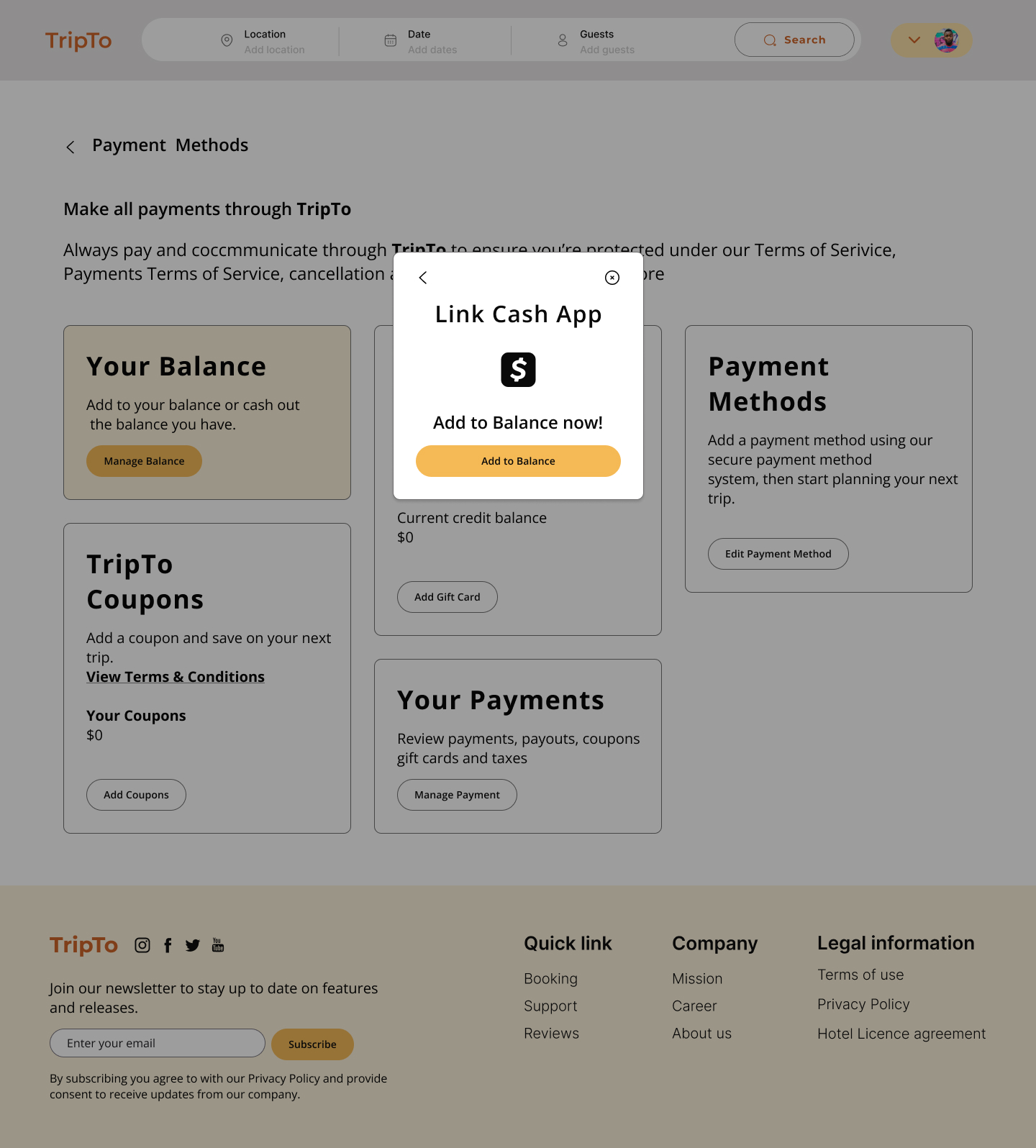
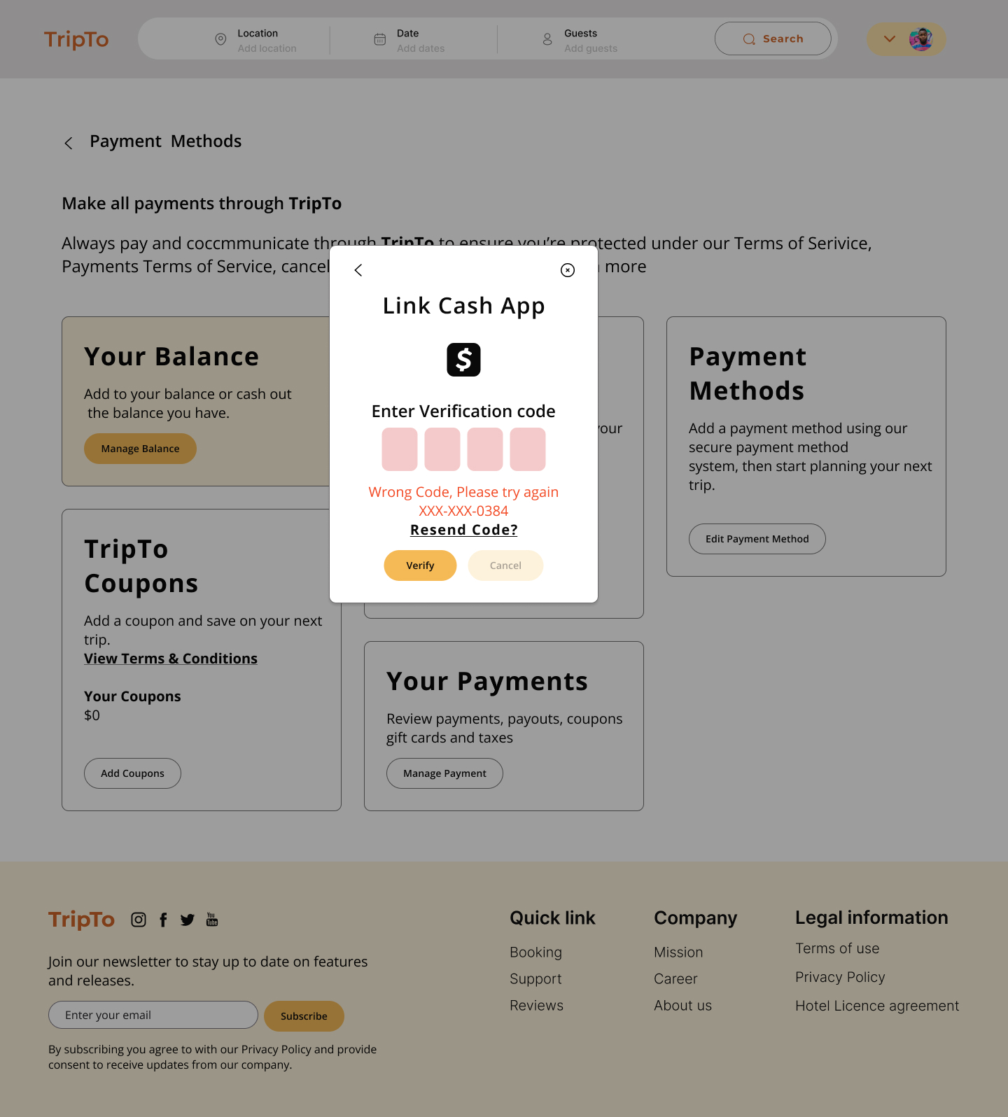
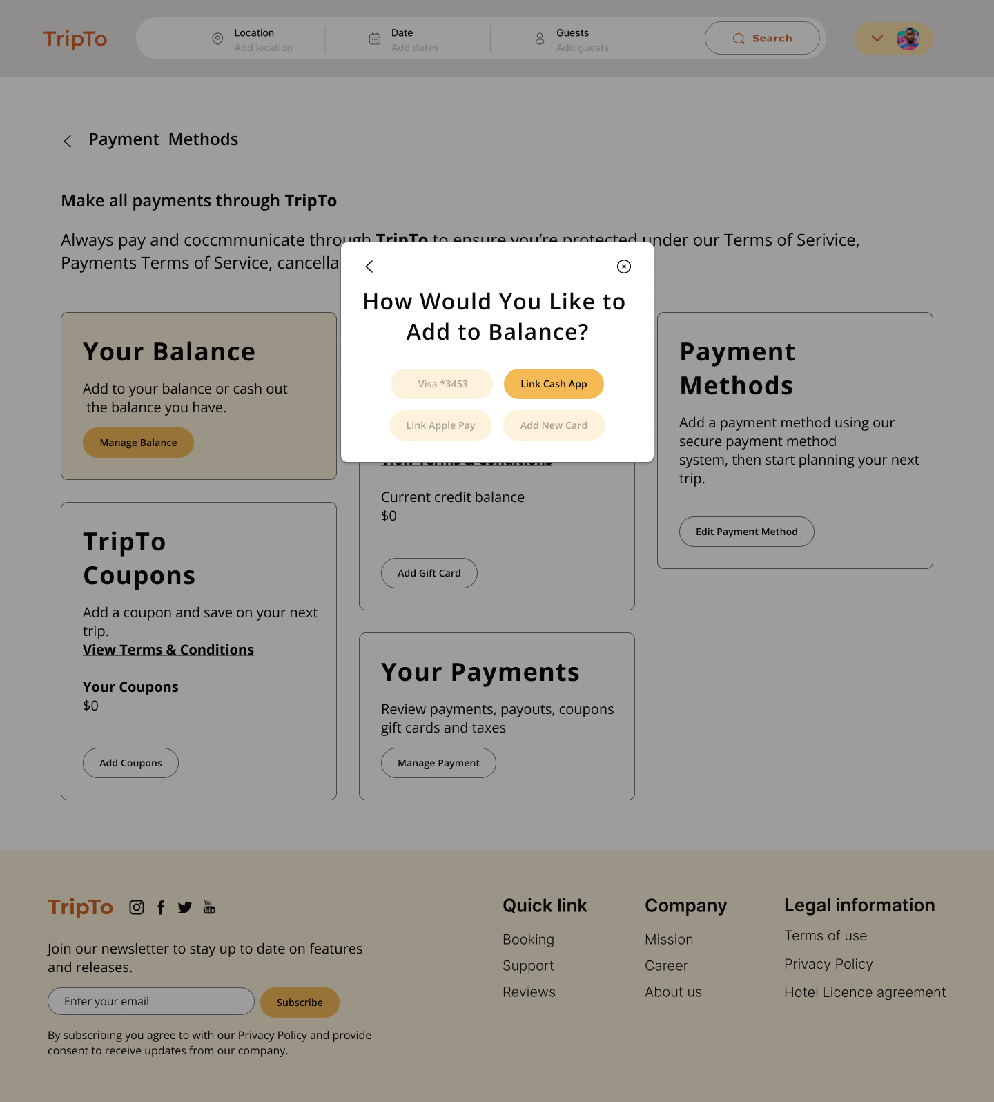
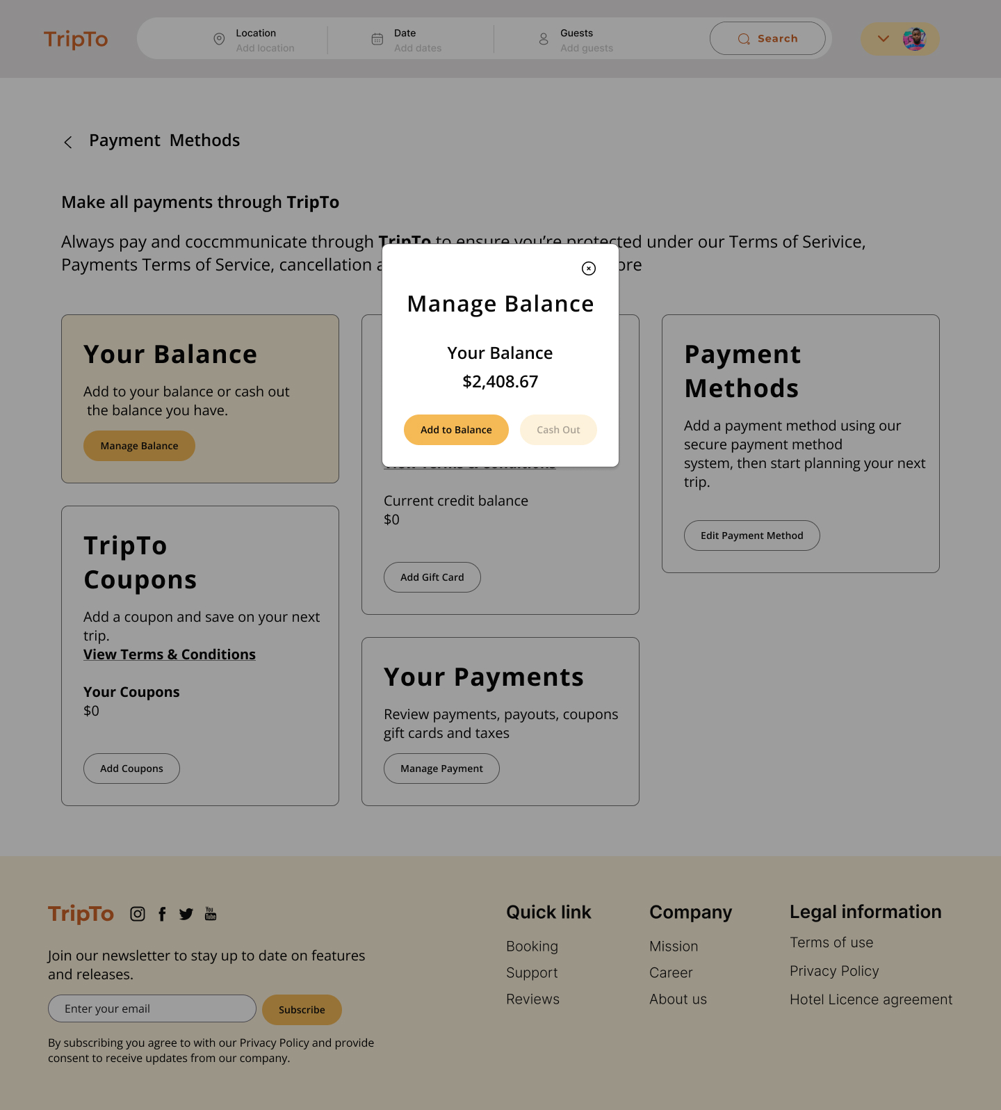
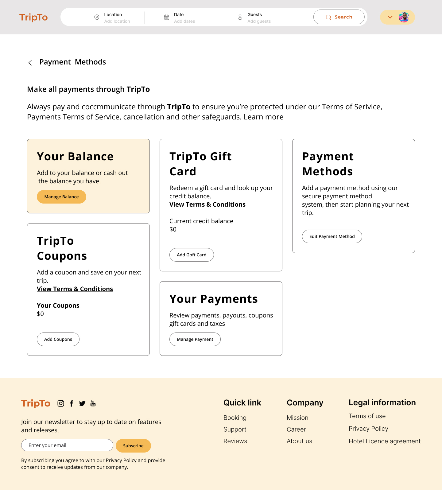
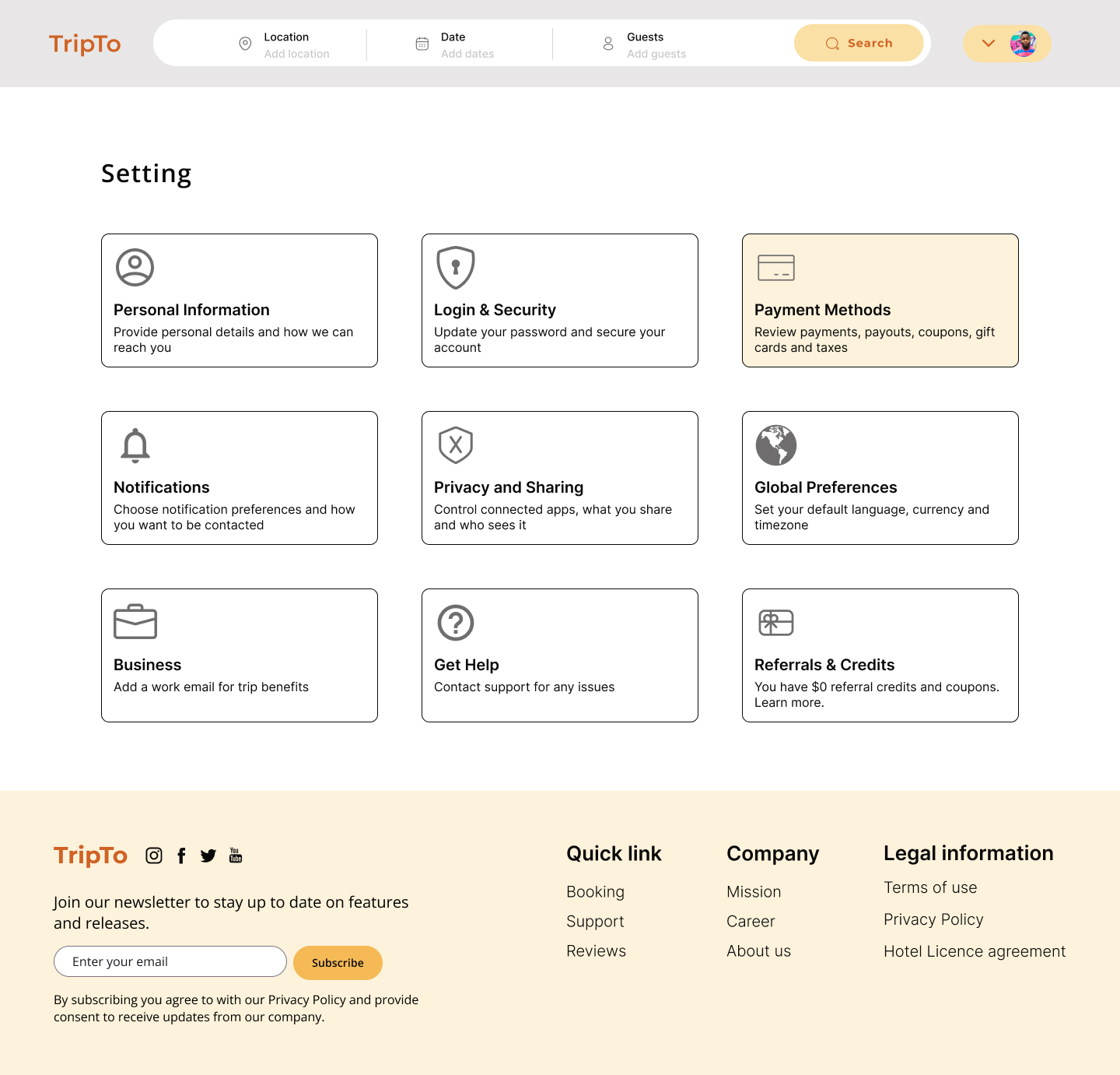
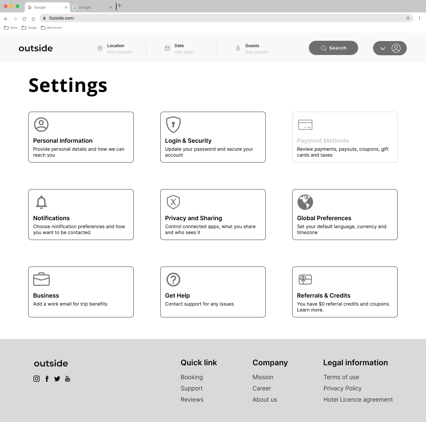
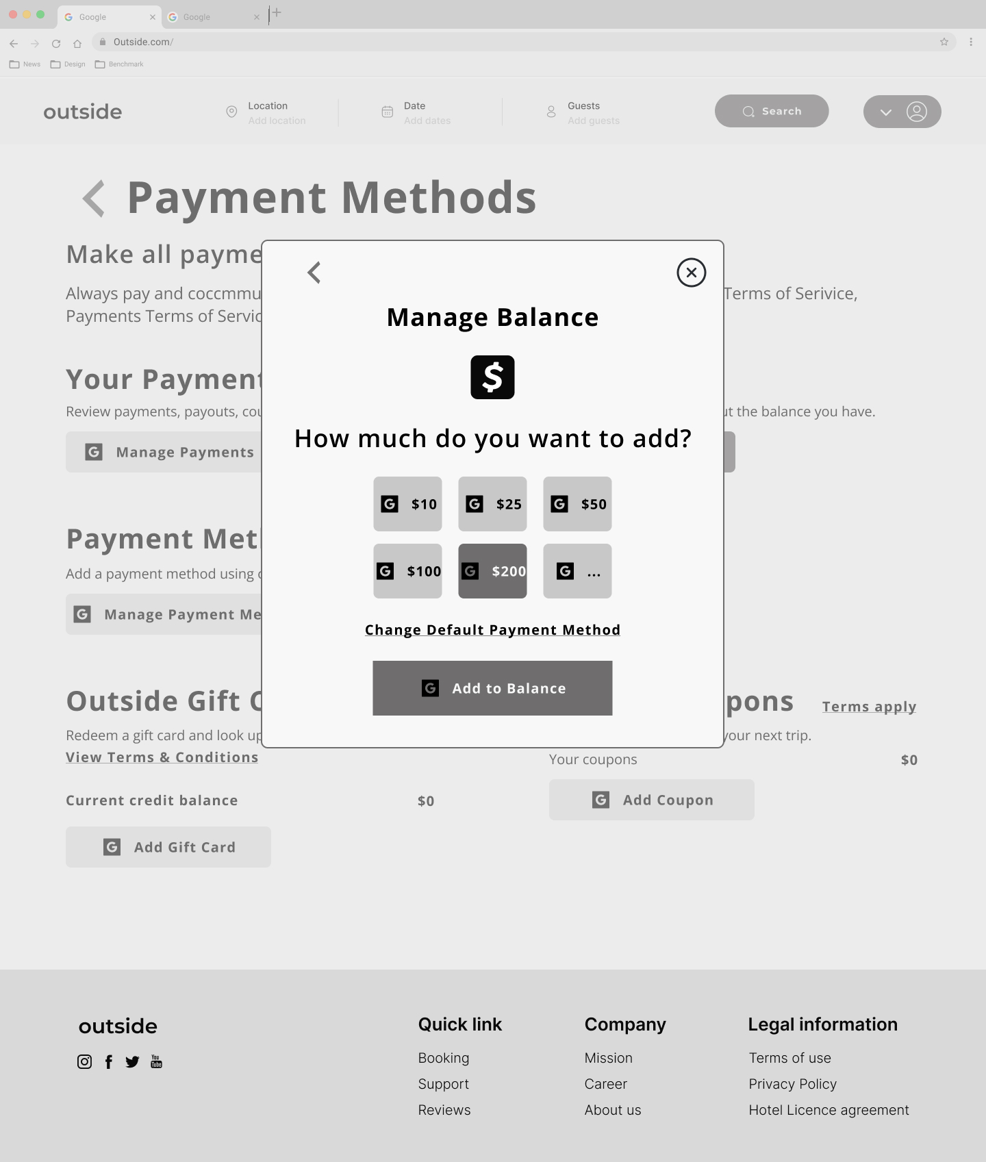
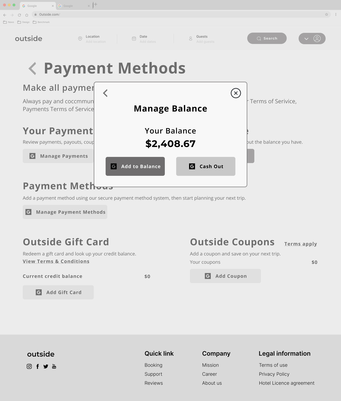
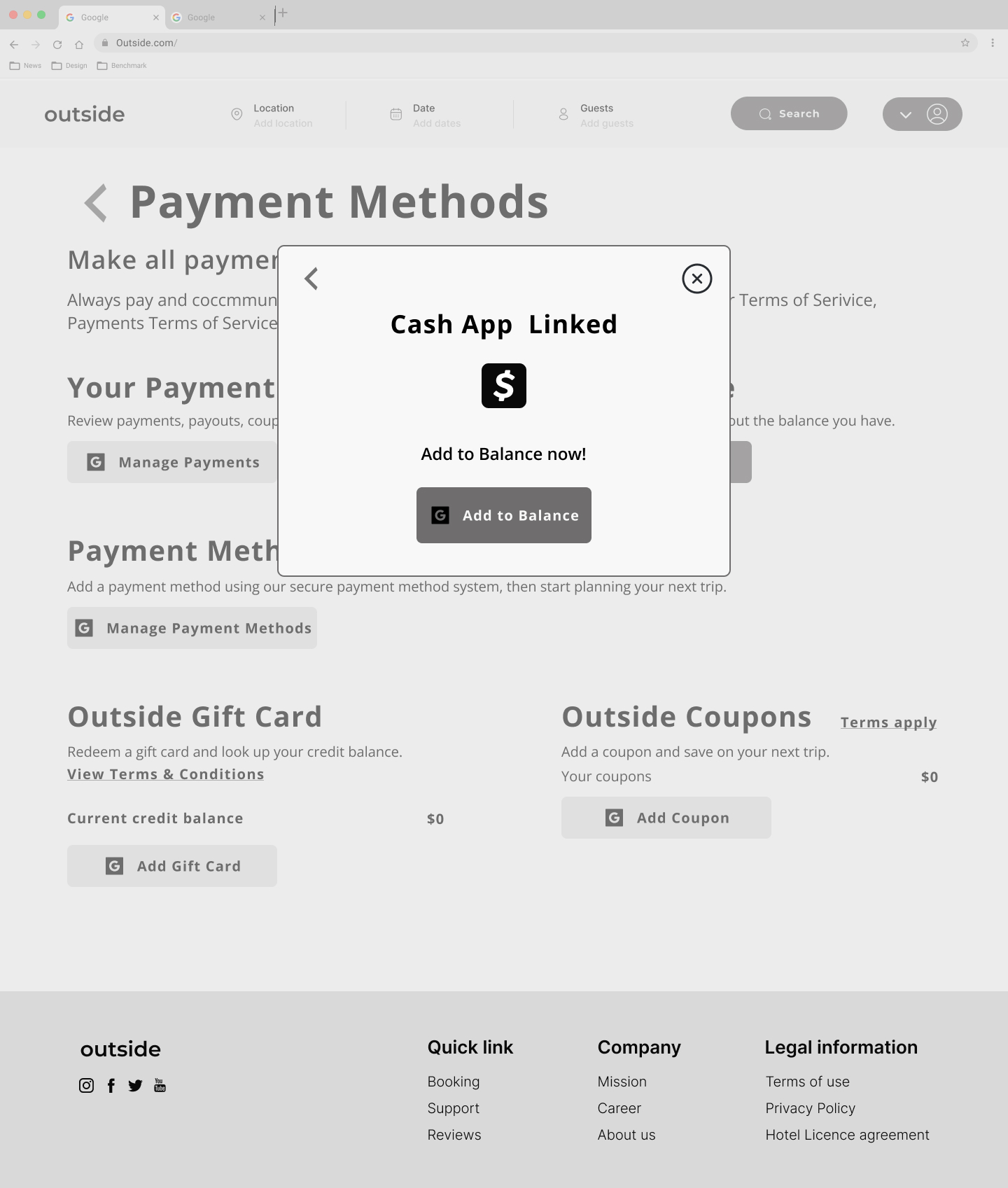
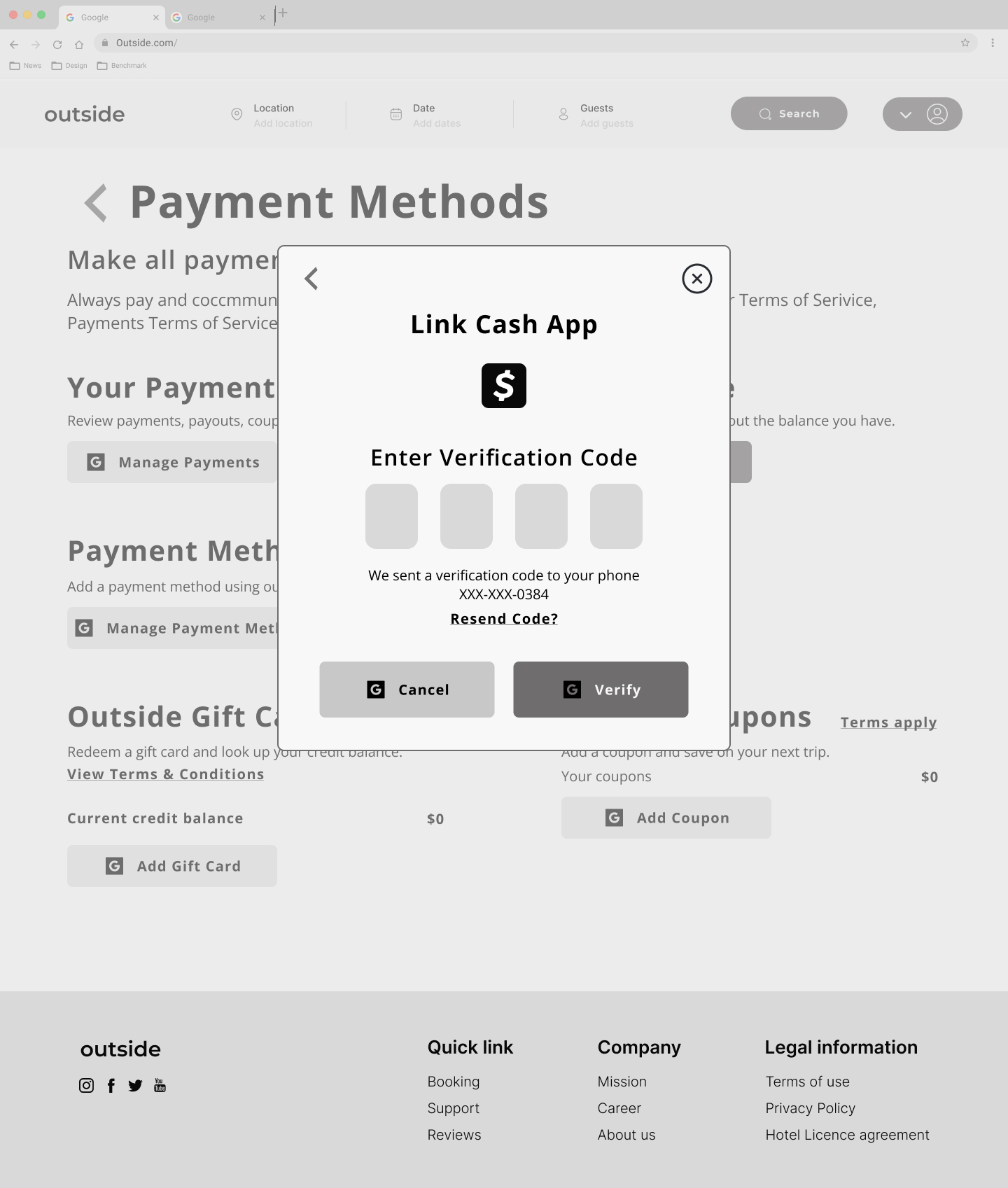
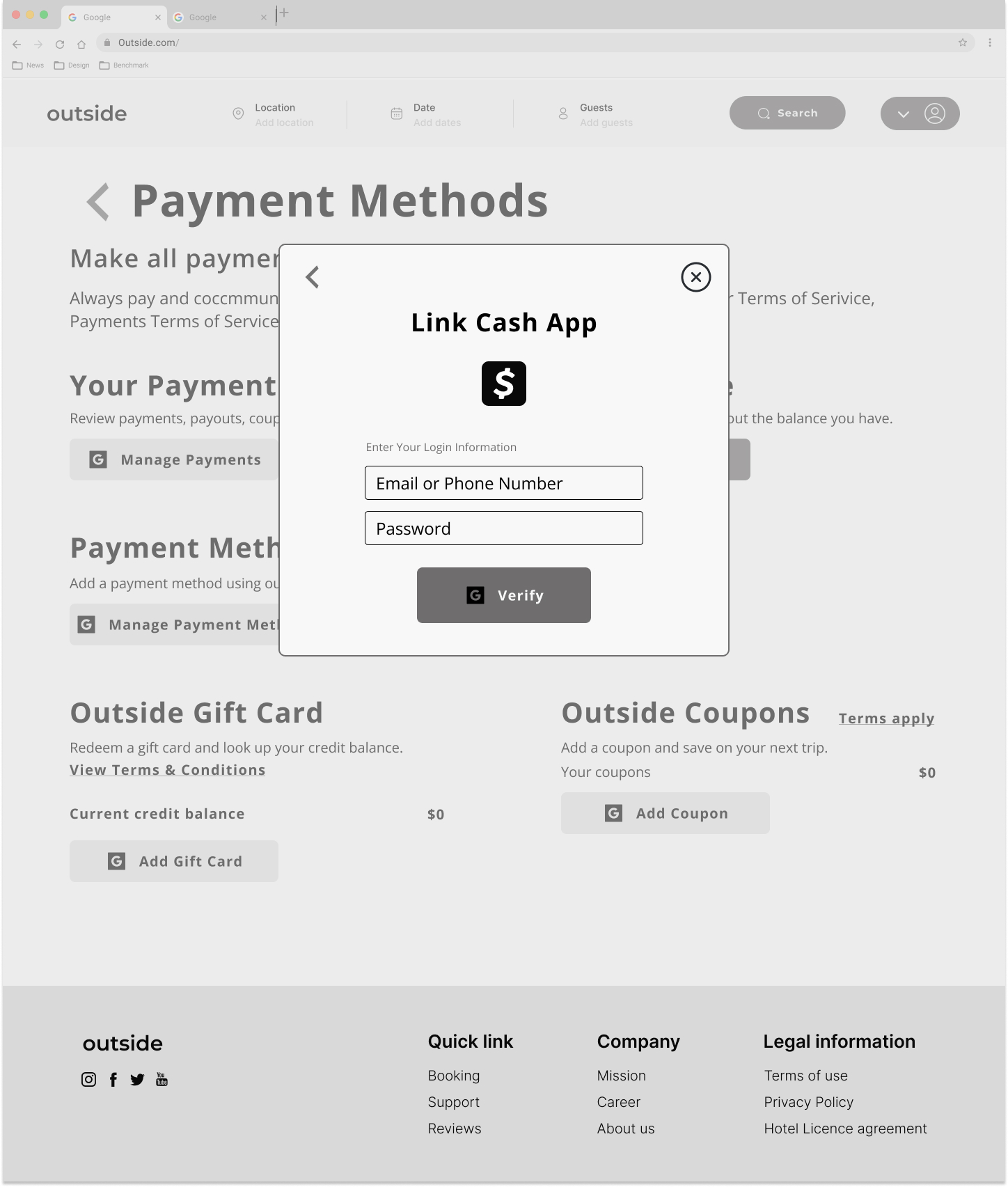
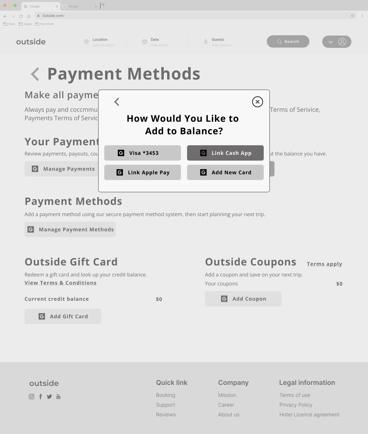
- Adding a Payment Method
We used Autoflow and measure plugins in Figma alongside with style guide for Providing developer hand-off files to ease the developer’s process.


Process
01. Discovery
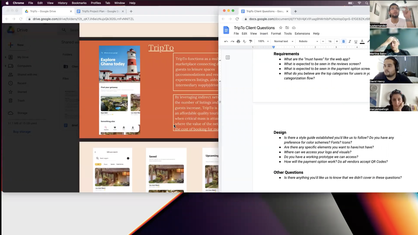
01.01. Client Research & Kick-off Meeting
The first step to having a better understanding of the client and user needs, we attend a kickoff meeting and reviewing the client-provided brief. The primary purpose of our meeting was to get all designers on the same page and off to a great start.
Our team starts this journey by creating a list of the right rational and inspirational client questions to draw out the plan for the working methods and dig deeper into the real problem of the product.
From all these questions we figured out that the product needs to have the following user flows at this phase of the project:
Sign Up/ Login
Booking Itineraries
Booking/Rebooking
Adding a Payment Method
01.02. Client Questions
A list of client questions is listed below for more clarification.
Competitors/inspiration
Have you seen other attempts previously to solve the user problem that you are trying to solve currently?
Currently No. The closest I have come to see is google maps with nearby space recommendations. Also, this is very similar to AirBnB but the differentiating factor is that AirBnB focuses on accommodations and experiences while TripTo’s focus is on outdoor leisure (like restaurants, bars, museums, art and Cultures spaces, etc.) and experiences
How do you see TripTo differentiating itself from the current market, and what makes the app stand out?
The app is African-centric. A marketplace for African hospitality starting from Kigali, Rwanda
Who are the top 3 competitors in your market?
-There are a couple of social media vloggers who market domestic African tourism, which is a good channel for marketing but there is currently no singular catalog/app platform with a comprehensive list of leisure spaces and experiences that pay particular attention to user experience and design. In Kigali, there is currently livinginkigali.com and ticket.rw
What apps have inspired your current product?
Airbnb, Spotify
Looking at competitors as well as other apps that inspire you, what about the experience do you like? What do you not like?
what part of these apps experience would you like to see in yours, if at all?
-With Airbnb, I specifically like how any user is able to host their space or experience.
-With Spotify, I like the user recommendations and the card layout
Users
What is the core user problem that we are trying to solve?
The core user problem is the UX/UI design and the seamlessness in making a successful booking. The UX/UI design is important because there is currently no marketplace platform that caters to hospitality bookings on the African continent.
Who are your current users?
The MVP is currently being launched to the student body of the African Leadership University in Kigali, Rwanda; A diverse student body comprising about 50 African countries and other nationalities as well, with visiting faculty and guests coming in to visit corners of the globe.
How do you see your user base expanding?
We eventually plan to make it accessible to anyone in any African city who is able to download the mobile app after launching a web app as an MVP in Rwanda.
What pain points do users currently face with your app?
Currently, users are required to pay a gate entrance fee for the events we host. They’ll want this process to be simpler with bookings made with an app. Also, users want a centralized marketplace with recommendations for any Art, Culture, and design space or experiences; they love the hospitality service we provide and want to see our brand curating recommendations for other spaces and experiences in the city.
Who are the core users we are trying to solve for and what are their use cases?
-The are two core users: the hosts and the tourist guests. The tourist guests are only looking for recommendations on spaces and experiences to visit for any given day or are able to make bookings for upcoming experiences.
-For space and experience hosts are looking to bring more users to their space or event and would especially benefit from the booking system and the ability for users to make payments for any service through the app.
Where would users be using this app, and in what situations would it be used?
Users would use this app because it has an exhaustive catalog of spaces and experiences with personalized recommendations. Also it bookings and payment processing is integrated into the app
Is there existing data we can use such as:
Existing user flow
Personas
Data /research
User feedback?
What does success look like to the user when using your app?
Success is the ability to make a booking to any space or experience
I see you want to improve the general user flow, what are the current pain points of the existing flow and what do you think the goal should be in improving that flow?
02. Research
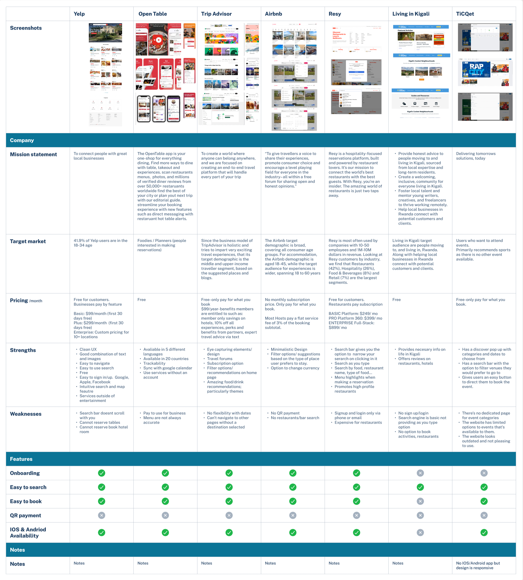
Competitive Analysis
This competitive analysis and research provided us with valuable insights into the features, functions, flows, and feelings evoked by the design solutions, strengths, and weaknesses of our competitors.
It helped us to develop a UX strategy to enhance TripTo’s user experiences and needs as well as App value.
We organized our competitor’s findings in this table efficiently and were able to identify the differences between competitors to improve our design.
03. Ideation
03.01. User Stories
As a team, we collaborated and created a google document to put together different user stories.
User stories gave us everything we needed to create a realistic, concrete, and shared view of the users.
Based on user goals, and what they want to accomplish, the team suggested different user stories and shared them with the client to facilitate our collaboration with him and start working on improvements..
Examples
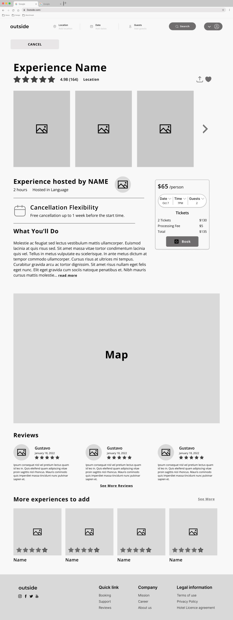
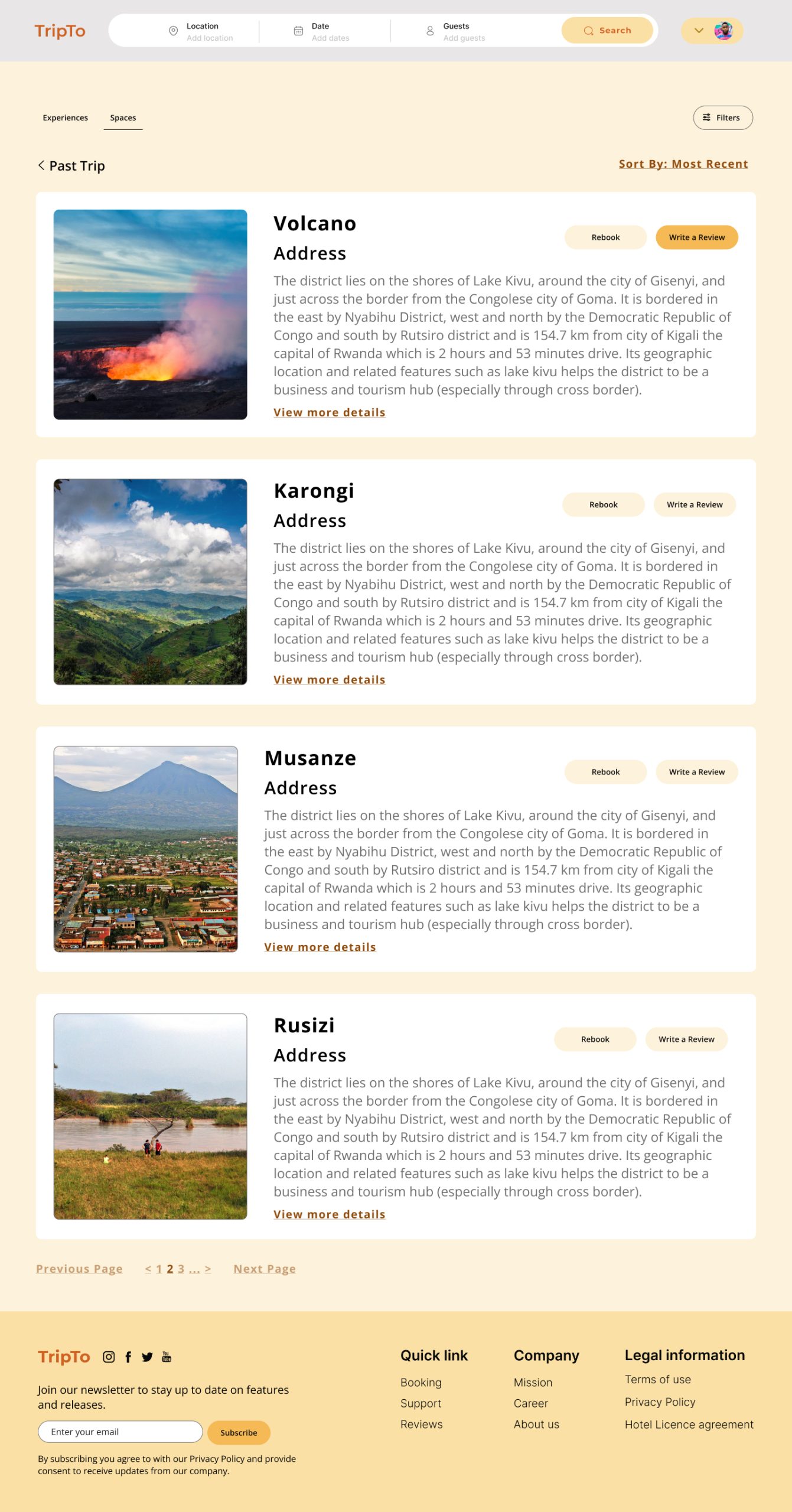
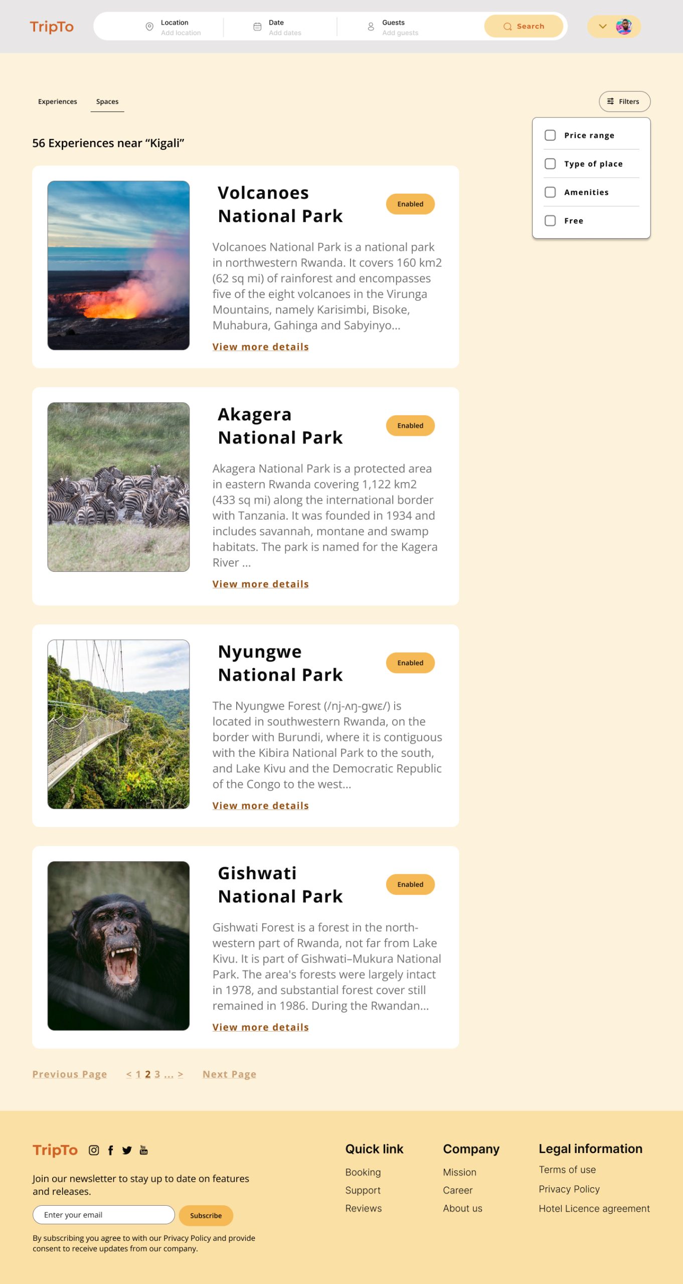
As a user, I want to be able to book hotels, experiences, and reserve tables on this platform so that I have one place to check all my itineraries.
As a user, I want to be able to see the different categories of experiences I can be a part of so that I can choose the one I would like best.
As a user, I want to re-purchase a booking from a previous experience so that I can shorten my search.
As a user, I want to be able to see the restaurant/bar activities that are available in the location I am in or visiting so that I am able to choose one that I would like.
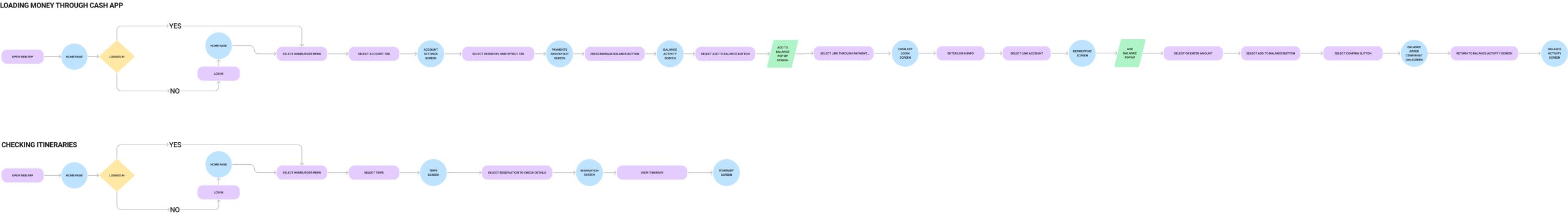
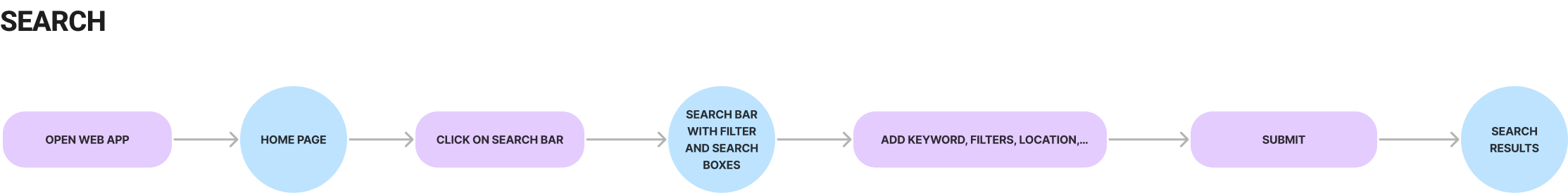
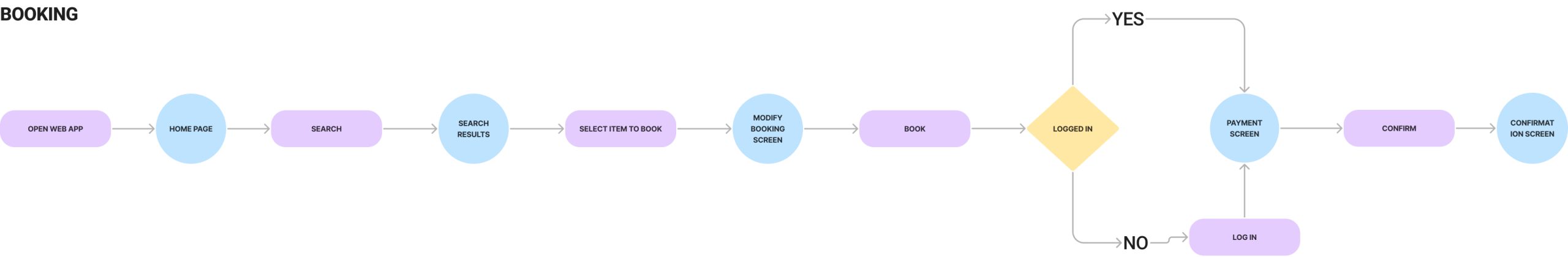
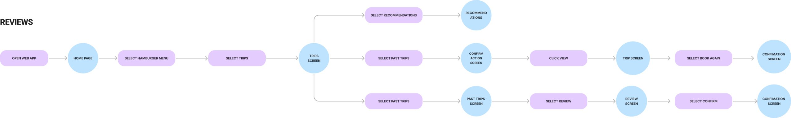
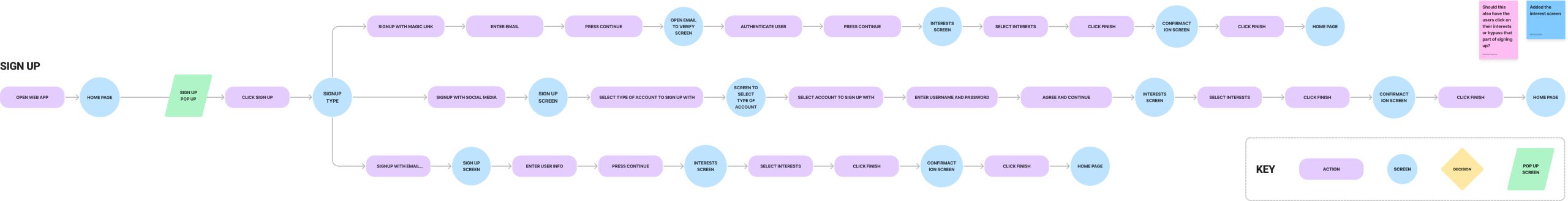
03.02. User Flows
By understanding the user’s need from user stories, we jumped into drawing the user flows in the early stages of our UX process, it helped us to formulate, map and visualize the ideas before we get into the step of creating high-fidelity, and wireframes. It is the best way to clearly understand the user needs and the experience we want the target users to have.
At this step, different potential flows were assigned to team members to split the tasks between us so that we were able to focus on different flows and work more efficiently.
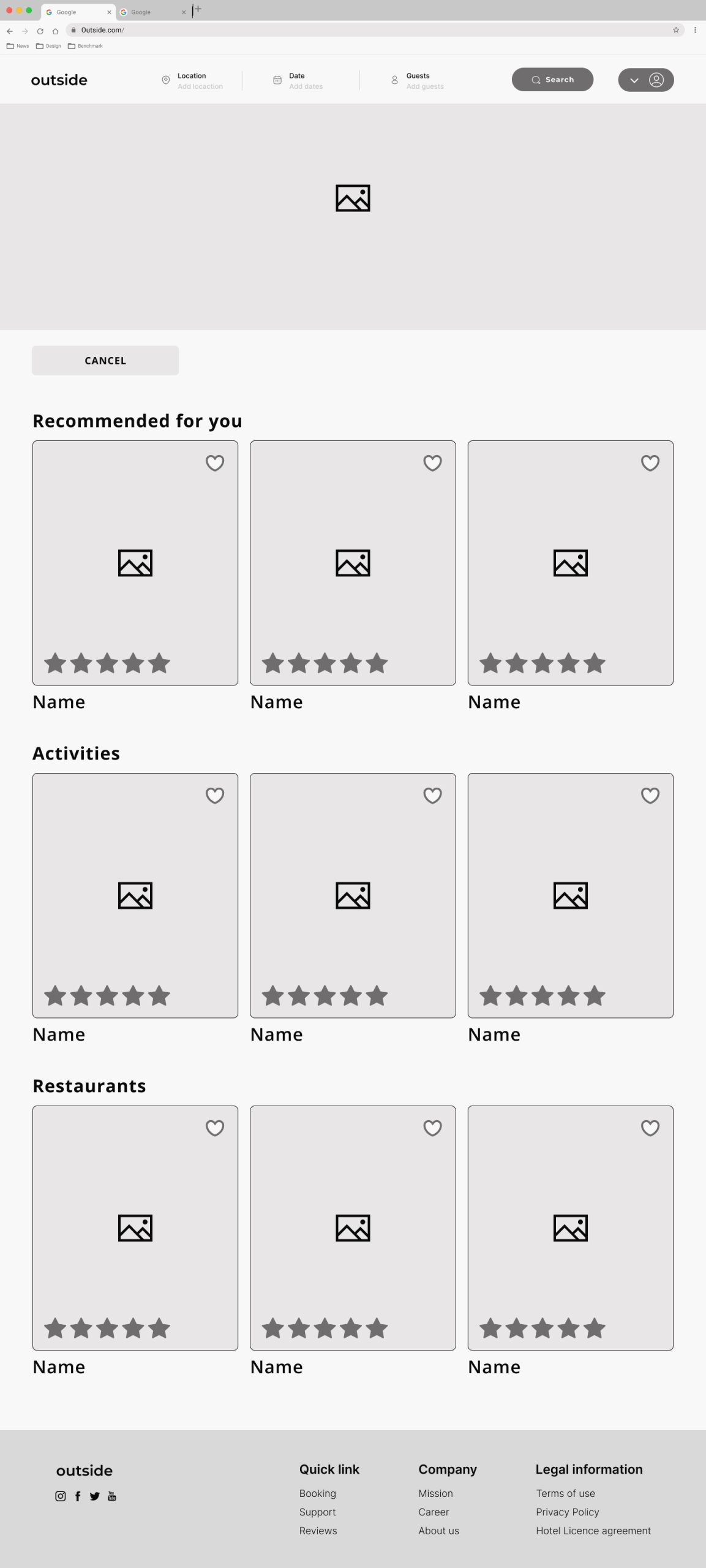
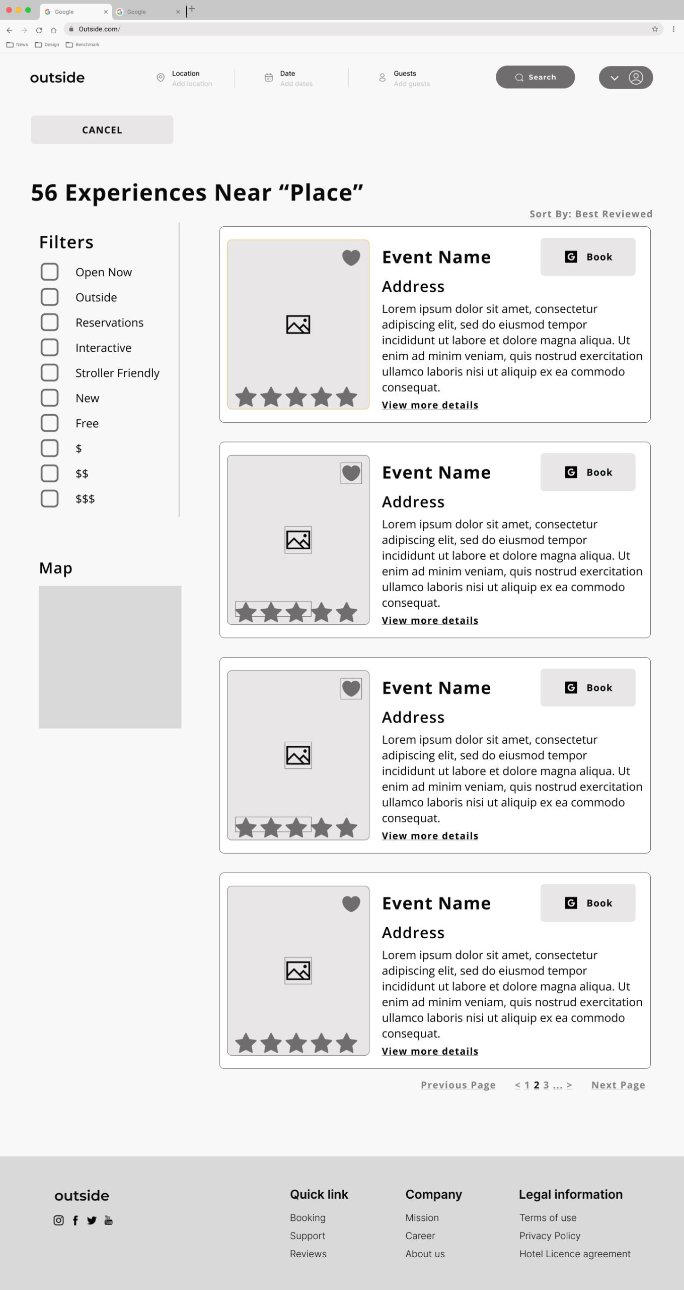
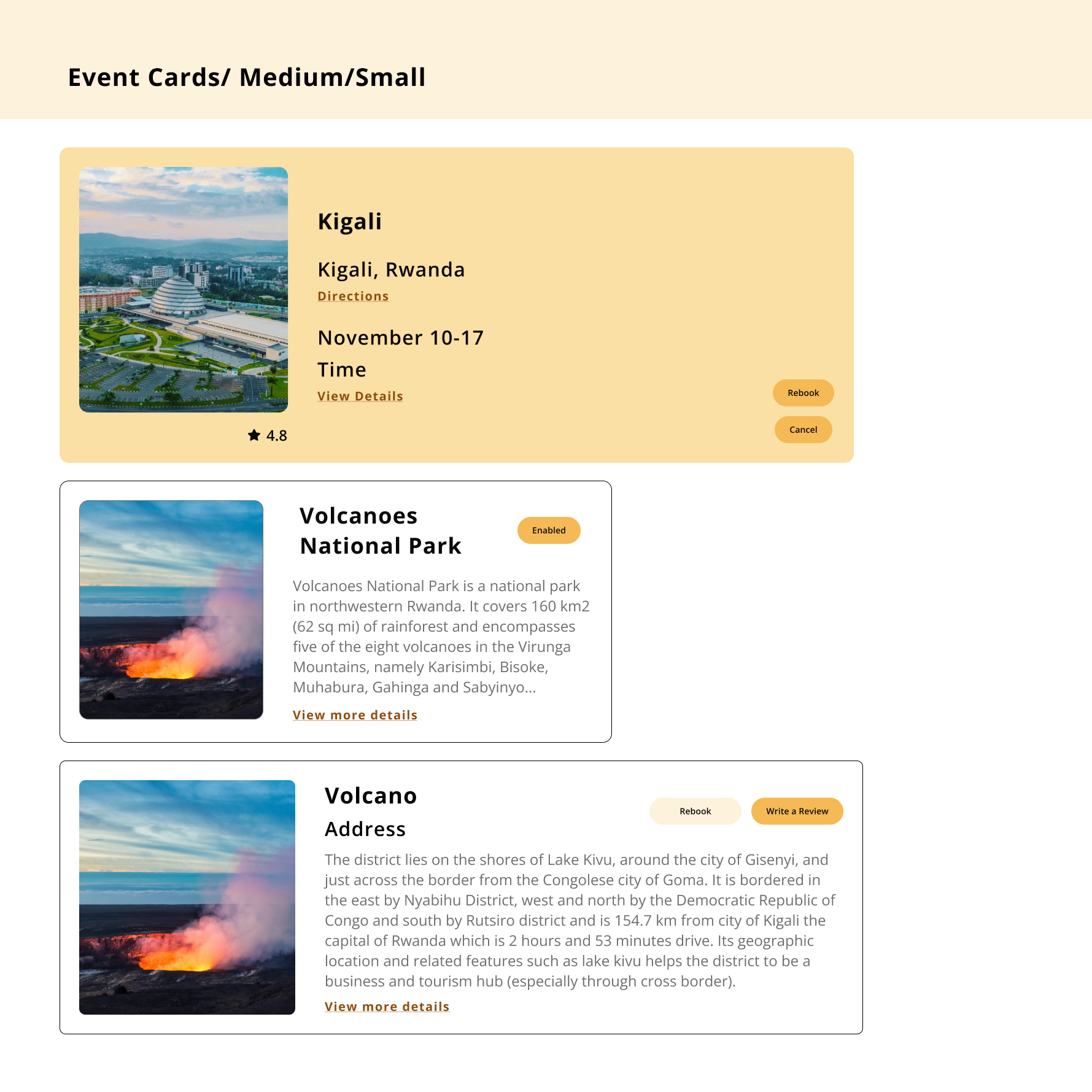
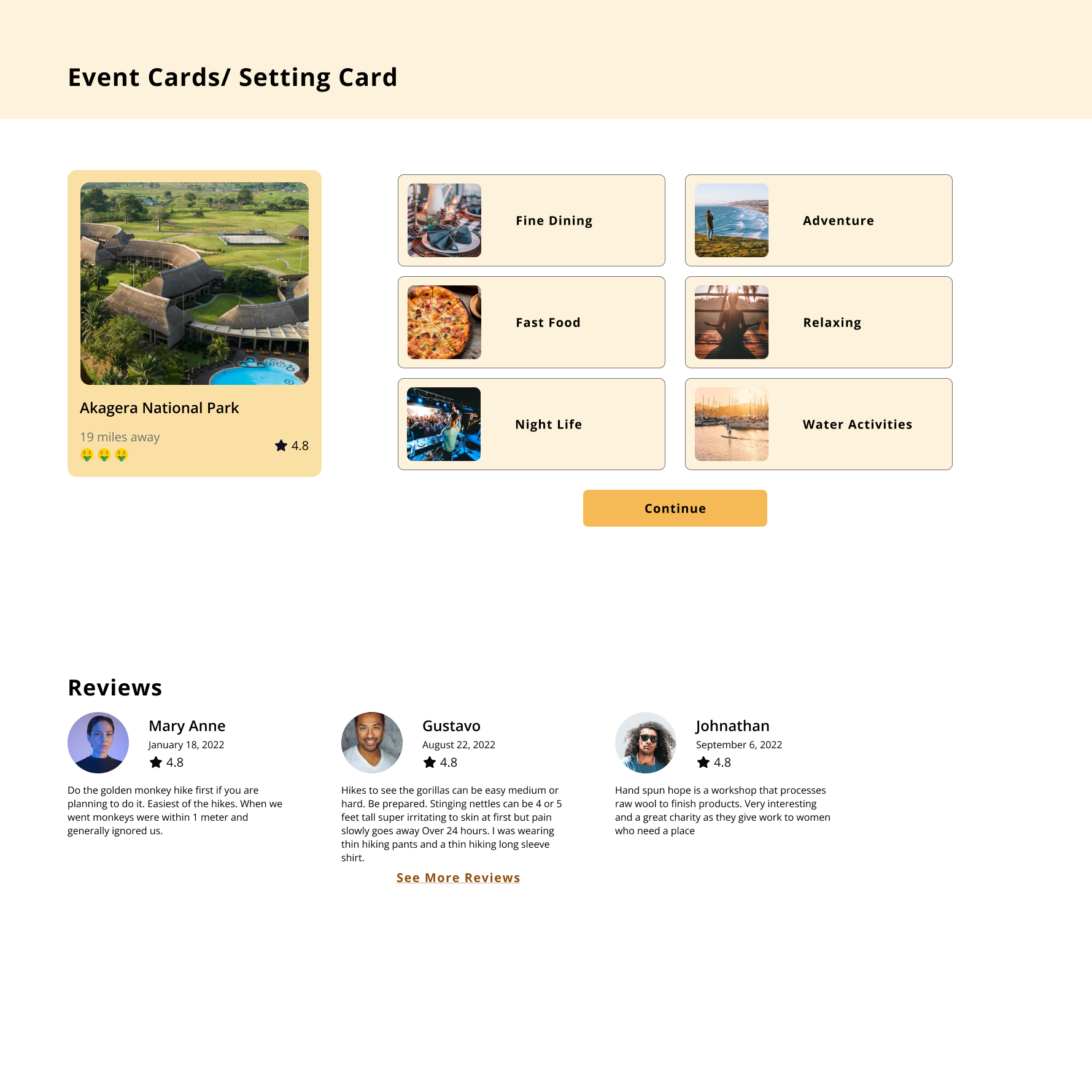
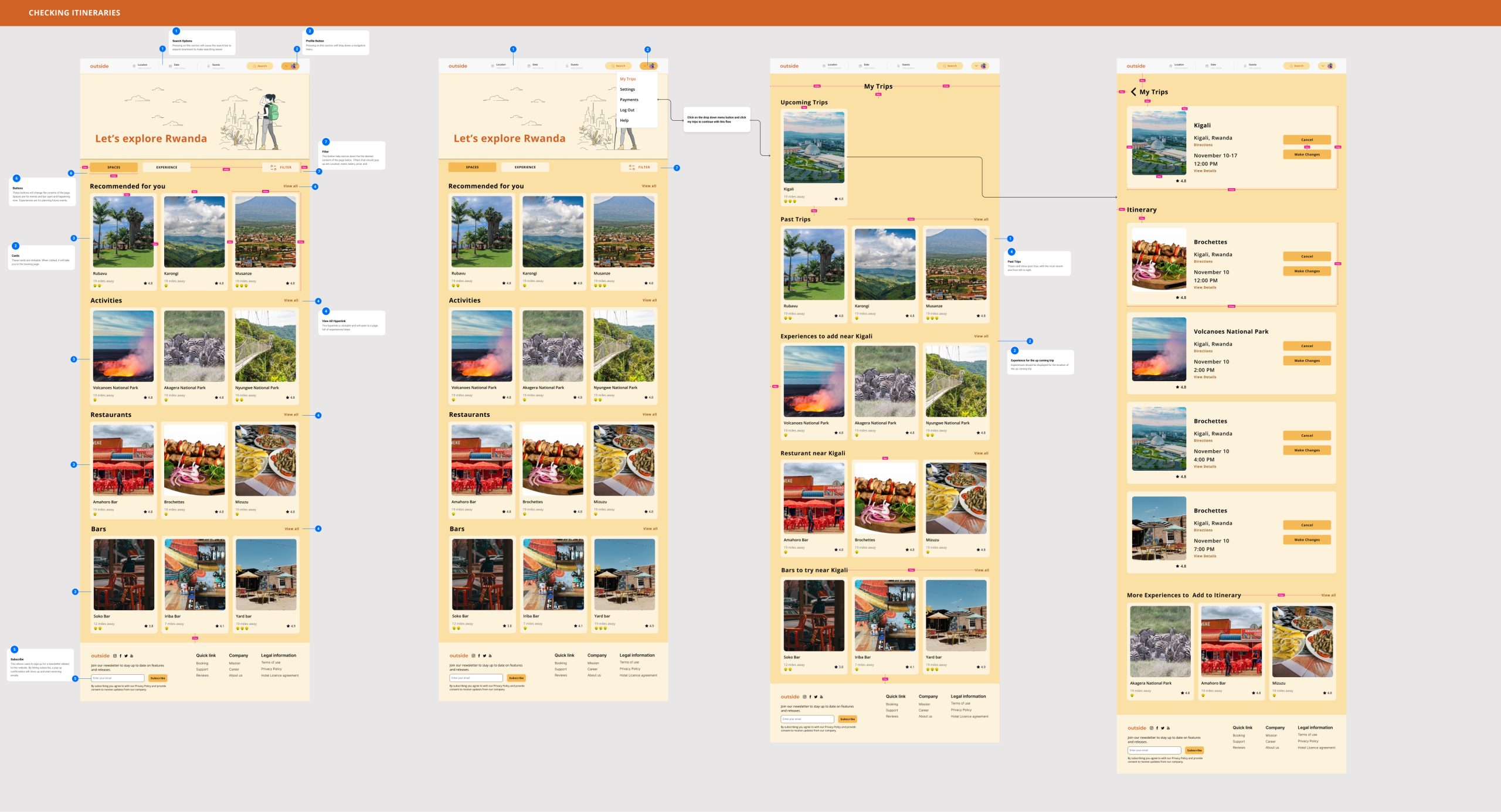
03.03. Medium- Fidelity Wireframes
Based on the user flows, in the next step, we worked on medium-fidelity wireframes. This allowed us to gather insights into the user’s behavior and interactions with the app, which we could use to refine the solution further as we proceed with more details.
Every team members were responsible for specific flows and through effective communication, we shared our ideas on Figma calls or slack chats as well as using similar UI kits to keep the consistency throughout the whole web app pages.
04. Design
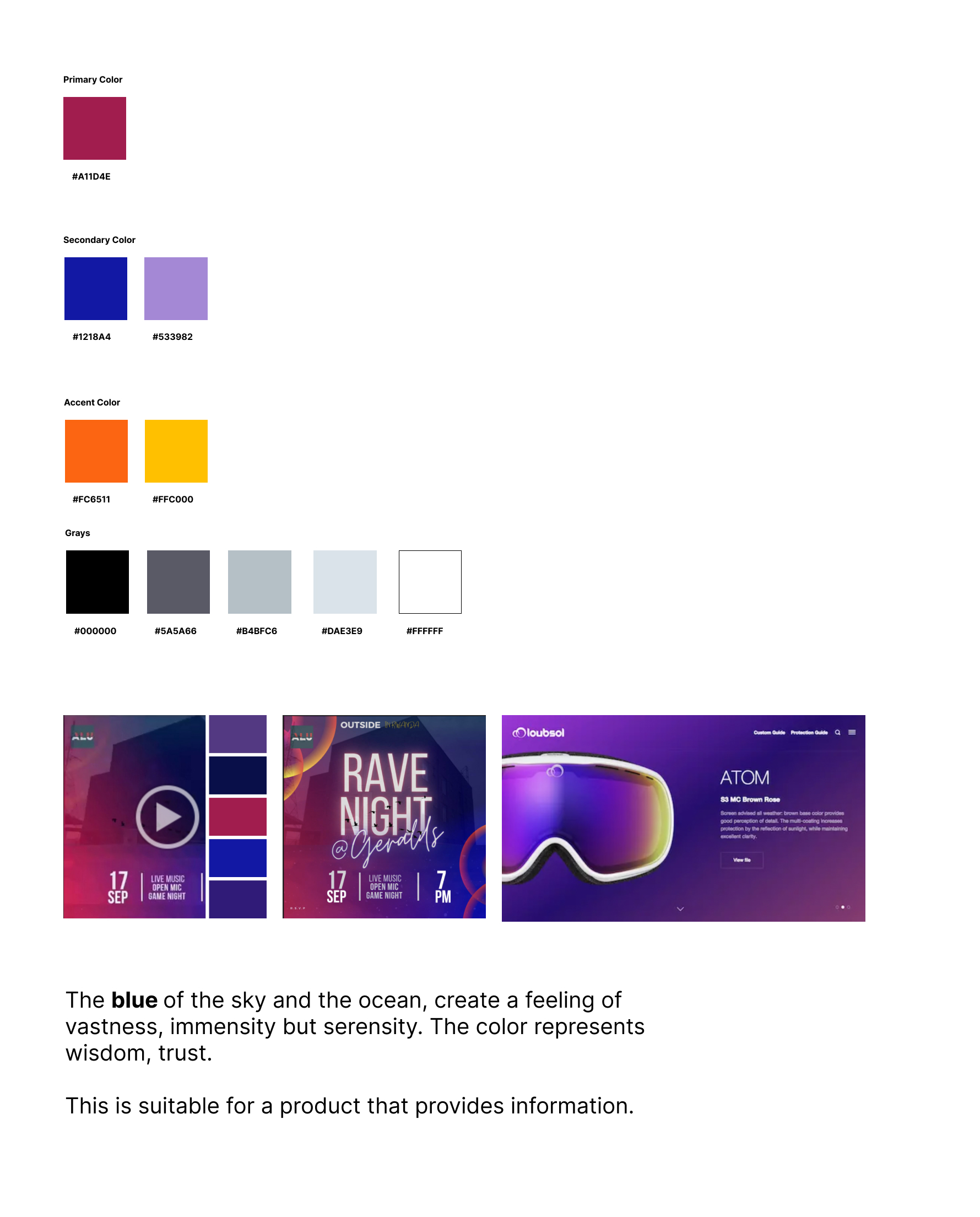
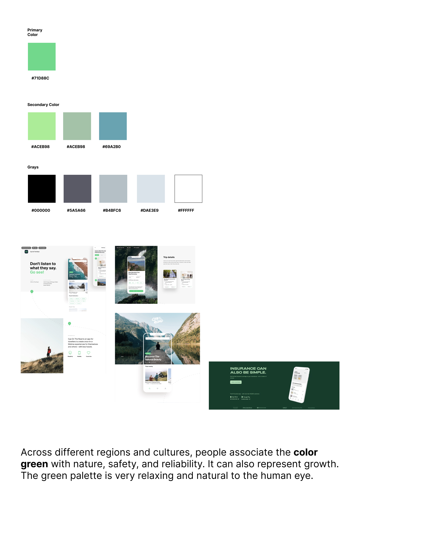
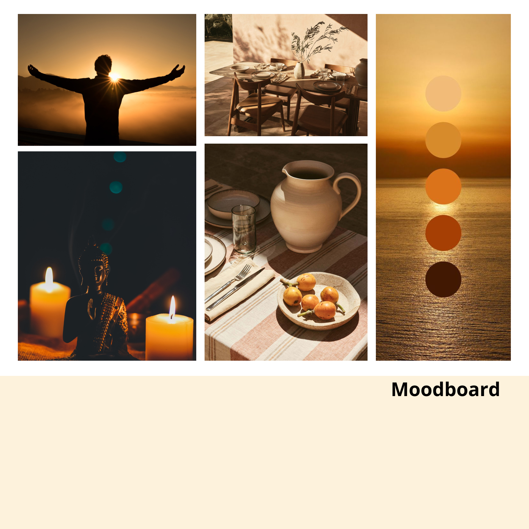
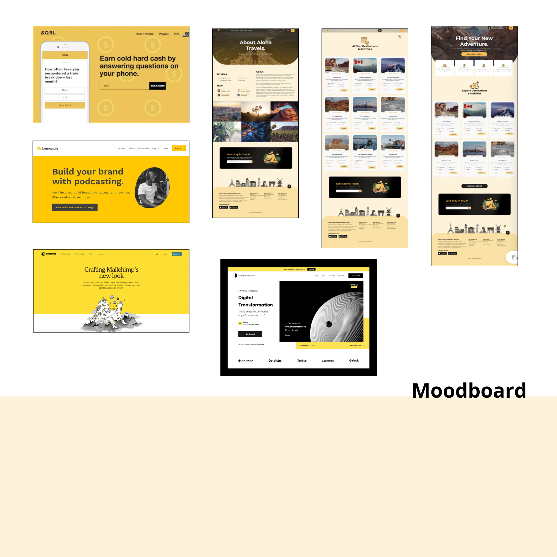
04.01. Color Exploration and UI Inspirations
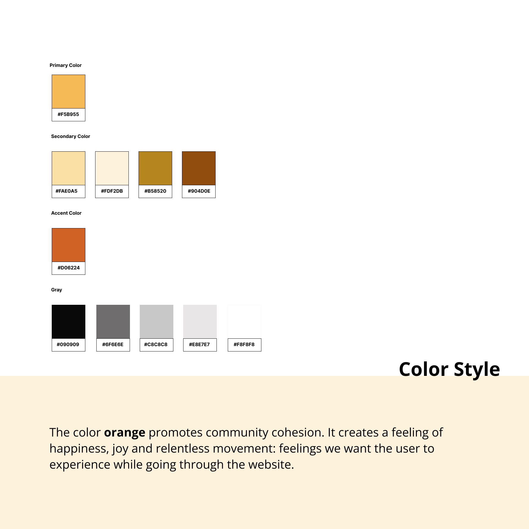
At this stage of the project, I found it helpful to start exploring some keywords associated with the TripTo product and creating different color palettes and visual elements inspirations. I started with some keywords that were associated with TripTo vision and goals as well as users’ needs. Here are some proposed colors/keywords:
The blue can represent the trust that is suitable for a product that provides information.
The orange can represent energy and create a feeling of happiness that is suitable for a booking and tourism product.
I also explored some color relationships but we finally voted as a team on the monochromatic orange color style that was our favorite style that suited TripTo’s visions the best.
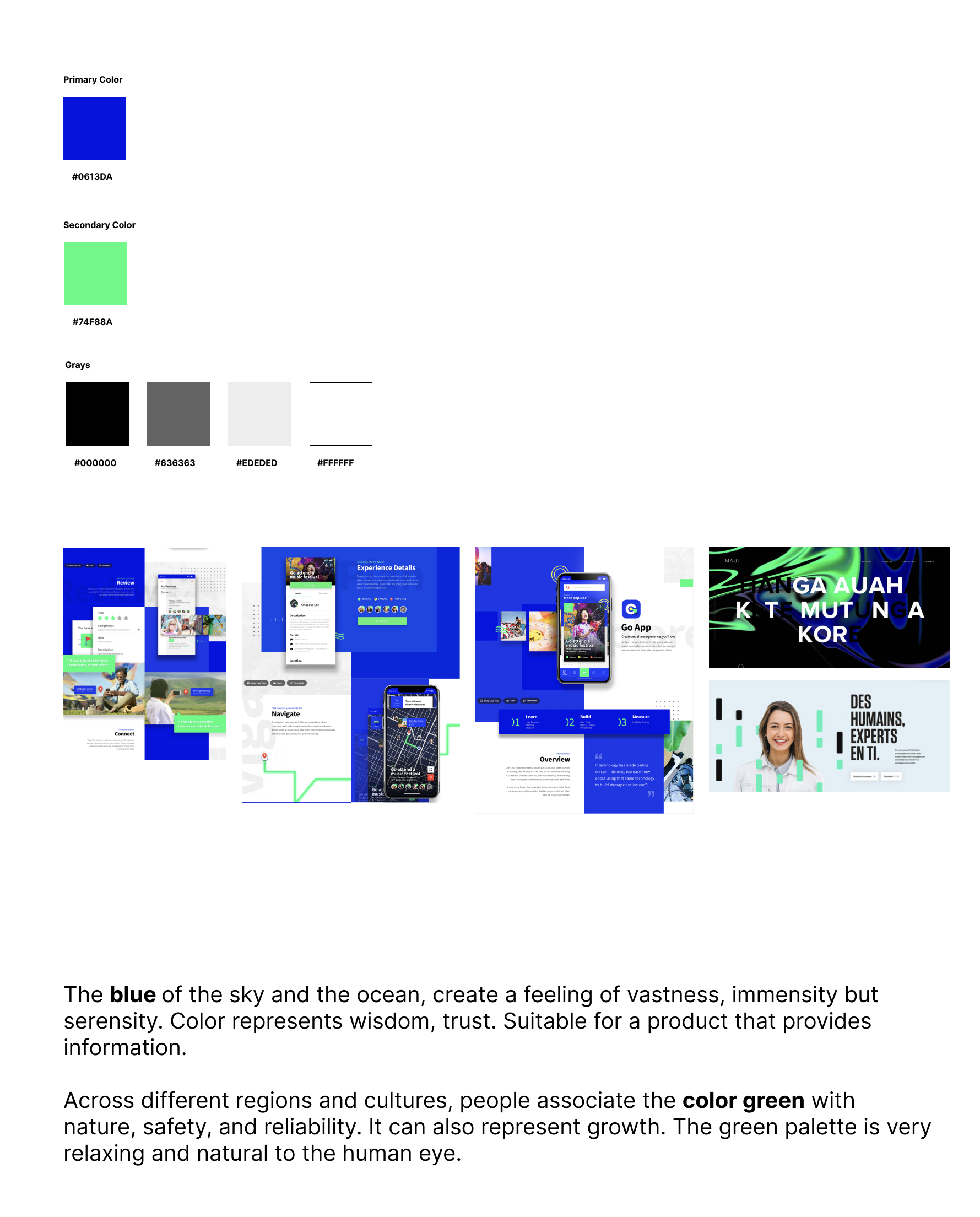
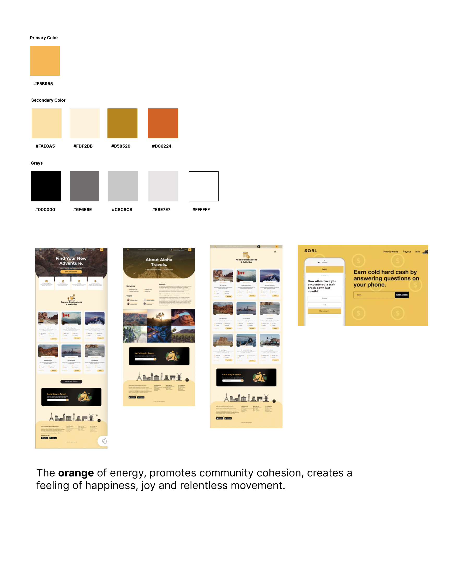
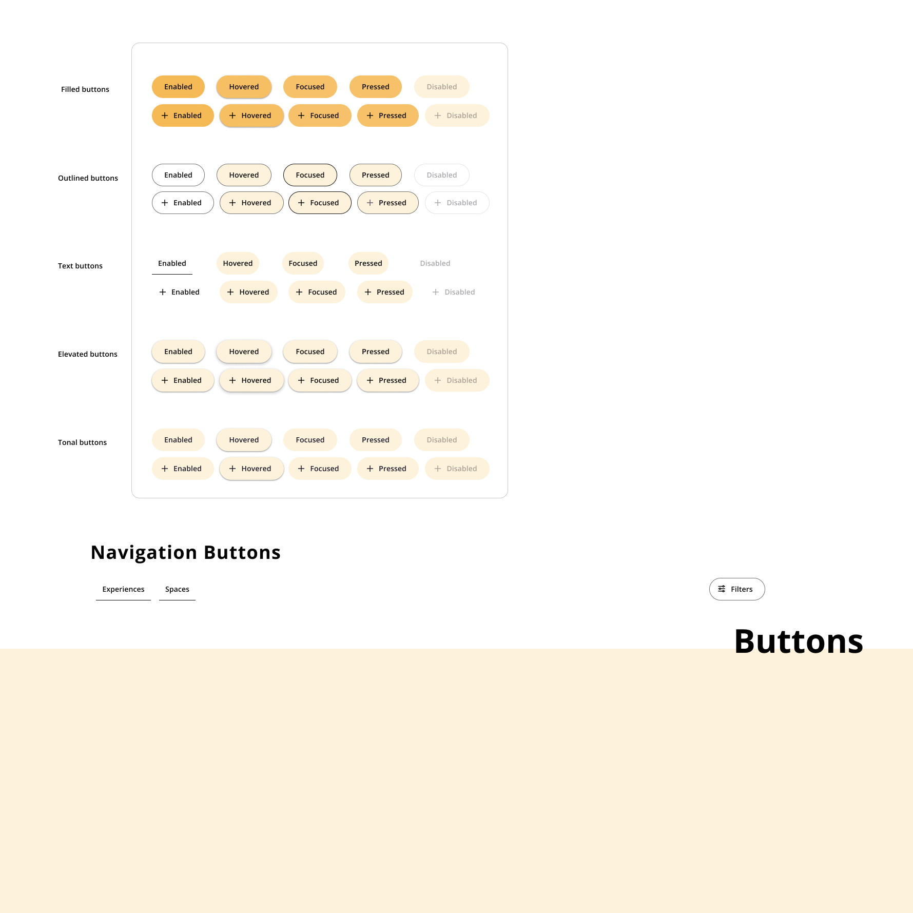
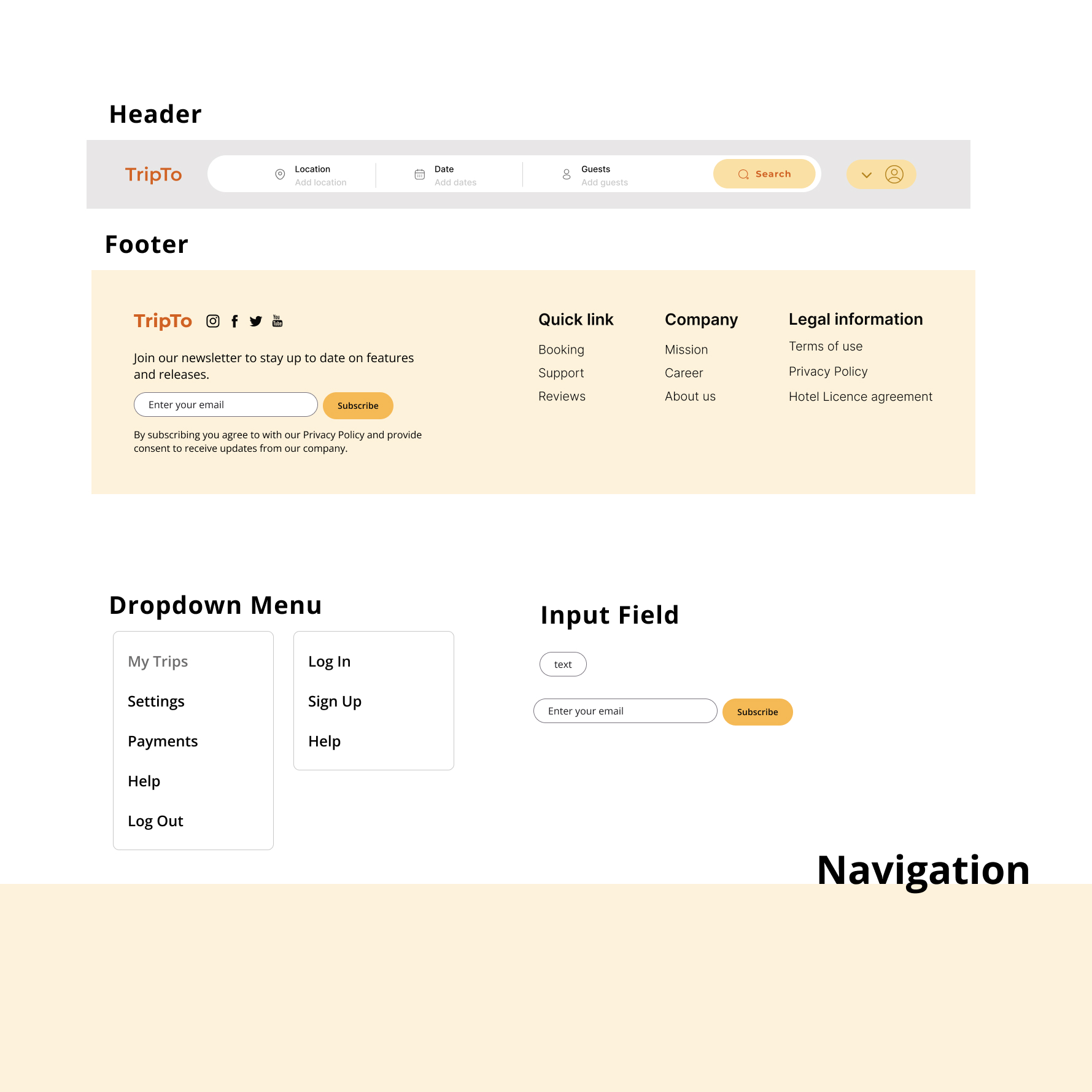
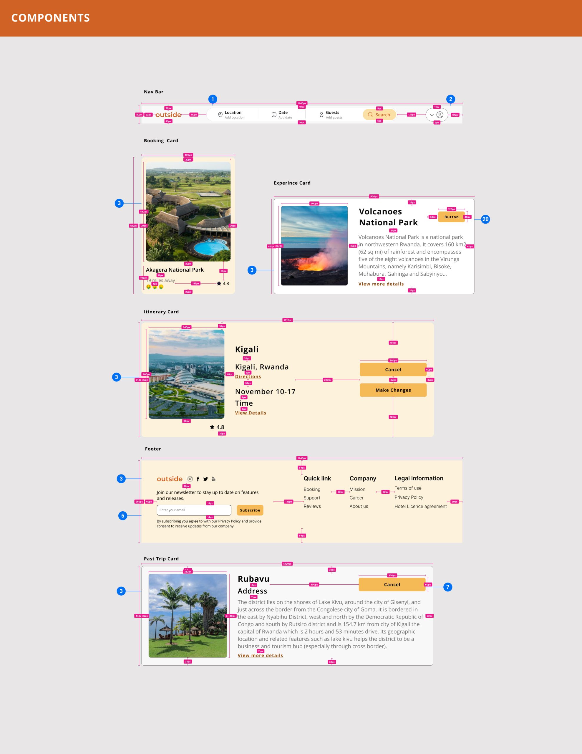
Style Guides could be a design and development tool for us that brought cohesion to TripTo’s user interface and experience.
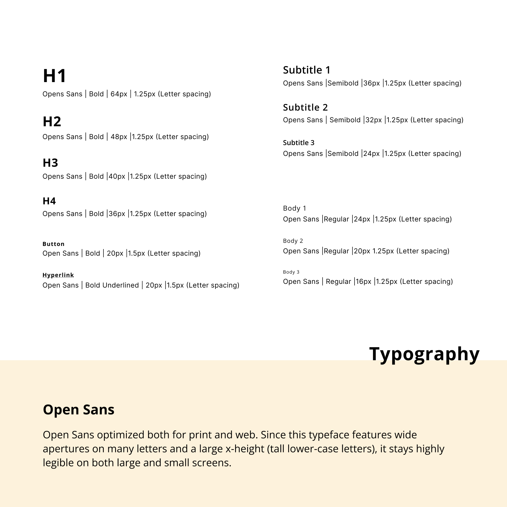
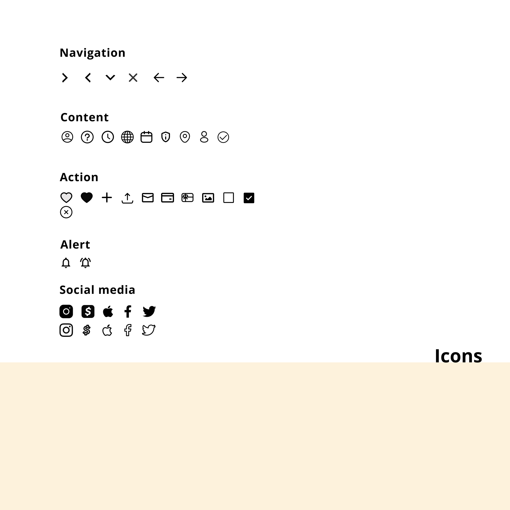
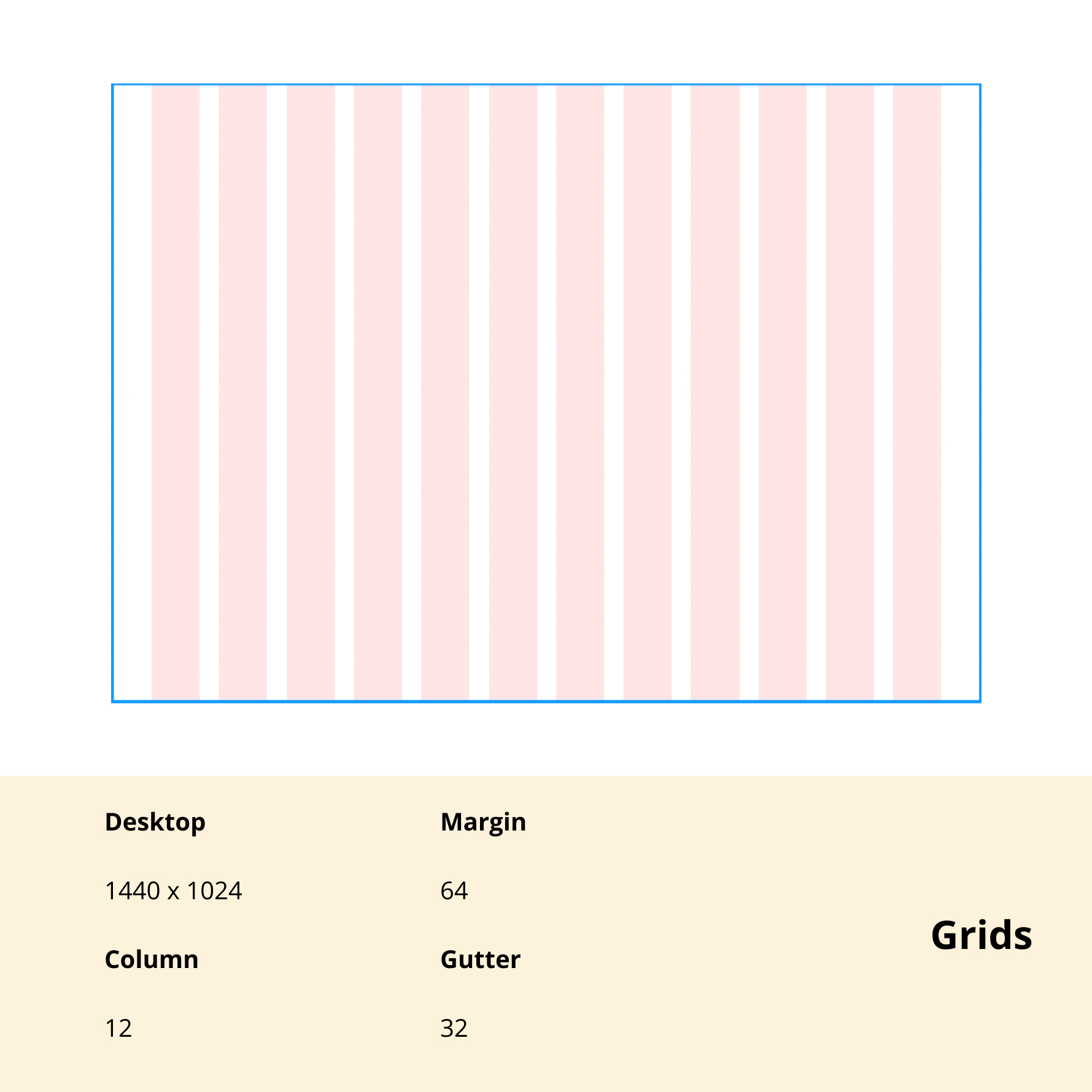
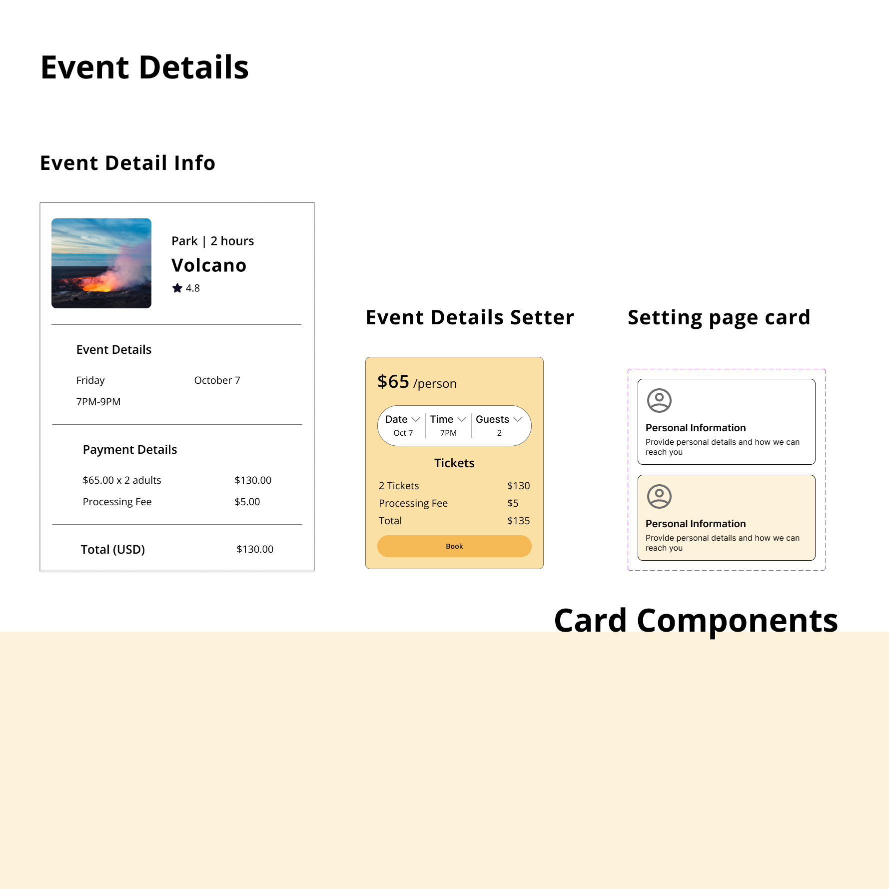
I started by creating a style guide with a color style based on our color exploration and mood boards and gradually added cards, components, typography styles, Iconography, grid style, header, footer, and button components as well as different card designs.
Using the UI style guide helped our team to keep different pages as cohesive as we can and fostered the team members to have an access to a variety of pre-made styles that saved our time for the rest of the project steps.
We constantly updated the style guide as we did the iterations.
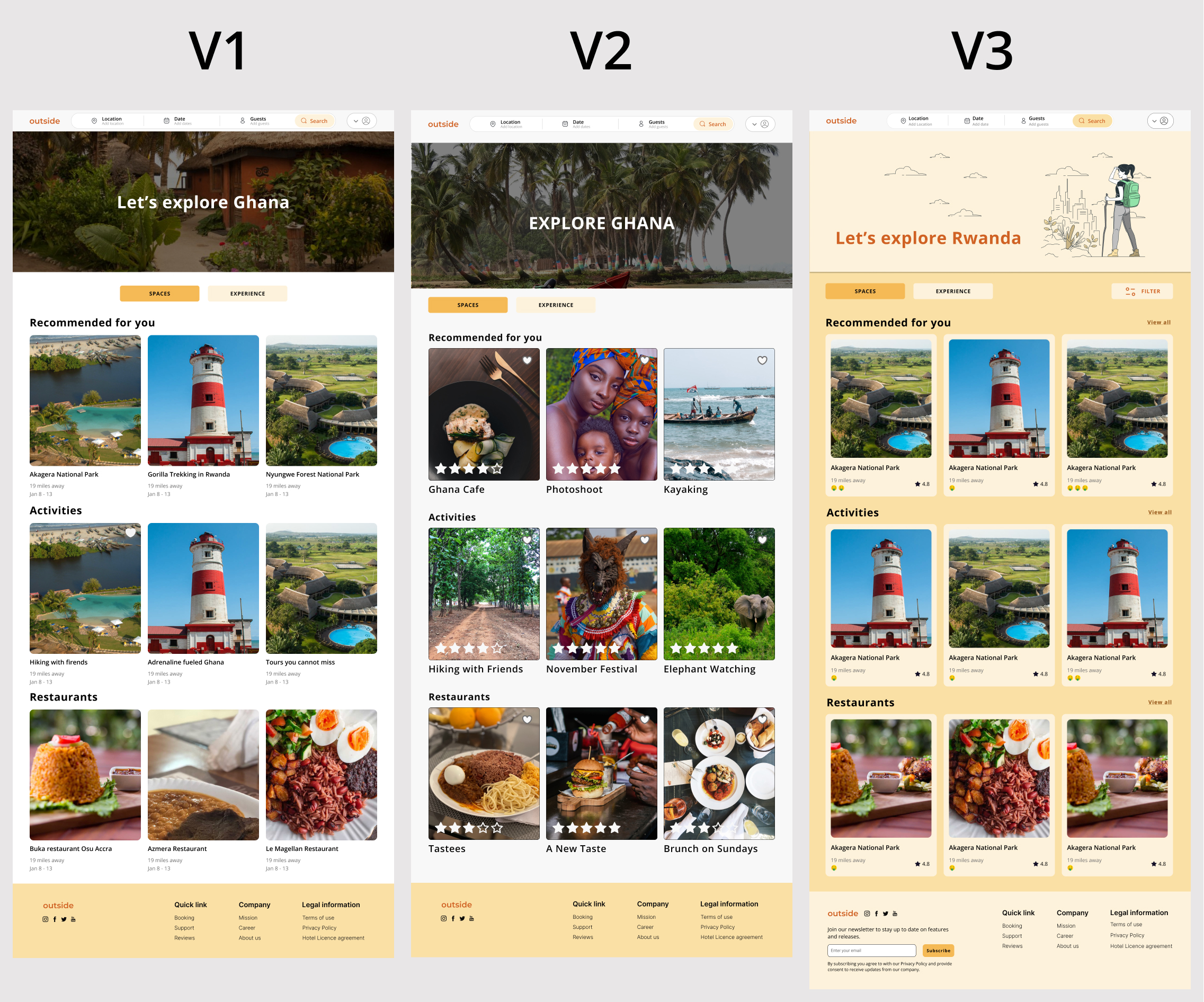
We presented the client with three different high-fidelity iterations. After receiving feedback, we made the necessary adjustments by adding different buttons and including different features the client desired and began working on the rest of the screens.
The client shared with us that he really loves the interface of Airbnb. I took inspiration from Airbnb to create various iterations that feel minimal and inviting. I wanted TripTo to feel more inclusive and stand out compared to other platforms, which is how I created version 3 by implementing monochromatic colors through the use of images and illustrations.

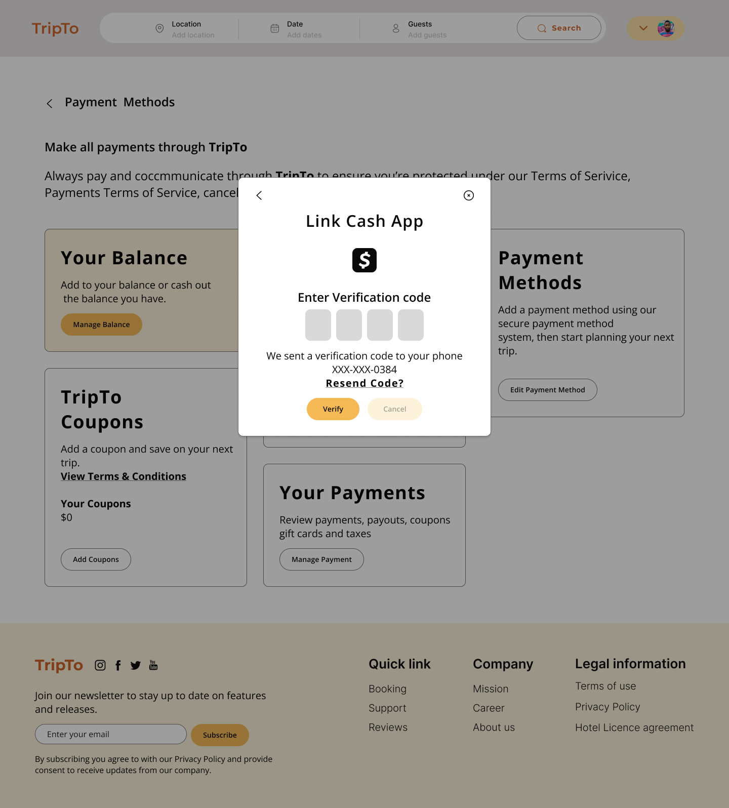
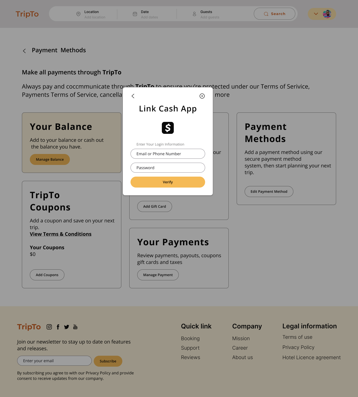
04.04. High-Fidelity Wireframes
After sharing these iterations with the team, we voted on which iterations would work best for TripTo voice. I distributed this style throughout our high-fidelity screens. I also created components of the style and features to ensure there was consistency throughout the screens.


05. Handoff & Reflection
05.01. Developer Handoff
As the project is coming to an end, I prepared annotations and measurements through Autoflow and measurement in Figma so that the developer has a better understanding of how the flow works and the minimum padding for each component. The style guide and component measurements alongside all variants are also shared with the developers to optimize their process.
05.02. Reflection
What I have learned from this project is that Communication is critical – constantly talking to the team and also the client always ensures a smooth design process and the best possible outcome. We were behind on our project plan due to miscommunication with the client in the middle of the project and with the professional help of our dedicated PM we figured out a short daily checking call as an exceptional way of communication with the client to give him a daily progress update and get his feedbacks before spending days of working and iterations. It helps us save the team time and energy and have a clear understanding of every design process for both the client and the team.
This project taught me that it is essential to create a working component library as soon as possible. If this stage is delayed, designs may not be consistent. Working without style or components can impact your project timeline while updating details or doing any changes. It can save the team energy to focus on more complex and challenging steps.
Moving forward, I am excited to continue developing this project. At this phase, our team tries to solve the local tourist problems as users, but I think the second group of users is the hosts. I feel like it was important to include how the hosts will post and present their space/experience and what are their needs and goals. Another necessary flow is to add a translation section for language and currency as the users will be expanded and they are not only local visitors. The ability to quickly access translation can be an easy step for user navigation.