Maryam Palizgir *Design

Product Designer

NanoFlick

NanoFlick is a mobile app to help people capture, edit and publish their moments with ease.

Overview

NanoFlick is a B2C start-up that aims to help content creators to make videos with no editing experience. Social media Content creation is our everyday life these days; however, for new users to this field, it can be a tough task.

Nanoflick helps people with this problem by providing video templates and guidelines in combination with video editing tools to create a seamless video recording experience.

Deliverables
  • User Flow
  • Heuristic Evaluation
  • Wireframes (Mid-Fi)
  • UI (Hi-Fi)
  • User Testing
  • Style Guide
  • Prototype
  • Dev Handoff
Role

UX/UI Designer (Team of 6)

Tools

Figma, FigJam, Slack, Zoom, G Workspace, Usertesting.com

Duration

7 weeks

Challenge

Users who want to create content for social media apps like TikTok and Instagram have struggled with the process because they do not know how to make videos that are visually pleasant. They may not know what types of shots or which camera angle is the best to show that grabs the viewer’s attention. The templates, instruction, and good ideas were in a Beta version, but the initial design was:

  • Outdated
  • Visually cluttered
  • High cognitive load


Users need a simple, clear way to communicate effectively and use the templates provided in the app.

Solution

I collaborate with 5 UX/UI designers through the evaluation and redesign of the app to create consistency and a better user experience.

Through competitive analysis and a heuristic evaluation, I redesigned the entire app, focusing on:

  • Updating the UI and creating a minimal look.
  • Organizing video templates in a way that makes user navigation easy.
  • Changing the complex onboarding to a minimal, illustrative design.
  • Reducing the multi-shot feature from 10 to 5 to make it more seamless and easier to use.

01. Research​

01.01. Research (User research documents provided by client)
The pitch presentation provided by the client and the kick-off call was our starting points to familiarize ourselves with the users as well as the product mission/vision. In addition, we compiled a list of questions to ask the client, which included general, UX, and UI-specific questions. Our goal in asking these questions was to get a better understanding of the user’s and client’s needs and goals.

Some of the questions are as follows:

  • What is the overarching goal of this app? What roadblocks do you feel are hindering your progress, if any, in reaching your overall goal for this app?
  • You mentioned in the kickoff call, you want to help users start and finish a video – can you share data collected about experiences regarding this problem so far?
  • Are there any features you feel your product needs you would like for us to add/focus on?
  •  Do you have specific apps you like the UX/UI of and want us to take inspiration from?
  • What research has been done till now? Which techniques were used? Were they helpful? How?
  • How long from start to finish does it take to make a video?
01.02. Heuristic Evaluation

We needed to conduct a heuristic evaluation as part of our research process because the app had a lot of outdated features that needed to be fixed. We began to look over the App beta version and target key areas we needed to address with the client and focus on as we move forward to update this app in the upcoming process.

Upon analyzing the data from this evaluation, we recognized that the app had many violations in aesthetic and minimalist designThere were some major usability issues we recognized while conducting this heuristic evaluation as listed:

Visibility of system status
  • Navigation did not indicate where the user was in the app.

  • The sound effects page is confusing.

  • Users cannot test the sound effect until the video is processed.

User control & freedom
  • There is no close button when a user wants to try a different video template. 

  • There was no undo option when trying to add a filter.

  • Trying to remove text from screens was confusing, and icons were also confusing and didn’t do what they intended.

Consistency & standards
  • Flicks, movies, and videos are used interchangeably.

  • Terminology, icons, and text styles should be more consistent.

Aesthetic & minimalist design
  • Screens were busy, and screen design and icons were outdated and not visually engaging.

  • The text seemed all over the place and not consistent at all.

  • The logo seemed a bit generic.

This was a daunting task due to the number of violations the app had, but team-wide Figma calls helped complete this task efficiently by dividing screens for team members and focusing on consistency.

02. Ideation

02.01.User stories

After completing the initials and categorized heuristic evaluation, our next step was to develop user stories. Doing the user stories helped us focus on the most important aspects of the project from the user’s perspective. The user stories were organized into the order of priority (High Priority, Medium Priority, and Low Priority). At this phase of the project, we just focused on high priority and medium priority to be addressed.

we wrote user stories that fit within 3 categories: Videos, Community, and Account/Settings.

Videos
The user stories focused on the production of videos, which included templates and editing tools.
Community
The user stories targeted how users would share their videos once they were created using Nanoflick.
Accounts/Settings
The user stories dealt with users’ profiles, passwords, and settings.

02.02. User Flow

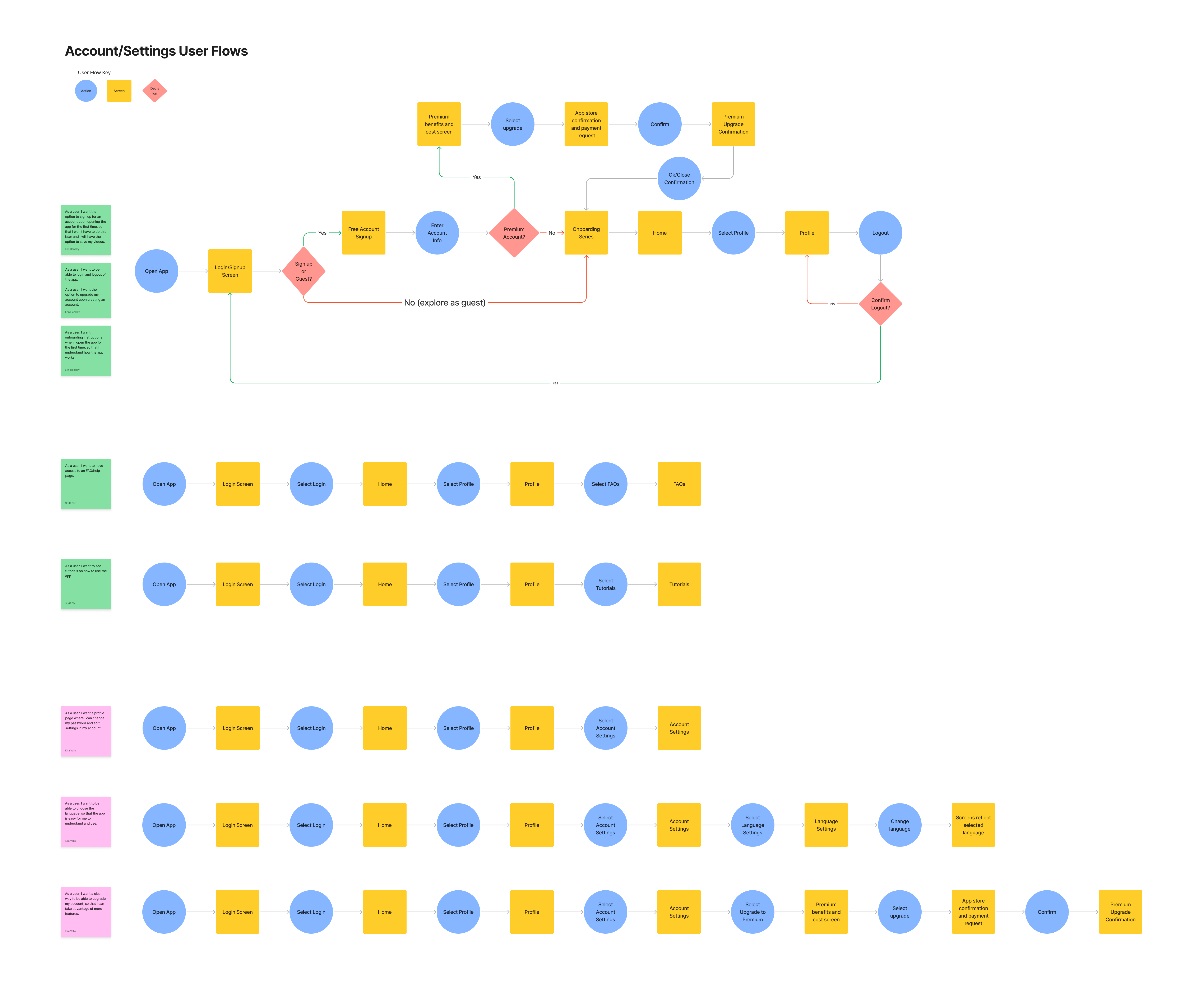
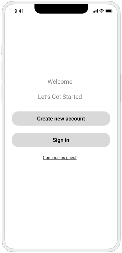
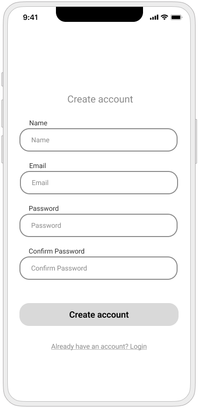
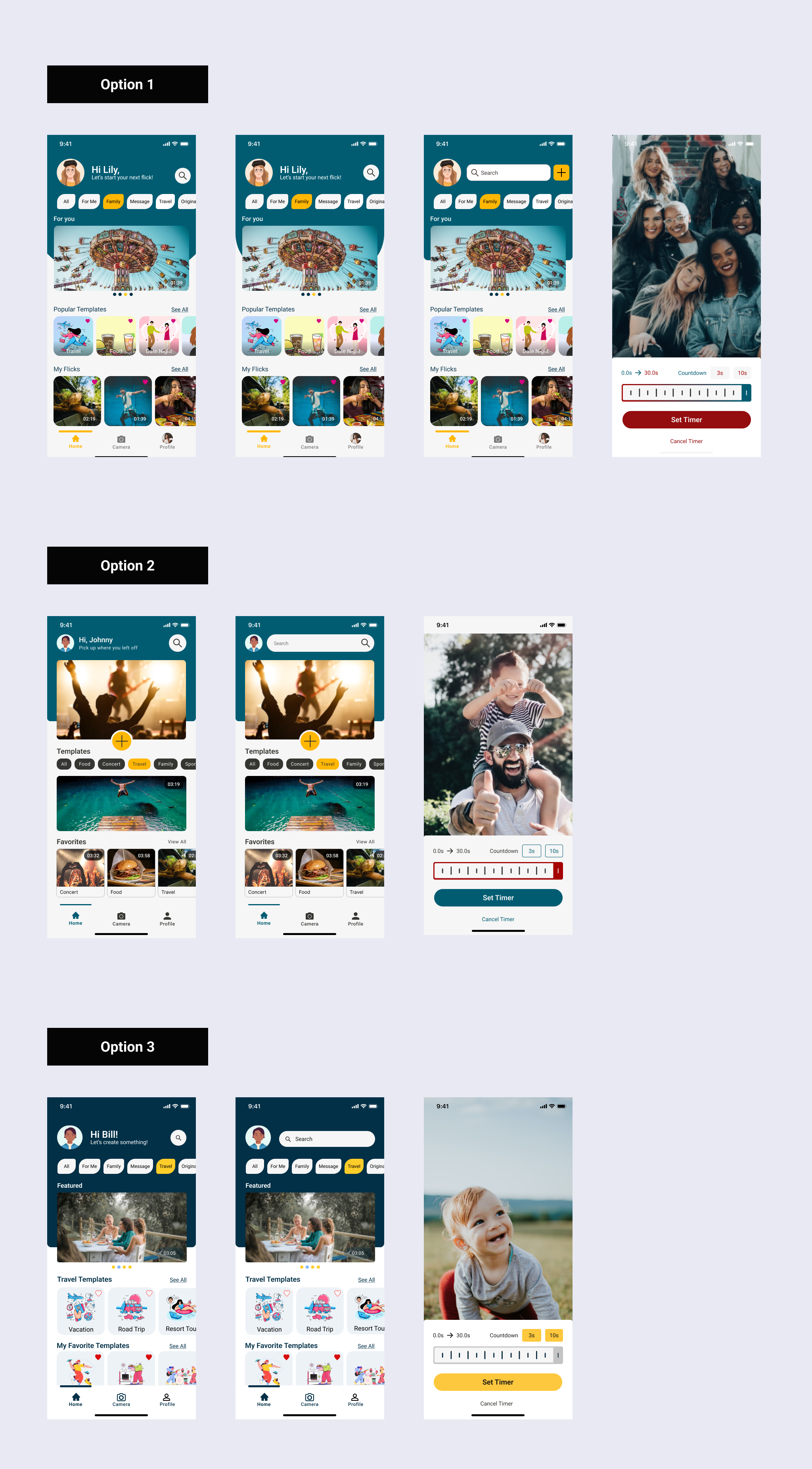
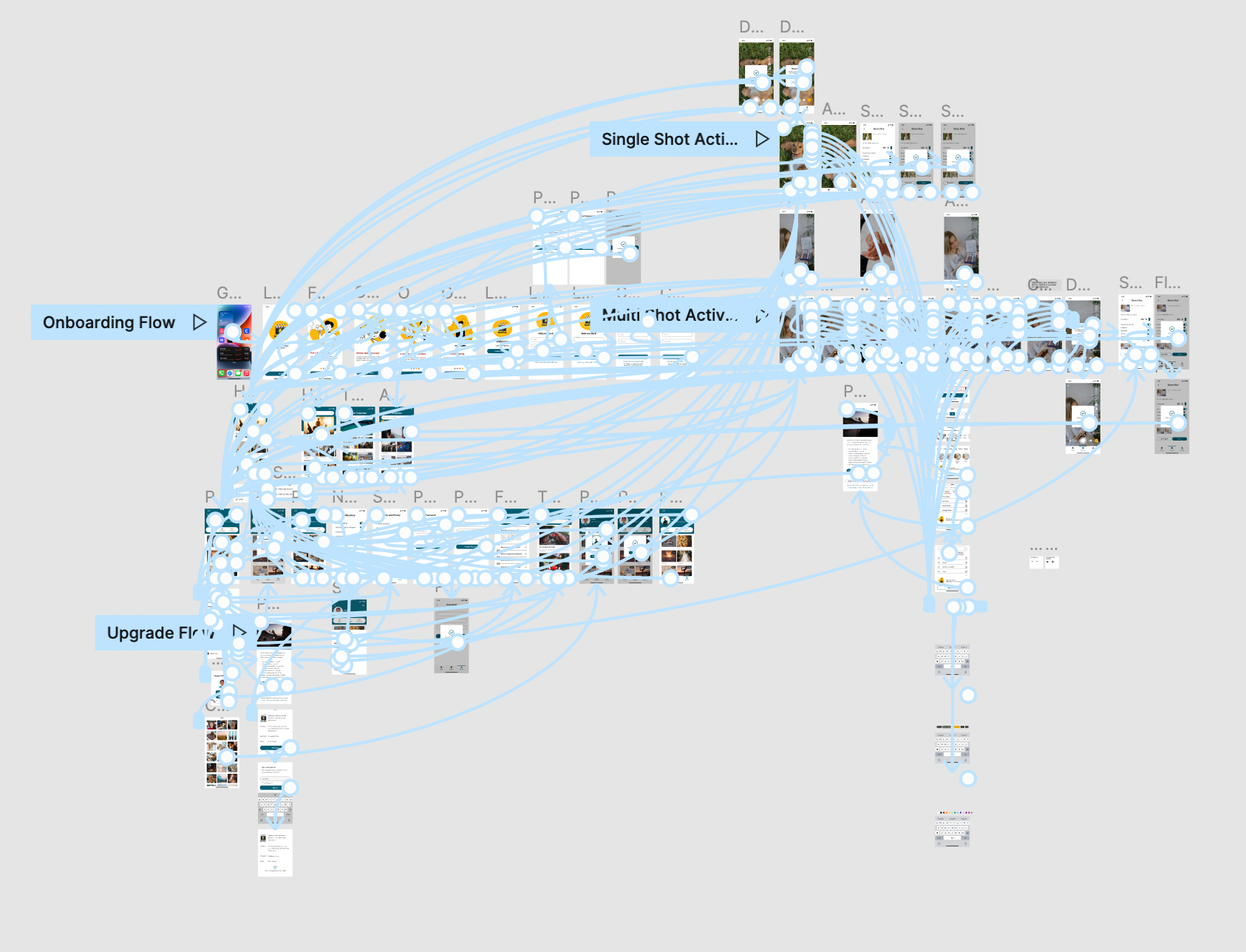
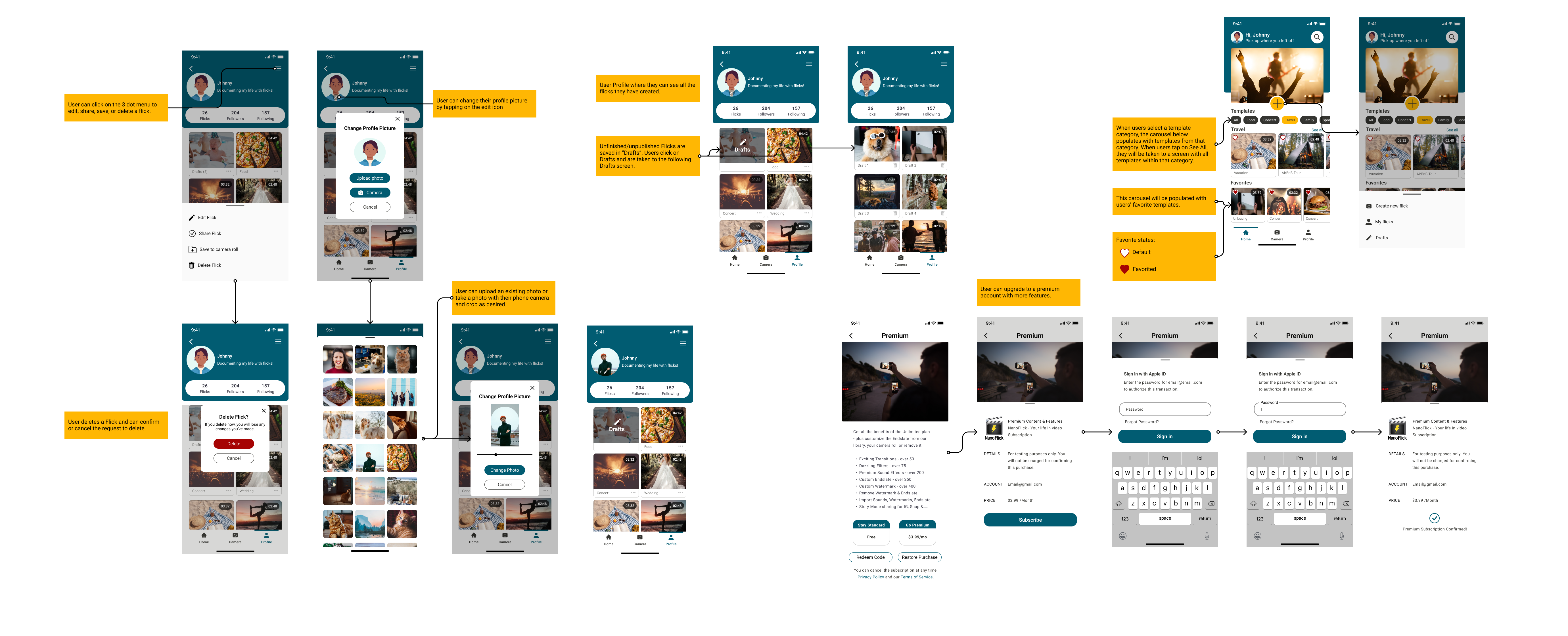
Using the data from our heuristic evaluation, we started the ideation process and as a first step, we jumped into user flows. The client wanted us to focus on the video production/accounts settings aspects of the app, so at this time. We did not proceed with the community aspect of the app.

Each team member was responsible for creating user flows for the high and mediumpriority user stories to ensure efficiency. Some of my user’s flows overlapped with my other team members, so we tried to maintain communication to ensure both of our flows worked together.

03. Design

03.01. Wireframes

Our next move as a team was to move on to design wireframes for each flow. At first, we divided up the screens that needed to be designed and worked independently. Once our first iteration was complete, we met to share feedback and iterate the screens multiple times to make sure about consistency before submitting our designs to stakeholders.

03.02. UI Inspirations

The next step was to create 3 different UI inspirations on two screens for the client to help him decide the best option that fits the product’s vision. We began with the color exploration based on the client’s desired color which was yellow. Then, we applied 3 different color palettes/design elements to several screens so the client could select the style he preferred.

3 UI Iterations for the Client

03.03. Style Guide

After selecting the client’s preferred style. The style guide focuses on typography style, grid and spacing, color styles, component libraries, and iconography. The guide was updated throughout the rest of the design process in preparation for the developer’s hand-off.

Final UI Design and Iterations

We applied the client’s preferred style to all wireframes, and as we began this process, we realized that some of our wireframes were not consistent in style. Some screens mimicked the outdated style of the original app, so we focused on maintaining consistency in updating the app UI.

04. Prototyping & Testing

We finished the app flows and UI redesigning to better mimic NanoFlick’s competitors. With the UI designs complete, we created a prototype of the app in Figma to be able to conduct user testing.

User testing flow

User Testing

Then we needed to conduct usability testing to ensure the designs met both the client and user goals. We created a high-fidelity prototype in Figma.

We ensured that we had different flows for all 8 tasks so participants would have a successful experience.

While waiting for the high-fidelity designs to be approved by all stakeholders, we created a usability testing plan that help us with possible design issues.

 
Usability Testing Plan

we wrote a usability testing plan to set clear objectives and tasks for participants. We wanted to assess the viability of the redesigned app and uncover usability issues by having users complete the following tasks:

  1. Complete the onboarding process and sign up for the app

  2. Create a multi-shot flick using a template

  3. Create a single shot flick and add music

  4. Change password

  5. Upgrade to Premium access

  6. Find drafts

  7. Delete a flick

  8. Change the profile picture by uploading an image from the camera roll.

Participants

I chose the following characteristics users must have in order to test the app:

  • content creators of a variety of ages

  • users who have a digital experience

  • users with limited experience in creating content

Testing Method

Our team members and I launched the prototype and conducted 5 unmoderated tests on usertesting.com.

The testers selected based on the criteria laid out were between the ages of 20 and 40 years old.

Usability Testing Findings

Overall, users reported that most of the tasks were easy to complete and that they liked the design and idea of the app. We hypothesized that users would be able to complete all 7 tasks with minimum difficulty.

Issue 01

Users had trouble finding drafts

Solution

To meet accessibility standards and reduce the user cognitive load, we Added an icon and increase the font size of the “drafts” label, located over the top of the drafts section.

Issue 02

Users had trouble shooting single-shot flicks

Solution

Add an overlay that pops up when users tap on “Create New Flick” where users can select single or multi-shot flicks to create.

05. Handoff &Reflection

05.01. Developer Handoff

I used the Figma Autoflow plugin for annotations to explain the screens’ navigation and functionality to the development team. The prototype and style guide was attached for more detailed information.

Developer hand-ff

05.02. Reflection​

I have a background in fine art photography and video art so I was super excited to work on this project. My background and experience in video art installation and video editing have impacted my understanding of the pain/gain points of this app as a potential user.

I really could not have asked for a better project experience with a better team. It was a seamless team dynamic – when we had different design styles or ideas, we would point things out to each other in our Figma calls, comments, or daily stands up and would always talk to each other. I am very grateful to have been on a team with a team leader who is highly communicative, and clear when an issue came up. It was also interesting to work with teammates who have different design styles from mine and I have learned from them.

I think for the next step, the app branding, including the logo needs to be redesigned to be consistent with the new minimal look of the app. The community aspect should be added and redesigned to connect users with other video-maker lovers on social media.

“Thank you so much, and please pass our thanks to the entire team! we have already made some big adjustments based on your input”
- Biunder
Of Nanoflickll, Fo