A physical activity planner &
information sharing platform
Overview
There are many fitness apps but most of them focus on individual training or virtual training in a group. funterest aims to increase the percentage of people’s physical activities that have decreased due to virtual social networking.
Provide a new ground for sharing fun activities and growing your network beyond digital social media. The habit of forming outdoor activities is a lifelong one, and this hobby can enhance the users’ physique, and it relieves stress in difficult situations. Encouraging users not only to connect with friends and family but also to make new friends.
Process
Quantitative Analysis
User Research
User Interview
Affinity Map
Competitive Analysis
Persona
Empathy Map
UI style guide
Process book Design
Information Architecture
Low /high-fidelity wireframing
High-fidelity prototyping
Usability Testing
Role
UX Designer/ UI Design Lead on a team of 4
Tools
Figma, FigJam, Miro, Slack, Zoom, Adobe After Effects, G Workspace
Duration
10 weeks
Challenge
Lack of physical activity due to sedentary lifestyle,increase of people using social media and not having friends to do activity with.
Solution
funterest aims to increase the percentage of people physical activities that has been decreased due to the virtual social networking .
The app aims to increase the percentage of people physical activities that has been decreased due to the virtual social networking.
As people are suffereing from several diseases due to inactivity funtrest could potentially change ones lifestyle from sedentary to active.
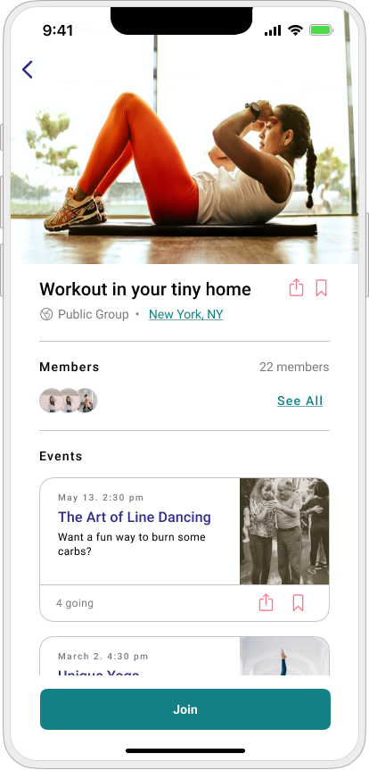
The app features for group activity aim to be accessible regardless of fitness level and provide people with the knowledge and confidence to be able to exercise in a group.
The first step we took as a team was to familiarize ourselves with the users as well as the mission and vision of the app. The client provided his pitch presentation and we had a kick-off call as well so we could begin exploring. In addition, we compiled a list of questions to ask the client, which included general, UX, and UI-specific questions. Our goal in asking these questions was to get a clear direction of where the client wants us to take the app.
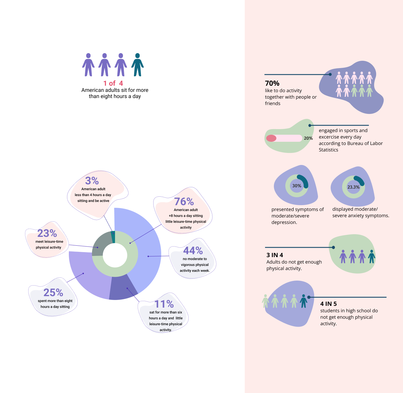
01.02. Quantitative Analysis
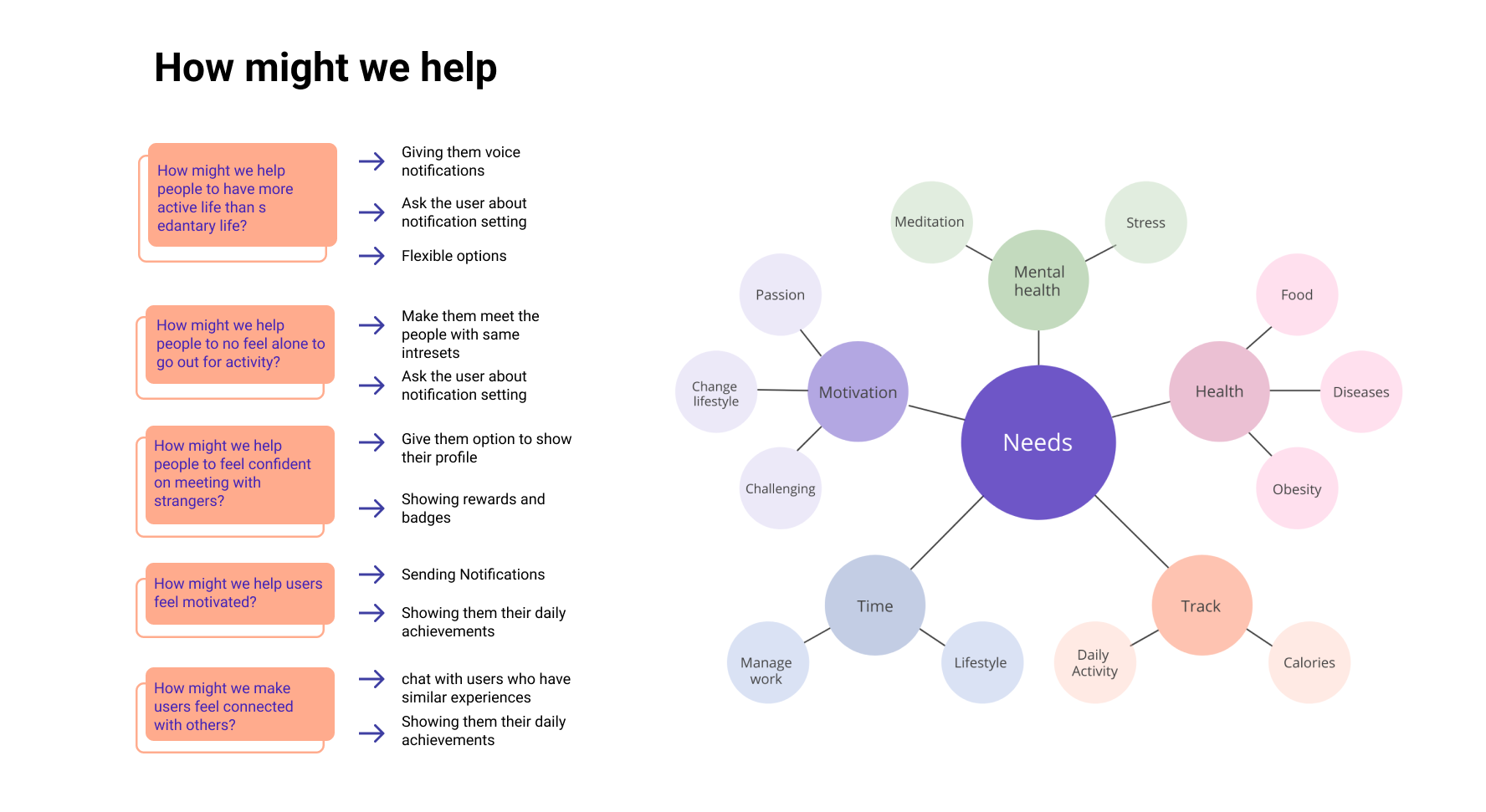
To start the project, we wanted to understand more about why funtrest is important to users and what it can offer. Through research process, we discovered:
01.02 Surveys
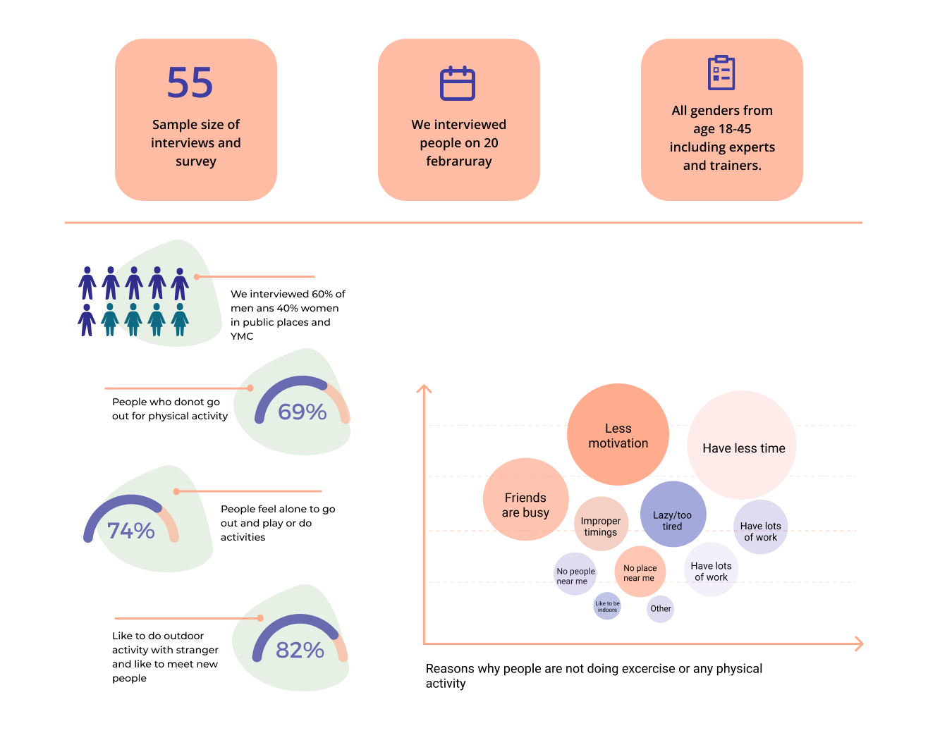
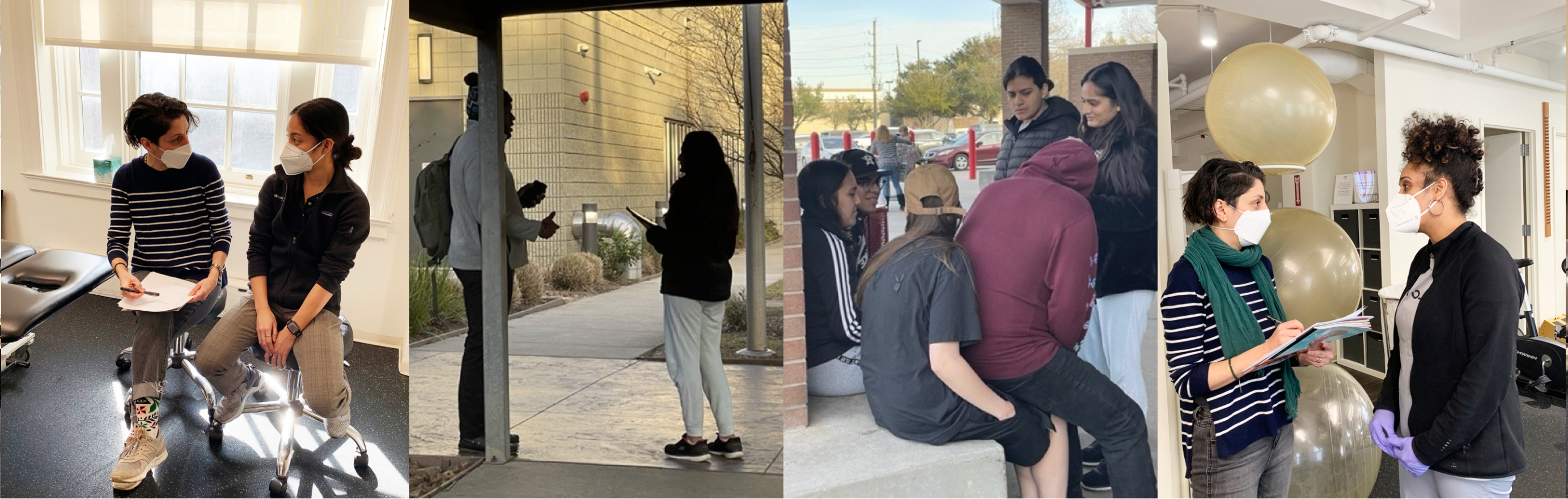
After the project kickoff, we defined our research strategy and objectives. Understanding the target audience and their challenges were our priority. First, we built an online survey and shared it in all genders from age 18-45 including experts and trainers. In just a few days, we received 55 submissions. Based on these, we identified common pain points, which lead us to the next step.
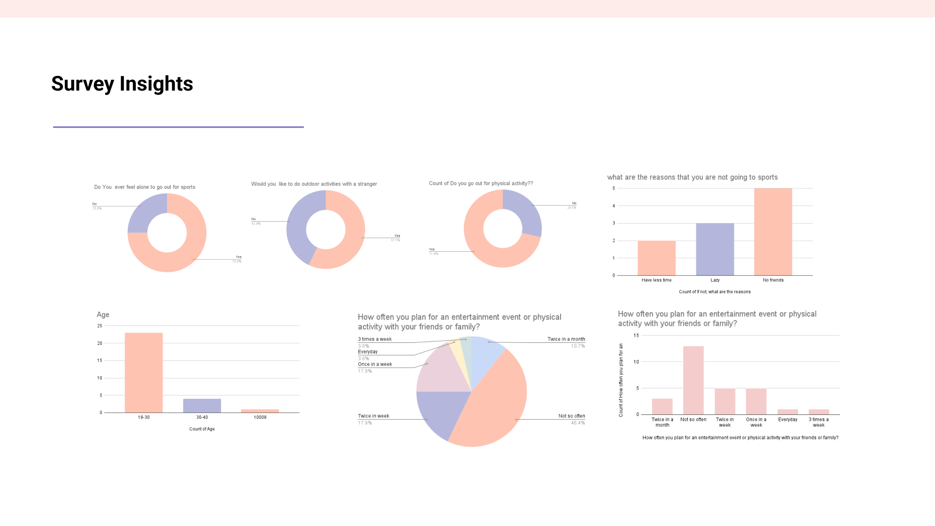
01.03. Interview Analysis
We conducted interviews and surveys to understand and analyze the user needs, problems and reasons. We would like to know about their physical activity routine and the reasons why they are not doing any physical activity. We want to know their experience if they used any app before and their opinion on the meet-up or fitness apps.
60%-40%
We interviewed 60% of men and 40% of women in public places, physical therapy offices, and YMC
69%
People who do not go out for physical activity
74%
You can write here as much as you People feel alone to go out and play or do activities
82%
You can write here as much as you People feel alone to go out and play or do activities
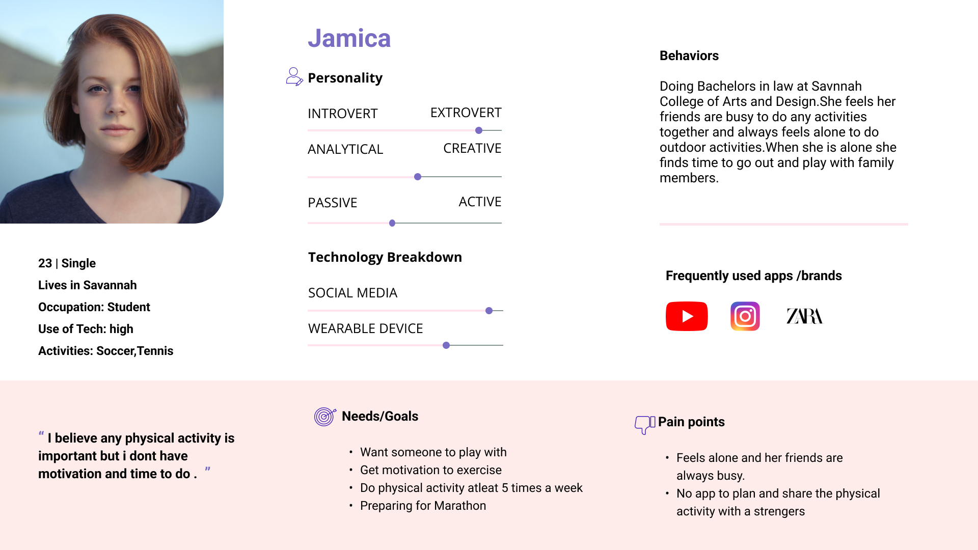
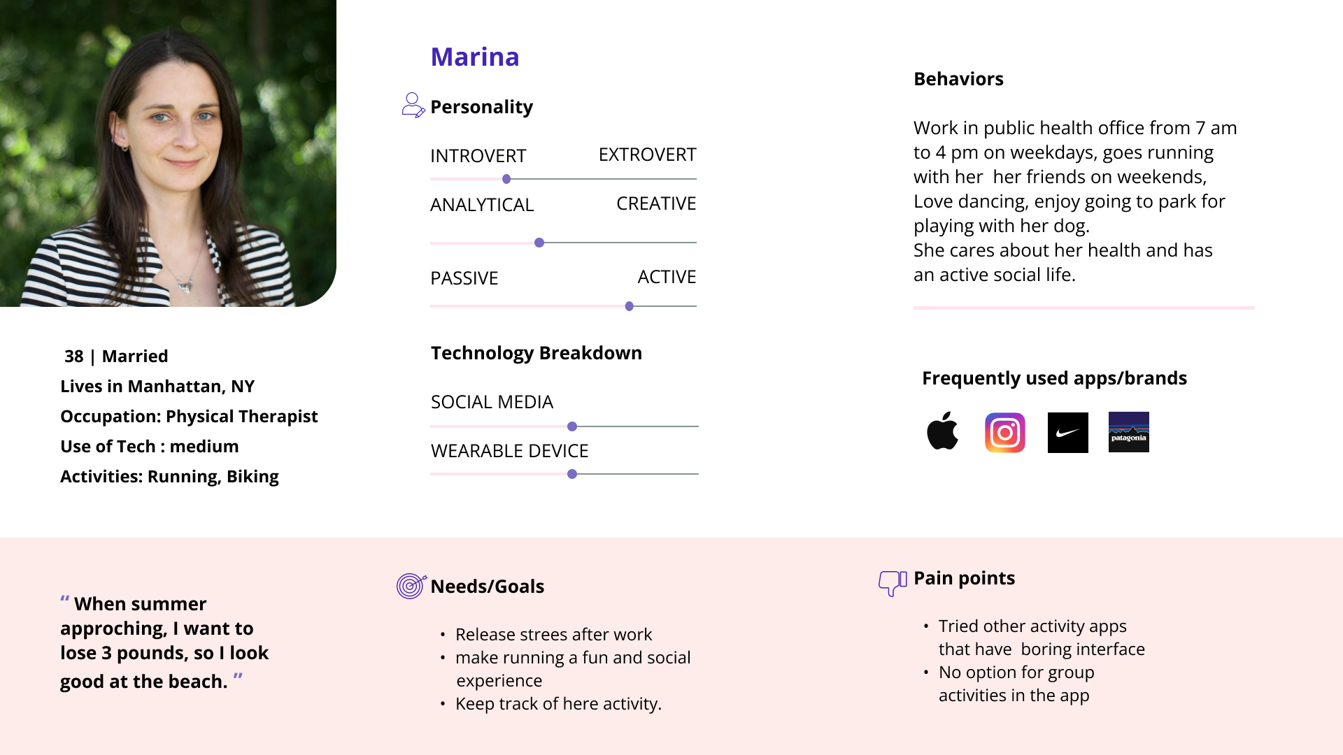
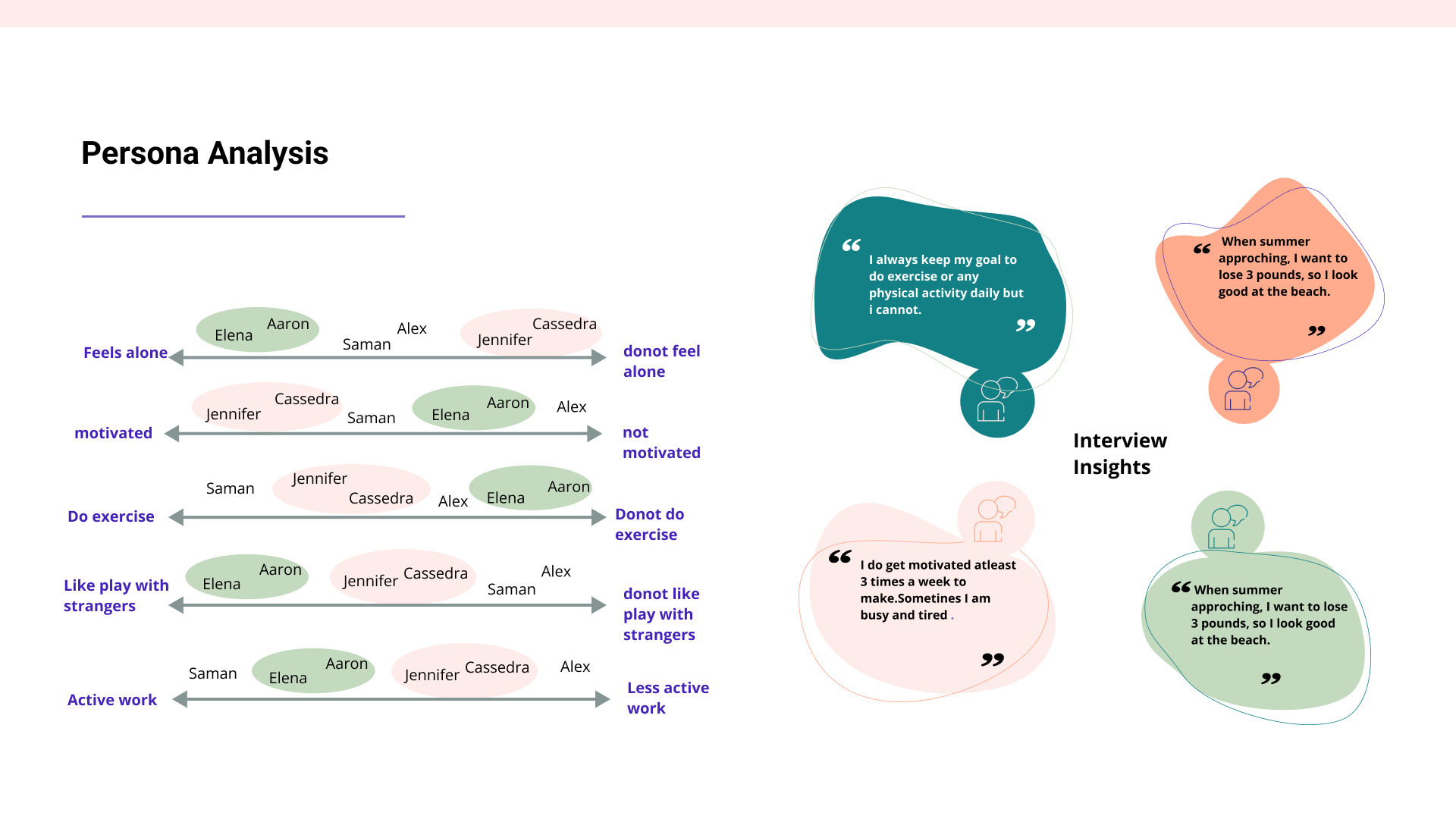
01.04. Personas
We wanted to form a deeper understanding of our users’ goals, needs, experiences, and behaviors. So, we created 3 personas for each of our user segments. They were based on user interviews and surveys, and we kept updating them throughout the project as we gathered more data. We used these personas whenever we wanted to step out of ourselves and reconsider our initial ideas.
User insights from the interview and Persona analysis
02. Ideation
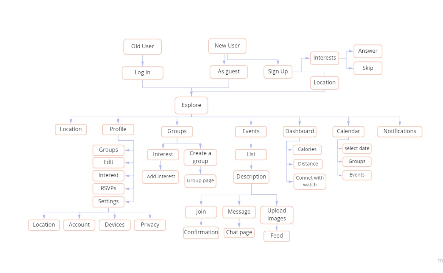
02.01. Information Architecture
Using the information from our survey and interviews, we began the ideation process. Our first step was to create a well-designed, user-friendly information architecture that ensures that users spend less time and effort searching for information and are successful in finding what they need. As a team, we all collaborate on creating the information architecture through the Figma call and make sure to maintain communication and consistency throughout the process.
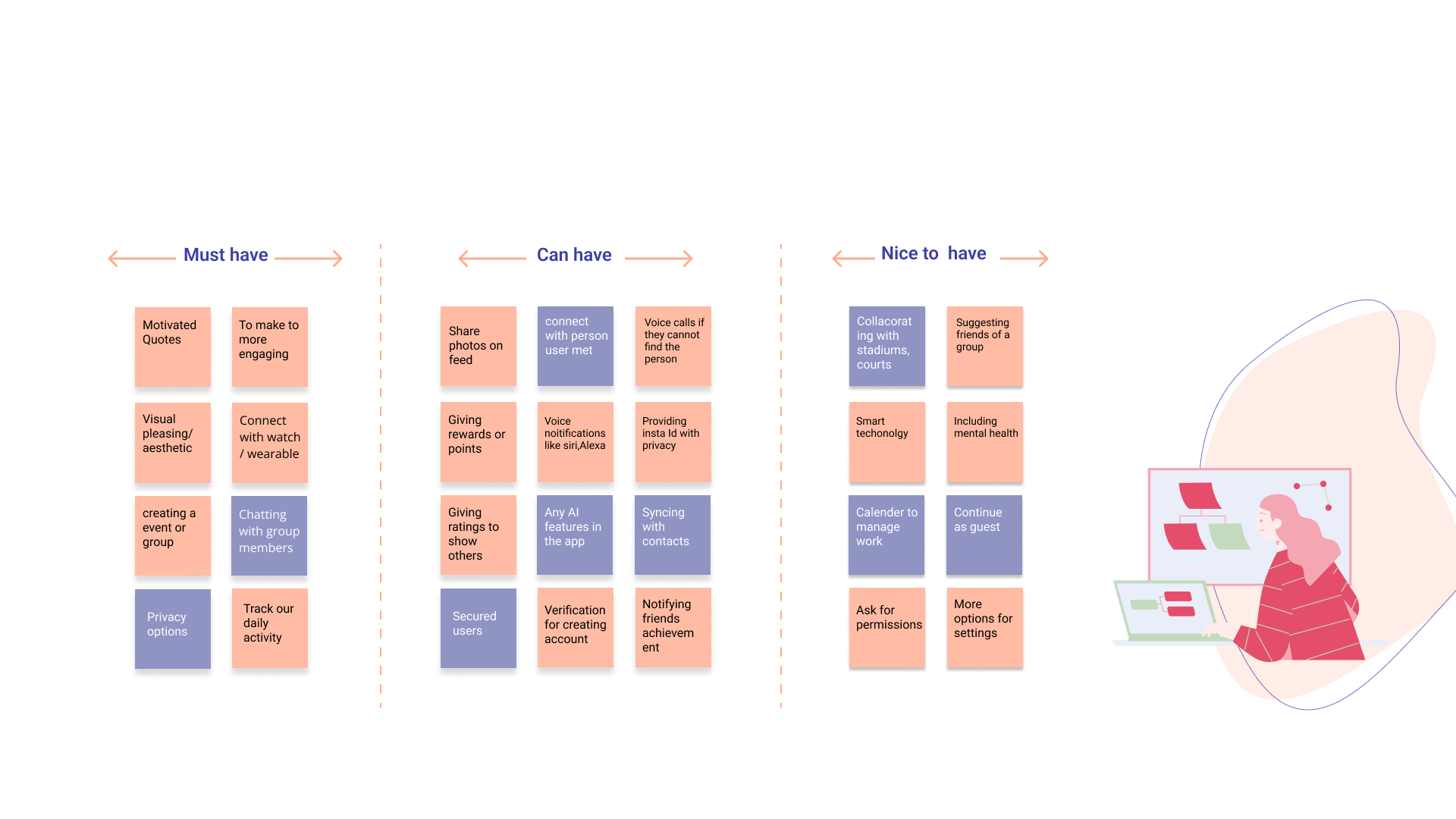
02.02. Affinity Map
I gather qualitative information about users and group it into these categories:
Must have
Can have
Nice to have
These groupings can help me extract insights and themes to build effectively toward the next steps.
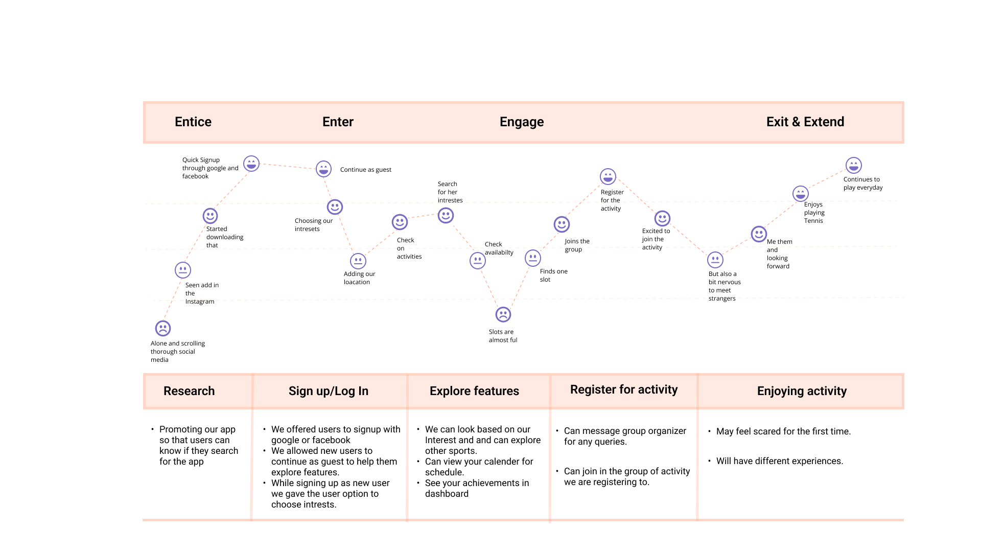
02.03. User Journey Map
At this point, I gain insight into how users interact with funterest app and what they might find helpful or frustrating. This in turn helps me design the app to be simpler and easier to use.
03. Design
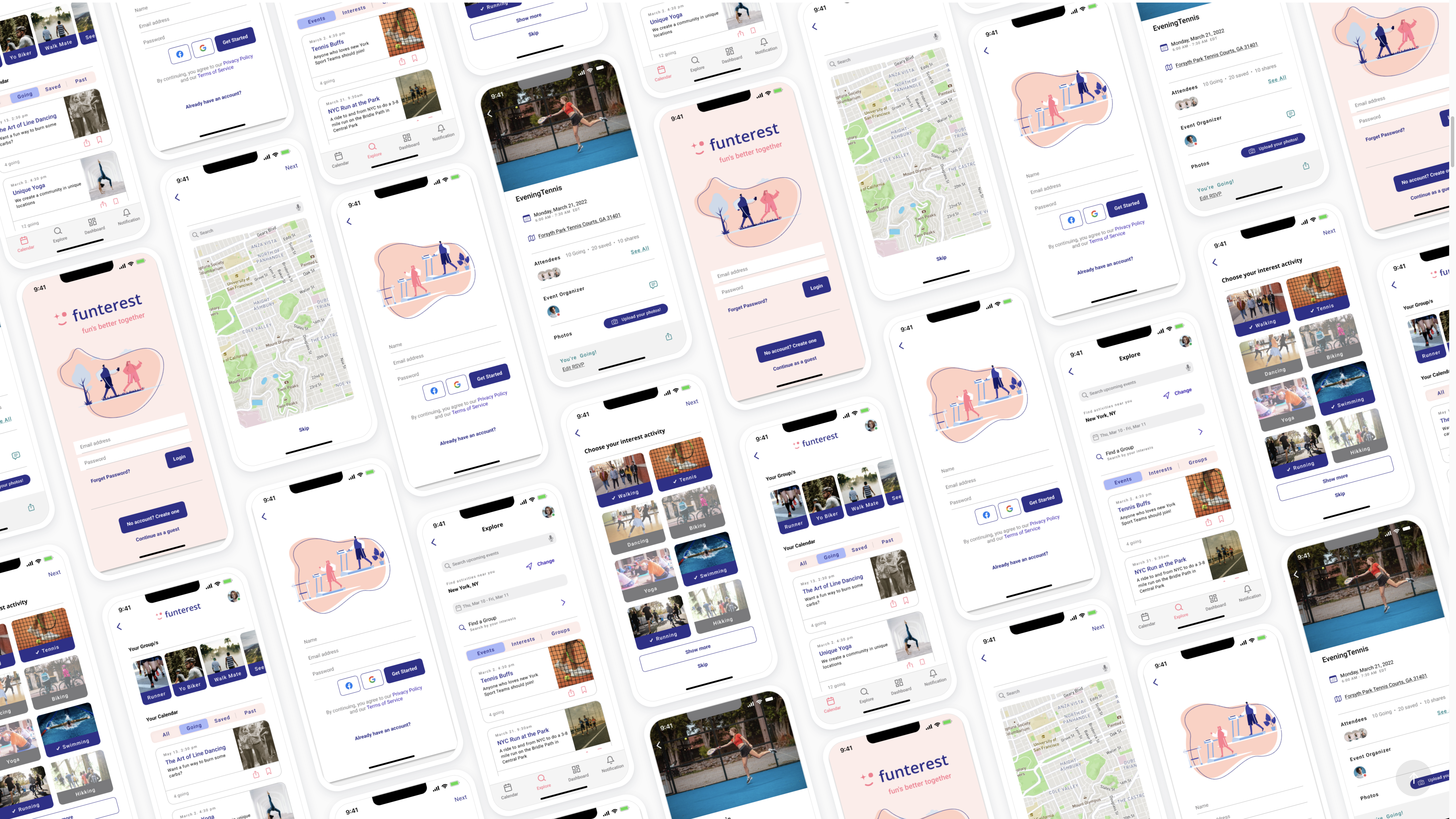
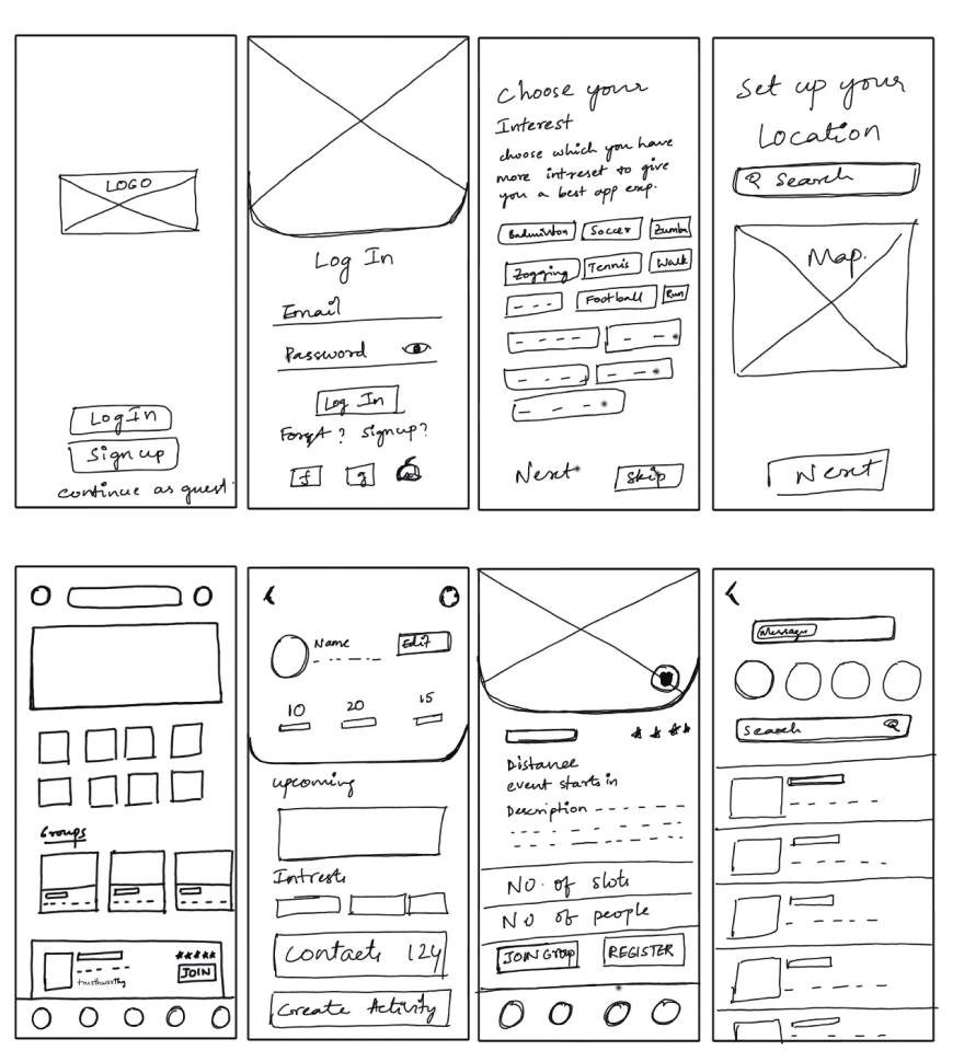
03.01. Wireframes
Using Figma, I translated my first sketches into low-fidelity wireframes. Then, I improved them by adding images provided by the client and more UI elements to create high-fidelity wireframes. At this stage, the wireframes were defined enough for some user testing. Based on 4 tests, I’ve made a few alternations and moved on to creating high-fidelity prototypes.
03.02. high-fidelity wireframes
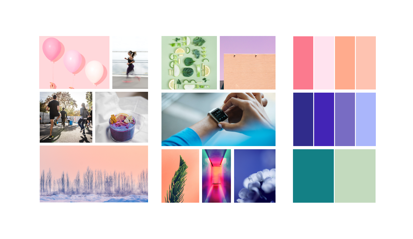
03.02. Mood-board3
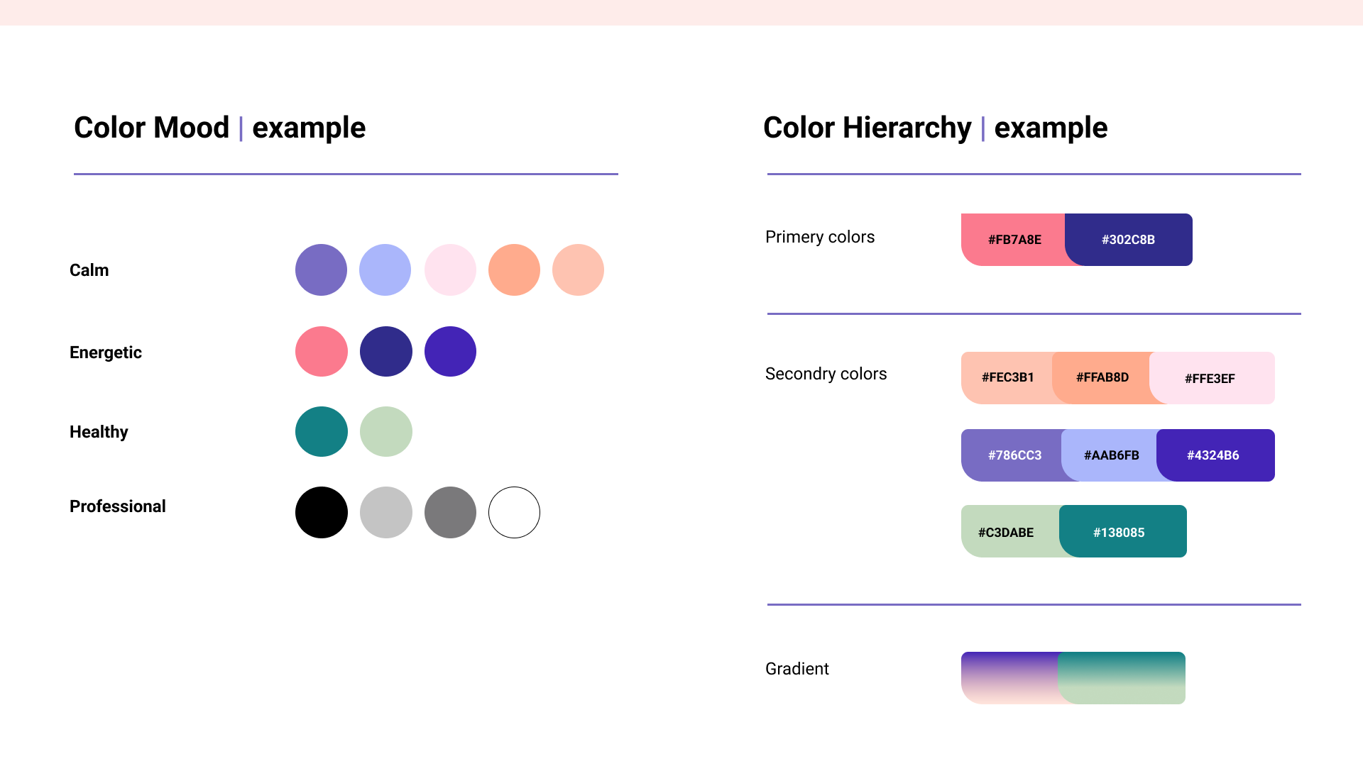
Based on this why, we came up with a design mood board reffering some words like energetic, socially engaging, calm, and healthy.
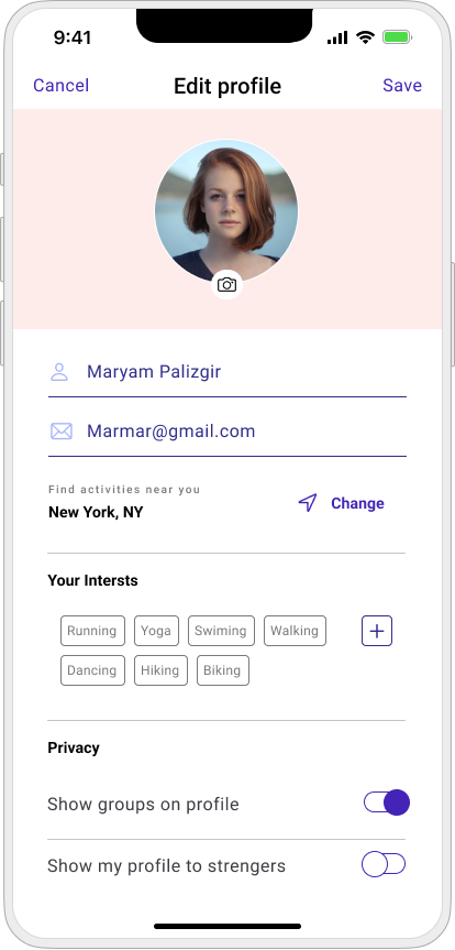
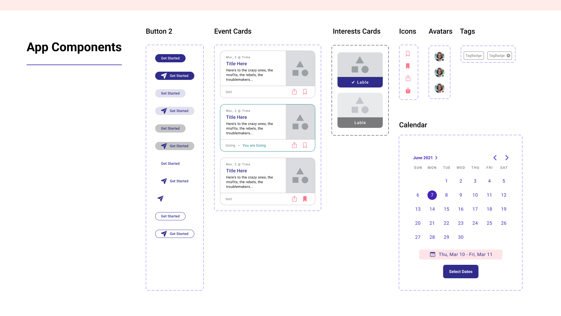
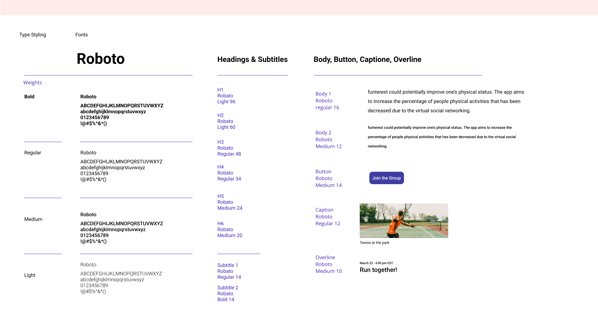
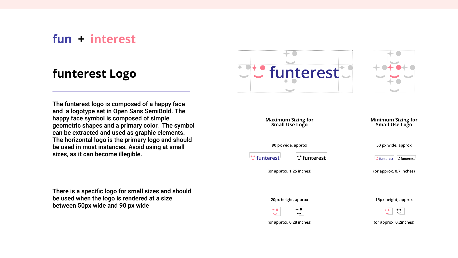
03.04. Style Guide
Once the client selected his preferred style, we put together the beginnings of a style guide. This guide was updated throughout the rest of the design process in preparation for hand-off to developers.
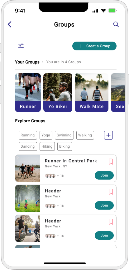
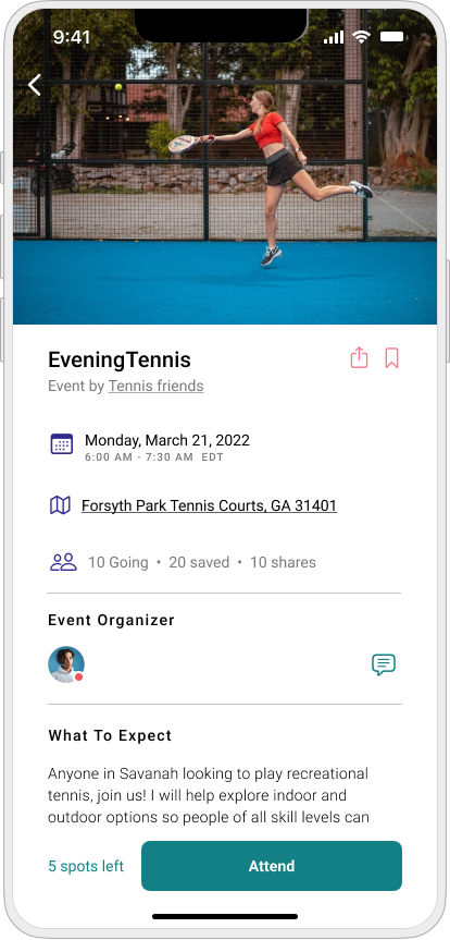
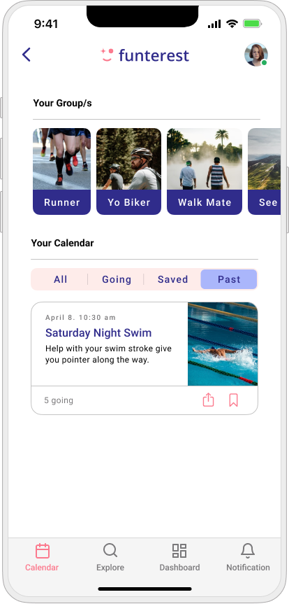
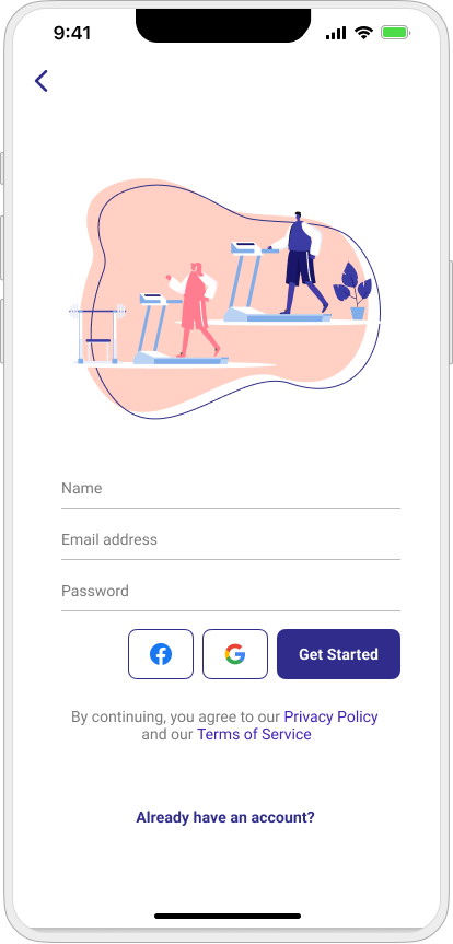
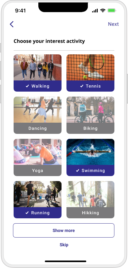
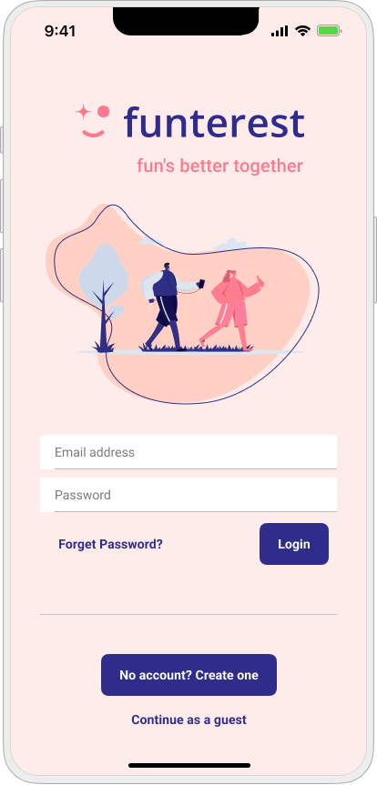
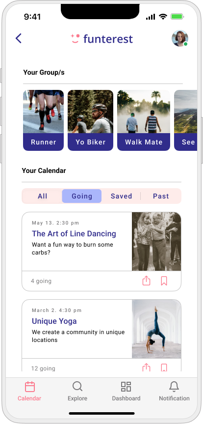
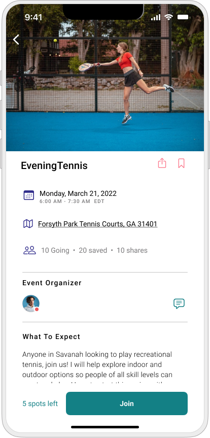
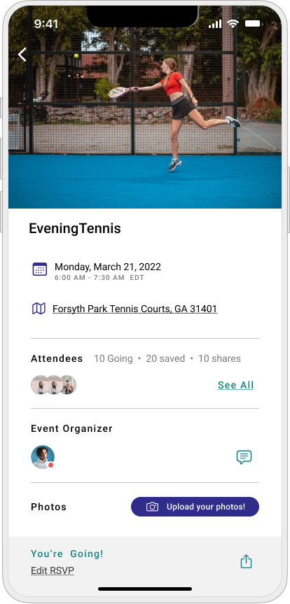
03.05. Prototyping
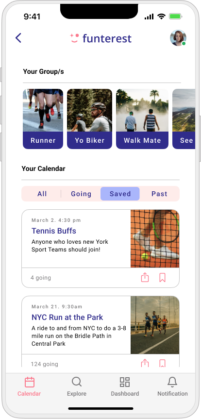
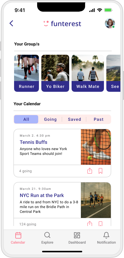
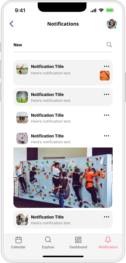
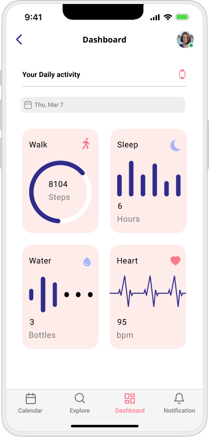
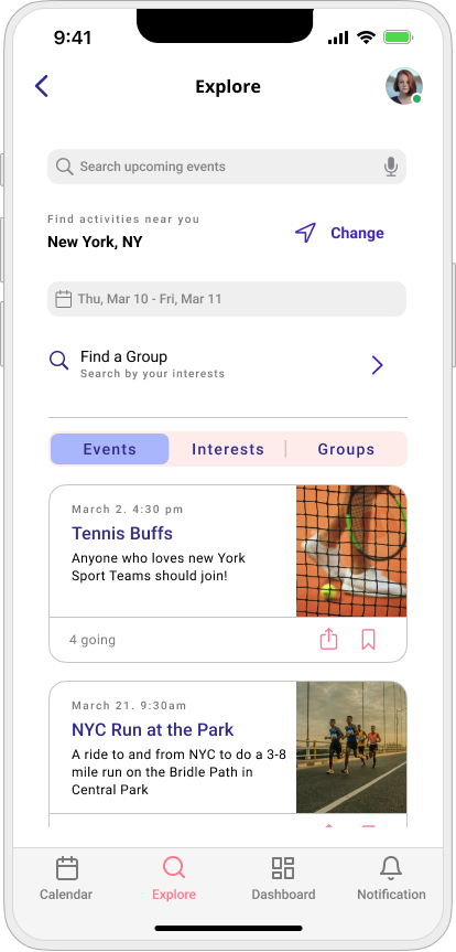
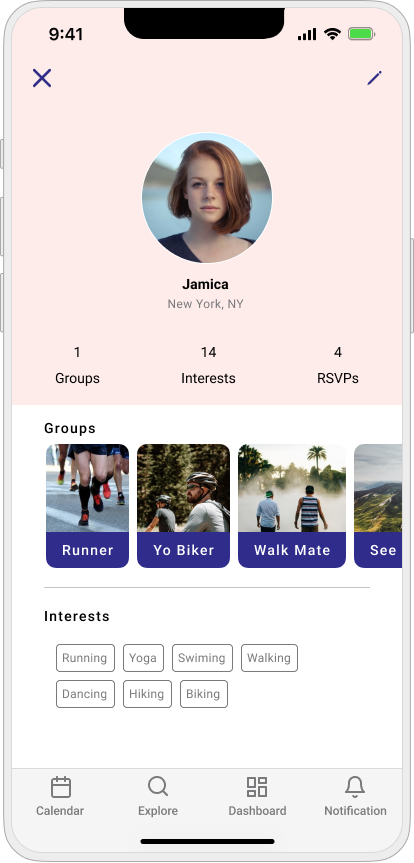
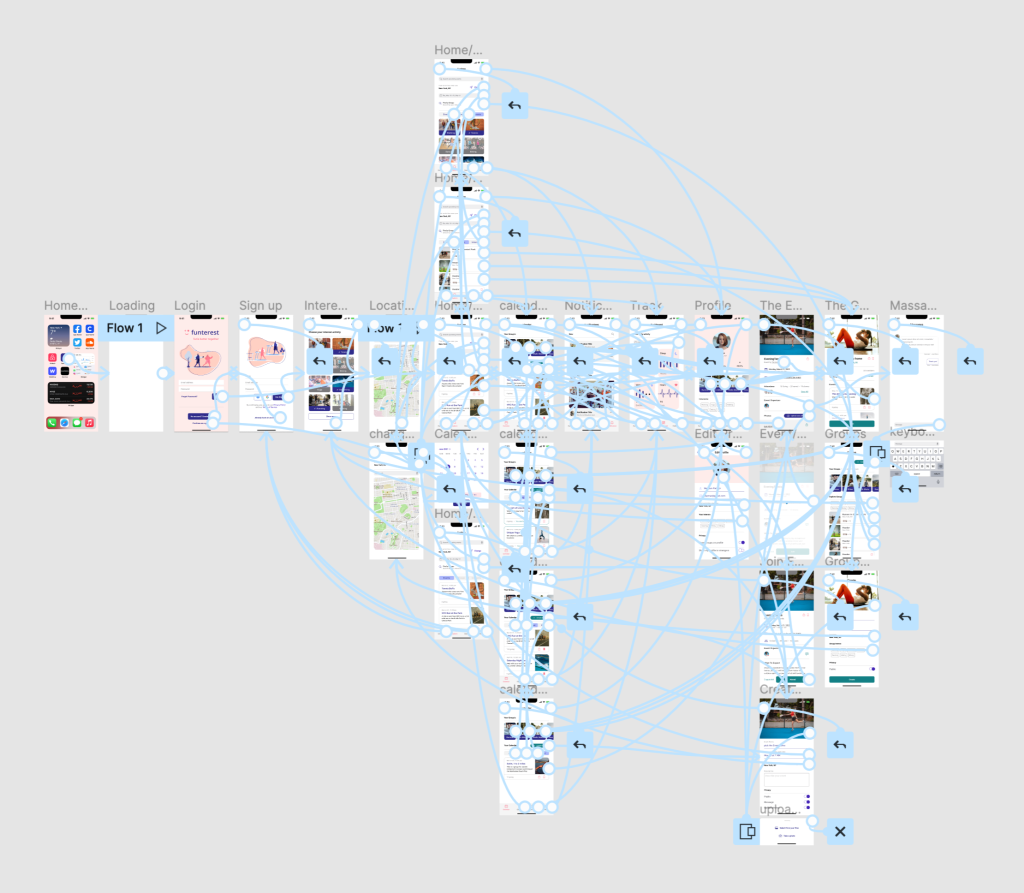
With the UI designs complete, we created a prototype of the app in Figma to conduct user testing.
Clickable Figma Prototype
04. Reflection
During this project, I learned how to value user needs and provide solutions to multiple problems for them.
A Couple of Challenges I had to Overcome
I needed to be mindful of how much time I could spend on each step of the UX design process with a complex app that needs multiple research and ideation processes.
I had to simplify my designs even though the app required quite a lot of information.
I also think that for the next phase of the project, the company should consider having a wearable device design . Most of the target users used different type of smart watches and they usually use that for tracking their physical activity.